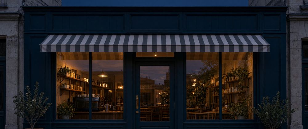

I wanted two images of the same coffee shop. One would help a visitor recognise the entrance, and the other would show what the shop feels like after sunset. I generated a daytime storefront, used that JPEG as the reference for a blue-hour edit, and compared both at the same display size. The entrance stayed recognisable in the evening image, though I had to look harder to make out the brass door hardware and the panels below the windows.
What Makes the Daylight Storefront Recognisable
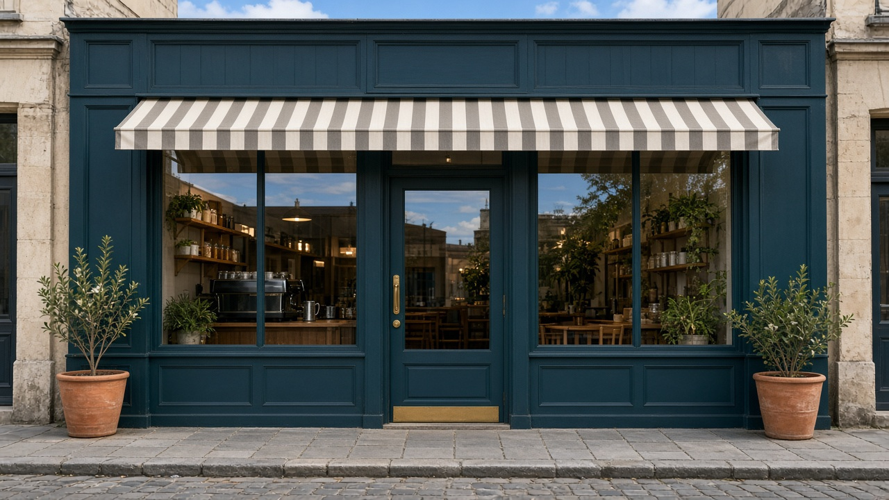
I used Grok Image 2.0 to generate a wide, straight-on storefront in Standard quality at 16:9. The result was a 1280 × 720 JPEG. I asked for a deep teal facade, a striped awning, brass door hardware and a planter on each side. The pale stone at the edges and the pavement across the bottom leave enough context to see how the shop sits on the street.
I chose the doorway, awning and two planters as the first landmarks to look for in the edit. They span the width and height of the composition, from the stripes above the windows to the pots near the pavement. If those landmarks move substantially, the two images can feel like different storefronts even if the exterior colours are similar.
The daytime windows already contain a few warm lights. What stands out more is the sky reflected in the upper glass. Beneath those reflections, the coffee machine is visible in the left window and the tables and shelves are visible on the right.
How Blue Hour Changes the Light
I uploaded the daytime JPEG as the reference in image-editing mode and kept Standard quality. The edit returned a 2816 × 1584 JPEG. I asked for blue-hour light, warm windows and faint reflections on the pavement while keeping the framing and architecture.
This was the submitted edit prompt:
Edit this same fictional cafe storefront from daytime to blue hour after sunset. Keep the camera position, framing, teal timber facade, three tall windows, door, awning, planters, and their placement. Add warm amber interior lighting visible through the glass, a cool navy sky, subdued exterior shadows, and faint reflections on the sidewalk. Keep the same composition and architecture. No added people, cars, legible text, or watermark.
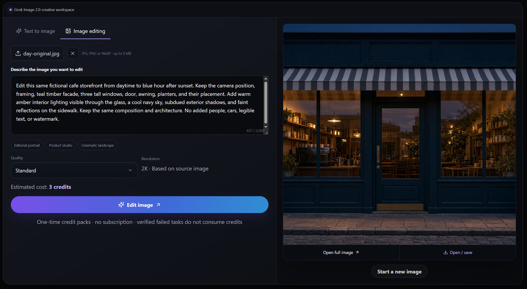
The sky above the awning is now deep blue. The exterior trim is darker, so the amber light in the windows has more contrast. In the left window, the hanging lamp and the cups above the coffee machine are easier to pick out. A narrow band of warm light is visible on the paving directly outside the shop.
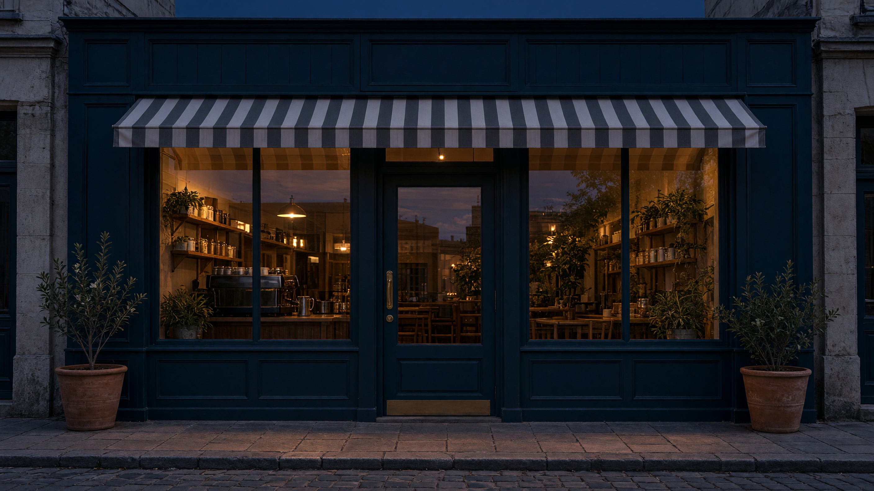
The reflections change too. In daylight, the upper glass shows patches of blue sky and cloud. In the edit, the reflections sit behind the warmer interior light, so the shelves and lamps are easier to pick out through the glass. The stone at the edges takes on a cooler tone, which makes the light spilling onto the paving easier to notice.
What Holds Up at the Same Display Size
I resized both originals to 640 × 360 for an internal side-by-side review and kept their full 16:9 frames. The original JPEGs are the two figures in this article. I kept the full frame because the outer corners contain two of the landmarks. Comparing them at equal display size helps isolate the visual effect of the edit because the evening file has more than twice the pixel width of the daylight reference.
The clearest points of comparison are the central door, the wide striped awning and the planters at the lower corners. They hold the composition together even though the JPEGs have different pixel dimensions. The larger forms in the interior also line up visually. The coffee machine remains in the left window, and seating remains visible on the right.
I looked at the dark parts separately. In the evening image, some leaves along the edges of the planters blend into the surrounding wall. The lower panels are visible, but the borders between them take more effort to see. The brass hardware on the door also has less contrast than it does in daylight. The edit therefore preserves the cues I need to recognise the shop while reducing the visibility of some details I might need to describe the entrance.
The main landmarks are still legible at this size. For a location page, I would check that the door reads as a distinct shape between the windows and that the planters remain visible at the edges. For an interior feature, I would check whether the counter and seating are clear enough to explain what the reader is looking at.
Which Version Works Better on the Page?
For a location page, I would use the daytime image. The bright stone, the paint colour and the door hardware give the reader visible details to look for when they approach the shop. For an evening feature about the space inside, I would use the blue-hour version. The illuminated windows give the coffee machine and seating more prominence while the door and awning keep the context clear.
For another pair, choose two or three landmarks before editing. Compare the results at the size they will appear on the page, then check one bright area and one shadowed area. If a detail the reader needs disappears at that size, use the other version or adjust the lighting around that detail before publishing.



Top comments (0)