forms-validation
how-to-set-input-limit-text-after-setting-max-length-of-textfield-in-flutter
flutter-text-field-form-validation
textfield-validation-in-flutter
do-textfield-validation
Regex Pattern
users-can-put-numbers-only-from-1-10-in-textformfield
Question
How to set input limit text after setting max length of TextField in Flutter?
how-to-set-input-limit-text-after-setting-max-length-of-textfield-in-flutter
text form validation using getter variable to control the _errorText
getter variable to control the _errorText
Textfield validation in Flutter using function in errot_text
Textfield validation in Flutter using function
Regex Pattern to Check Email Address for phone and Email address
https://www.fluttercampus.com/guide/91/how-to-validate-form-textfield-values-flutter/
How users-can-put-numbers-only-from-1-10-in-textformfield
users-can-put-numbers-only-from-1-10-in-textformfield
forms-validation
forms-validation
Apps often require users to enter information into a text field. For example, you might require users to log in with an email address and password combination.
To make apps secure and easy to use, check whether the information the user has provided is valid. If the user has correctly filled out the form, process the information. If the user submits incorrect information, display a friendly error message letting them know what went wrong.
In this example, learn how to add validation to a form that has a single text field using the following steps:
- Create a Form with a GlobalKey.
- Add a TextFormField with validation logic.
- Create a button to validate and submit the form.
Create a Form with a GlobalKey
First, create a Form. The Form widget acts as a container for grouping and validating multiple form fields.
When creating the form, provide a GlobalKey. This uniquely identifies the Form, and allows validation of the form in a later step.
import 'package:flutter/material.dart';

// Define a custom Form widget.
class MyCustomForm extends StatefulWidget {
  const MyCustomForm({super.key});

  @override
  MyCustomFormState createState() {
    return MyCustomFormState();
  }
}

// Define a corresponding State class.
// This class holds data related to the form.
class MyCustomFormState extends State<MyCustomForm> {
  // Create a global key that uniquely identifies the Form widget
  // and allows validation of the form.
  //
  // Note: This is a `GlobalKey<FormState>`,
  // not a GlobalKey<MyCustomFormState>.
  final _formKey = GlobalKey<FormState>();

  @override
  Widget build(BuildContext context) {
    // Build a Form widget using the _formKey created above.
    return Form(
      key: _formKey,
      child: Column(
        children: <Widget>[
          // Add TextFormFields and ElevatedButton here.
        ],
      ),
    );
  }
}
Tip: Using a GlobalKey is the recommended way to access a form. However, if you have a more complex widget tree, you can use the Form.of() method to access the form within nested widgets.
Add a TextFormField with validation logic
Although the Form is in place, it doesn’t have a way for users to enter text. That’s the job of a TextFormField. The TextFormField widget renders a material design text field and can display validation errors when they occur.
Validate the input by providing a validator() function to the TextFormField. If the user’s input isn’t valid, the validator function returns a String containing an error message. If there are no errors, the validator must return null.
For this example, create a validator that ensures the TextFormField isn’t empty. If it is empty, return a friendly error message.
TextFormField(
  // The validator receives the text that the user has entered.
  validator: (value) {
    if (value == null || value.isEmpty) {
      return 'Please enter some text';
    }
    return null;
  },
),
Create a button to validate and submit the form
Now that you have a form with a text field, provide a button that the user can tap to submit the information.
When the user attempts to submit the form, check if the form is valid. If it is, display a success message. If it isn’t (the text field has no content) display the error message.
ElevatedButton(
  onPressed: () {
    // Validate returns true if the form is valid, or false otherwise.
    if (_formKey.currentState!.validate()) {
      // If the form is valid, display a snackbar. In the real world,
      // you'd often call a server or save the information in a database.
      ScaffoldMessenger.of(context).showSnackBar(
        const SnackBar(content: Text('Processing Data')),
      );
    }
  },
  child: const Text('Submit'),
),
How does this work?
To validate the form, use the _formKey created in step 1. You can use the _formKey.currentState() method to access the FormState, which is automatically created by Flutter when building a Form.
The FormState class contains the validate() method. When the validate() method is called, it runs the validator() function for each text field in the form. If everything looks good, the validate() method returns true. If any text field contains errors, the validate() method rebuilds the form to display any error messages and returns false.
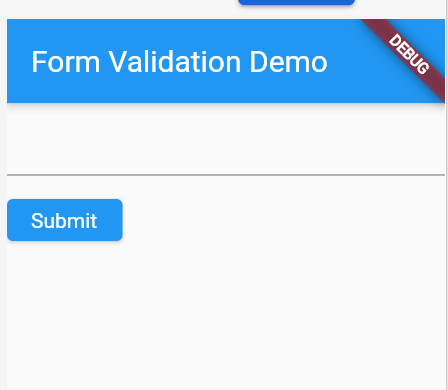
import 'package:flutter/material.dart';

void main() => runApp(const MyApp());

class MyApp extends StatelessWidget {
  const MyApp({super.key});

  @override
  Widget build(BuildContext context) {
    const appTitle = 'Form Validation Demo';

    return MaterialApp(
      title: appTitle,
      home: Scaffold(
        appBar: AppBar(
          title: const Text(appTitle),
        ),
        body: const MyCustomForm(),
      ),
    );
  }
}

// Create a Form widget.
class MyCustomForm extends StatefulWidget {
  const MyCustomForm({super.key});

  @override
  MyCustomFormState createState() {
    return MyCustomFormState();
  }
}

// Create a corresponding State class.
// This class holds data related to the form.
class MyCustomFormState extends State<MyCustomForm> {
  // Create a global key that uniquely identifies the Form widget
  // and allows validation of the form.
  //
  // Note: This is a GlobalKey<FormState>,
  // not a GlobalKey<MyCustomFormState>.
  final _formKey = GlobalKey<FormState>();

  @override
  Widget build(BuildContext context) {
    // Build a Form widget using the _formKey created above.
    return Form(
      key: _formKey,
      child: Column(
        crossAxisAlignment: CrossAxisAlignment.start,
        children: [
          TextFormField(
            // The validator receives the text that the user has entered.
            validator: (value) {
              if (value == null || value.isEmpty) {
                return 'Please enter some text';
              }
              return null;
            },
          ),
          Padding(
            padding: const EdgeInsets.symmetric(vertical: 16.0),
            child: ElevatedButton(
              onPressed: () {
                // Validate returns true if the form is valid, or false otherwise.
                if (_formKey.currentState!.validate()) {
                  // If the form is valid, display a snackbar. In the real world,
                  // you'd often call a server or save the information in a database.
                  ScaffoldMessenger.of(context).showSnackBar(
                    const SnackBar(content: Text('Processing Data')),
                  );
                }
              },
              child: const Text('Submit'),
            ),
          ),
        ],
      ),
    );
  }
}
How to set input limit text after setting max length of TextField in Flutter?
how-to-set-input-limit-text-after-setting-max-length-of-textfield-in-flutter
I'm using Flutter for building iOS app. With TextField, I set max length of TextField is 4. Then, I input 8 words, but It (TextFiled) show 4 words and hide 4 words.
This is my code:
TextField(
          controller: _controller,
          onChanged: (text) {
            print("text change: $text");
          },
          onSubmitted: (text) {
            print("text submit: $text");
          },
          decoration: InputDecoration(
            hintText: 'Input Money',
            counterText: '',
          ),
          maxLength: 4,
        )
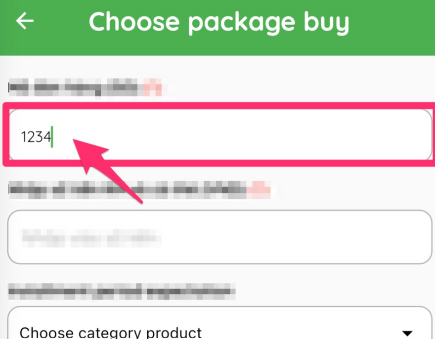
When user delete words on TextField, They must delete 8 words.
How to fix this problem?
*Solution *
use TextFormField instead, you can use a validator to warn user about input limit.
At first declare a key
final GlobalKey<FormFieldState> _textFieldOneKey = GlobalKey<FormFieldState>();
then validate it.It will give a warning to the user,whenever they trying to input more than 4 words!
TextFormField(
  controller: _controller,
    key: _textFieldOneKey,
    onChanged: (value) {
      _textFieldOneKey.currentState.validate();
      print("text submit: $value");
    },
    validator: (value) {
      if(value.length>4) {
        return "Max 4 word is allowed";
      }
      return null;
    },
    // maxLength: 4,
  ),
You can check the illustration here
use TextFormField instead, you can use a validator to warn user about input limit.
At first declare a key
final GlobalKey _textFieldOneKey = GlobalKey();
then validate it.It will give a warning to the user,whenever they trying to input more than 4 words!
TextFormField(
controller: _controller,
key: _textFieldOneKey,
onChanged: (value) {
_textFieldOneKey.currentState.validate();
print("text submit: $value");
},
validator: (value) {
if(value.length>4) {
return "Max 4 word is allowed";
}
return null;
},
// maxLength: 4,
),
You can check the illustration here
And you can check if the field is valid or not in any button or function like this one
  floatingActionButton: FloatingActionButton(
    onPressed: (){
      if(_textFieldOneKey.currentState.isValid) {
        print("valid");
      } else {
        print("not valid");
      }
    },
    tooltip: 'Increment',
    child: Icon(Icons.add),
  ),
Another Method
0
I fixed this bug with bellow code:
               TextField(
                          controller: _controller,
                          maxLength: 4,
                          onChanged: (text) {
                            text = text.substring(0, 4);
                            _controller.value = TextEditingValue(
                              text: text,
                              selection: TextSelection.collapsed(
                                offset: text.length,
                              ),
                            );
                          },
                        ),
You must set selection for text.
text form validation using getter variable to control the _errorText
getter variable to control the _errorText
In this example, we show a custom error hint and disable the submit button if the text is empty or too short.
If you wanted to implement this functionality in Flutter, how would you do it?
People on StackOverflow seem to have many opinions about it, and indeed there are two main ways of doing this:
- Use a TextField with a TextEditingController and a ValueListenableBuilder to update the UI.
- Use a Form and a TextFormField along with a GlobalKey to validate and save the text field data. In this article, we'll explore both solutions so you can learn how to work with text input in Flutter.
Flutter TextField Validation with TextEditingController
Basic UI with TextField and ElevatedButton
Step one is to create a StatefulWidget subclass that will contain both our TextField and the submit button:
class TextSubmitWidget extends StatefulWidget {
  const TextSubmitWidget({Key? key, required this.onSubmit}) : super(key: key);
  final ValueChanged<String> onSubmit;

  @override
  State<TextSubmitWidget> createState() => _TextSubmitWidgetState();
}
Note how we added an onSubmit callback. We will use this to inform the parent widget when the user presses the "Submit" button upon entering a valid text.
Next, let's create the State subclass:
class _TextSubmitWidgetState extends State<TextSubmitWidget> {
  @override
  Widget build(BuildContext context) {
    return Column(
      mainAxisSize: MainAxisSize.min,
      crossAxisAlignment: CrossAxisAlignment.stretch,
      children: [
        TextField(
          decoration: InputDecoration(
            labelText: 'Enter your name',
            // TODO: add errorHint
          ),
        ),
        ElevatedButton(
          // TODO: implement callback
          onPressed: () {},
          child: Text(
            'Submit',
            style: Theme.of(context).textTheme.headline6,
          ),
        )
      ],
    );
  }
}
This is a simple Column layout that contains a TextField and an ElevatedButton.
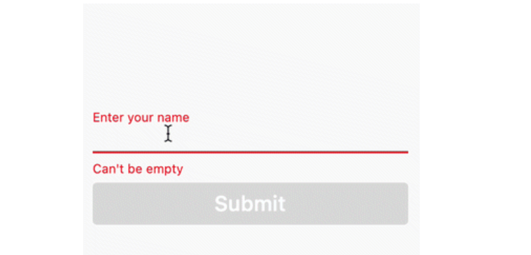
If we run this code inside a single-page Flutter app, both the text field and the submit button will show:
Next, we want to add all the validation logic and update the UI according to these rules:
if the text is empty, disable the submit button and show Can't be empty as an error hint
if the text is not empty but too short, enable the submit button and show Too short as an error hint
if the text is long enough, enable the submit button and remove the error hint
Let's figure out how to implement this.
Adding a TextEditingController
Flutter gives us a TextEditingController class that we can use to control our text field.
So let's use it. All we have to do is to create it inside the State subclass:
class _TextSubmitWidgetState extends State {
// create a TextEditingController
final _controller = TextEditingController();
// dispose it when the widget is unmounted
@override
void dispose() {
_controller.dispose();
super.dispose();
}
...
}
And then we can pass it to our TextField:
TextField(
  // use this to control the text field
  controller: _controller,
  decoration: InputDecoration(
    labelText: 'Enter your name',
  ),
),
We can also add a getter variable to control the _errorText that we pass to the TextField:
String? get _errorText {
  // at any time, we can get the text from _controller.value.text
  final text = _controller.value.text;
  // Note: you can do your own custom validation here
  // Move this logic this outside the widget for more testable code
  if (text.isEmpty) {
    return 'Can\'t be empty';
  }
  if (text.length < 4) {
    return 'Too short';
  }
  // return null if the text is valid
  return null;
}
// then, in the build method:
TextField(
  controller: _controller,
  decoration: InputDecoration(
    labelText: 'Enter your name',
    // use the getter variable defined above
    errorText: _errorText,
  ),
),
With this in place, we can add some custom logic to the onPressed callback inside our button:
ElevatedButton(
  // only enable the button if the text is not empty
  onPressed: _controller.value.text.isNotEmpty
      ? _submit
      : null,
  child: Text(
    'Submit',
    style: Theme.of(context).textTheme.headline6,
  ),
)
Note how we call a _submit method if the text is not empty. This is defined as follows:
void _submit() {
  // if there is no error text
  if (_errorText == null) {
    // notify the parent widget via the onSubmit callback
    widget.onSubmit(_controller.value.text);
  }
}
But if we run this code, the TextField always shows the error text and the submit button remains disabled even if we enter a valid text:
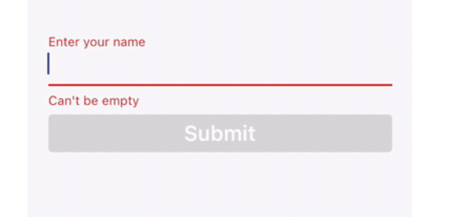
Widget rebuilds and setState()
The problem is that we are not telling Flutter to rebuild our widget when the text changes.
We could fix this by adding a local state variable and updating it with a call to setState() inside the onChanged callback of our TextField:
// In the state class
var _text = '';

// inside the build method:
TextField(
  controller: _controller,
  decoration: InputDecoration(
    labelText: 'Enter your name',
    errorText: errorText,
  ),
  // this will cause the widget to rebuild whenever the text changes
  onChanged: (text) => setState(() => _text),
),
With this change our UI updates on the fly and behaves as expected:
Flutter TextField validation now working correctly
Flutter TextField validation now working correctly
But a local state variable is not necessary because our TextEditingController already holds the text value as it changes.
As a proof of this, we could make an empty call to setState() and everything would still work:
onChanged: (_) => setState(() {}),
But forcing a widget rebuild like this seems a bit of an anti-pattern. There must be a better way.
How to use TextEditingController with ValueListenableBuilder
As it turns out, we can wrap our widget tree with a ValueListenableBuilder that takes our TextEditingController as an argument:
@override
Widget build(BuildContext context) {
  return ValueListenableBuilder(
    // Note: pass _controller to the animation argument
    valueListenable: _controller,
    builder: (context, TextEditingValue value, __) {
      // this entire widget tree will rebuild every time
      // the controller value changes
      return Column(
        mainAxisSize: MainAxisSize.min,
        crossAxisAlignment: CrossAxisAlignment.stretch,
        children: [
          TextField(
            controller: _controller,
            decoration: InputDecoration(
              labelText: 'Enter your name',
              errorText: _errorText,
            ),
          ),
          ElevatedButton(
            onPressed: _controller.value.text.isNotEmpty
                ? _submit
                : null,
            child: Text(
              'Submit',
              style: Theme.of(context).textTheme.headline6,
            ),
          )
        ],
      );
    },
  );
}
As a result, both the TextField and ElevatedButton will rebuild when the text changes:
Flutter TextField validation still working correctly
Flutter TextField validation still working correctly
But why are we allowed to pass our TextEditingController to the ValueListenableBuilder?
ValueListenableBuilder(
  // this is valid because TextEditingController implements Listenable
  valueListenable: _controller,
  builder: (context, TextEditingValue value, __) { ... }
)
Well, ValueListenableBuilder takes an argument of type ValueListenable.
And TextEditingController extends ValueNotifier, which implements ValueListenable. This is how these classes are defined in the Flutter SDK:

Top comments (0)