Definition
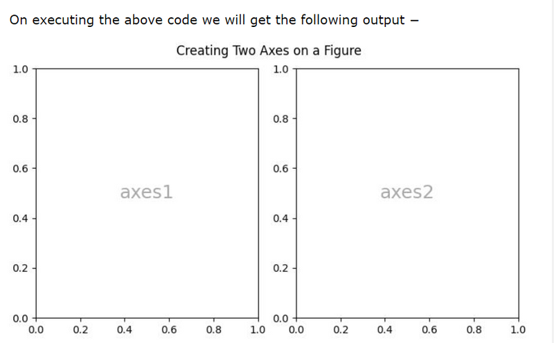
creating a figure object (fig) along with multiple subplots
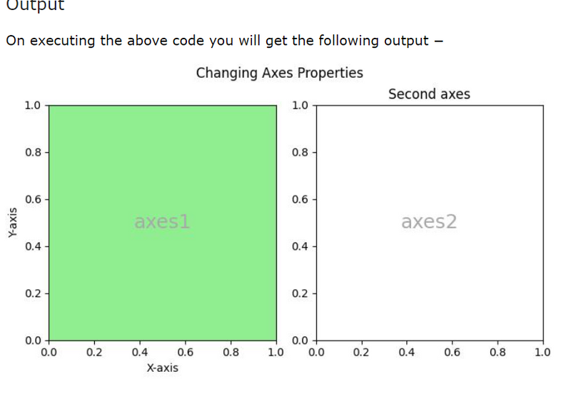
Changing an Axes properties like xlabel,ylabel,facecolor
Definition
it represents the entire plotting area on a figure or canvas. Which includes the x-axis, y-axis, plotting data, ticks, ticks labels, and more.
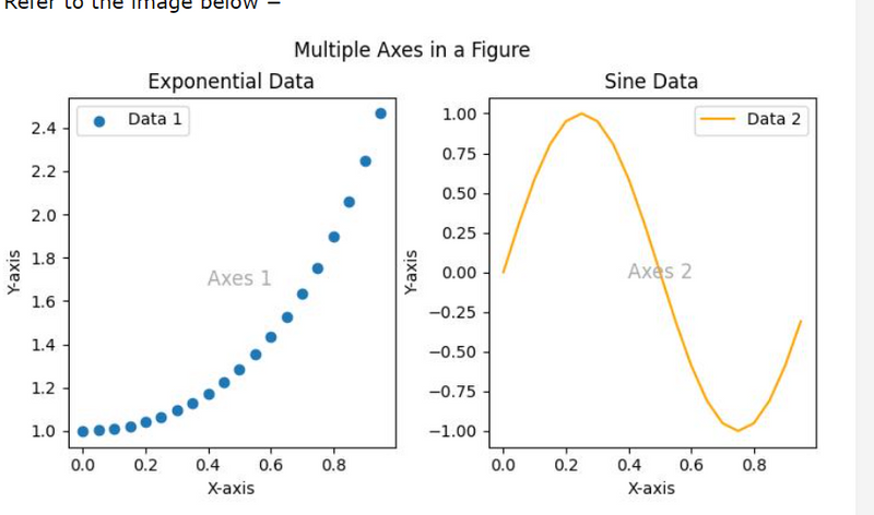
Consider the figure where two Axes objects are created using the ax = fig.subplots() method. The first axes display exponential data, while the second axes show a sine wave. Each Axes (subplot) has its own set of labels, ticks, and legends, providing a distinct representation within the same figure.
creating a figure object (fig) along with multiple subplots
import matplotlib.pyplot as plt
import numpy as np

# Creating a 1x2 subplot layout
fig, (axes1, axes2)  = plt.subplots(1, 2, figsize=(7, 4),
   layout="constrained")

# Adding labels to each subplot
axes1.annotate('axes1', (0.5, 0.5),transform=axes1.transAxes,
   ha='center', va='center', fontsize=18,
   color='darkgrey')

axes2.annotate('axes2', (0.5, 0.5),transform=axes2.transAxes,
   ha='center', va='center', fontsize=18,
   color='darkgrey')

fig.suptitle('Creating Two Axes on a Figure')

# Displaying the plot
plt.show()
output
Another way
import matplotlib.pyplot as plt

# Create the figure
fig = plt.figure(figsize=(7, 4))

# Add the first subplot
axes1 = fig.add_subplot(1, 2, 1)  # 1 row, 2 columns, first subplot
# Add the second subplot
axes2 = fig.add_subplot(1, 2, 2)  # 1 row, 2 columns, second subplot

# Adding labels to each subplot
axes1.annotate('axes1', (0.5, 0.5), transform=axes1.transAxes,
               ha='center', va='center', fontsize=18,
               color='darkgrey')

axes2.annotate('axes2', (0.5, 0.5), transform=axes2.transAxes,
               ha='center', va='center', fontsize=18,
               color='darkgrey')

# Add a title to the figure
fig.suptitle('Creating Two Axes on a Figure')

# Displaying the plot
plt.show()
output
Another Example
import matplotlib.pyplot as plt
import numpy as np

# Creating a 1x2 subplot layout
fig, (axes1, axes2) = plt.subplots(1, 2, figsize=(7, 4),
   constrained_layout=True)

# Changing the properties of the first axes
axes1.set_xlabel("X-axis")        # Set label for X-axis
axes1.set_ylabel("Y-axis")        # Set label for Y-axis
axes1.set_facecolor('lightgreen') # Setting background color
axes1.annotate('axes1', (0.5, 0.5), transform=axes1.transAxes,
   ha='center', va='center', fontsize=18,
   color='darkgrey')
axes2.set_title('Second axes')
axes2.annotate('axes2', (0.5, 0.5), transform=axes2.transAxes,
   ha='center', va='center', fontsize=18,
   color='darkgrey')

# Adding a title to the figure
fig.suptitle('Changing Axes Properties')

# Displaying the plot
plt.show()
Axes is the most basic and flexible unit for creating sub-plots. Axes allow placement of plots at any location in the figure. A given figure can contain many axes, but a given axes object can only be in one figure. The axes contain two axis objects 2D as well as, three-axis objects in the case of 3D. Let’s look at some basic functions of this class.
axes() function
axes() function creates axes object with argument, where argument is a list of 4 elements [left, bottom, width, height]. Let us now take a brief look to understand the axes() function.
*Syntax *:
axes([left, bottom, width, height])
Example:
import matplotlib.pyplot as plt


fig = plt.figure()

#[left, bottom, width, height]
ax = plt.axes([0.1, 0.1, 0.8, 0.8])
Output:
Here in axes([0.1, 0.1, 0.8, 0.8]), the first ‘0.1’ refers to the distance between the left side axis and border of the figure window is 10%, of the total width of the figure window. The second ‘0.1’ refers to the distance between the bottom side axis and the border of the figure window is 10%, of the total height of the figure window. The first ‘0.8’ means the axes width from left to right is 80% and the latter ‘0.8’ means the axes height from the bottom to the top is 80%.
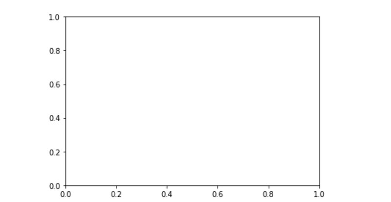
add_axes() function
Alternatively, you can also add the axes object to the figure by calling the add_axes() method. It returns the axes object and adds axes at position [left, bottom, width, height] where all quantities are in fractions of figure width and height.
Syntax :
add_axes([left, bottom, width, height])
Example :
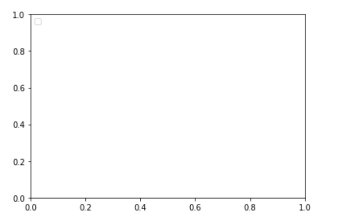
import matplotlib.pyplot as plt


fig = plt.figure()

#[left, bottom, width, height]
ax = fig.add_axes([0, 0, 1, 1])
Output:
ax.legend() function
Adding legend to the plot figure can be done by calling the legend() function of the axes class. It consists of three arguments.
Syntax :
ax.legend(handles, labels, loc)
Where labels refers to a sequence of string and handles, a sequence of Line2D or Patch instances, loc can be a string or an integer specifying the location of legend.
Example :
import matplotlib.pyplot as plt


fig = plt.figure()

#[left, bottom, width, height]
ax = plt.axes([0.1, 0.1, 0.8, 0.8])

ax.legend(labels = ('label1', 'label2'),
          loc = 'upper left')
Output:
ax.plot() function
plot() function of the axes class plots the values of one array versus another as line or marker.
Syntax : plt.plot(X, Y, ‘CLM’)
Parameters:
X is x-axis.
Y is y-axis.
‘CLM’ stands for Color, Line and Marker.
Note: Line can be of different styles such as dotted line (':'), dashed line ('—'), solid line ('-') and many more
Marker codes
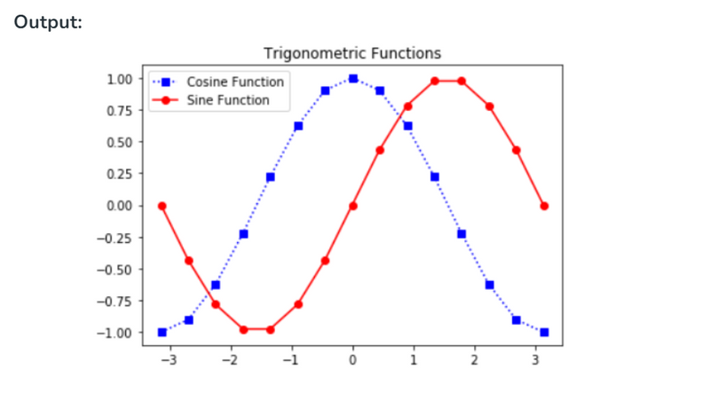
The following example shows the graph of sine and cosine functions.
import matplotlib.pyplot as plt
import numpy as np


X = np.linspace(-np.pi, np.pi, 15)
C = np.cos(X)
S = np.sin(X)

# [left, bottom, width, height]
ax = plt.axes([0.1, 0.1, 0.8, 0.8])

# 'bs:' mentions blue color, square
# marker with dotted line.
ax1 = ax.plot(X, C, 'bs:')

#'ro-' mentions red color, circle
# marker with solid line.
ax2 = ax.plot(X, S, 'ro-')

ax.legend(labels = ('Cosine Function',
                    'Sine Function'),
          loc = 'upper left')

ax.set_title("Trigonometric Functions")

plt.show()

Top comments (0)