Explanation of Visualizations and Their Use Cases
-
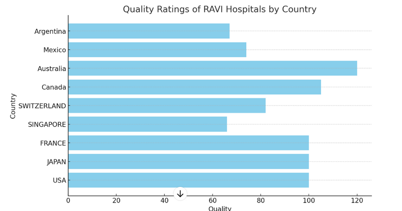
Bar Charts: Visualize the quality ratings for different countries.
Usage:
When: Bar charts are used when you want to compare the quality ratings of different countries.
Where: They are ideal for presenting categorical data where each category (country) has a distinct value (quality rating).
Example: Comparing the quality of hospitals in different countries.
Advantages:
Easy to understand and interpret.
Clearly shows the differences between categories.
-
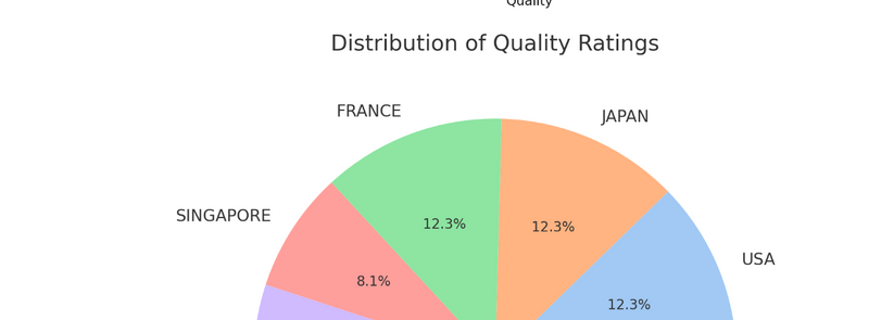
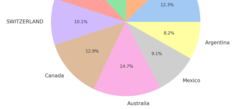
Pie Charts: Show the distribution of quality ratings.
Usage:
When: Pie charts are used to show the proportion of each category relative to the whole.
Where: They are suitable for illustrating how quality ratings are distributed across different countries.
Example
: Visualizing how the total quality ratings are divided among different countries.
Advantages:
Provides a quick sense of proportions.
Visually appealing and easy to interpret.
- Line Charts: Display trends in quality ratings over time if historical data is available. Usage:
When: Line charts are used when you want to show trends or changes in quality ratings over a period of time.
Where: They are ideal for time-series data to show how the quality of hospitals has changed over years or months.
Example: Tracking the quality ratings of hospitals over the last decade.
Advantages:
Clearly shows trends and patterns over time.
Useful for identifying increases, decreases, or fluctuations in data.
- Tables: Present detailed numerical data in a structured format. Usage:
When: Tables are used to present detailed and precise numerical data.
Where: They are suitable for detailed reports where exact values are important.
Example: Providing a comprehensive list of quality ratings along with other attributes like number of hospitals, etc.
Advantages:
Presents data in a structured and detailed manner.
Easy to look up specific values.
-
Heatmaps: Highlight areas of high and low quality visually on a map.
Usage:
When: Heatmaps are used to show the intensity of data values across a two-dimensional space.
Where: They are ideal for highlighting areas with high or low quality ratings.
Example: Visualizing the concentration of high-quality hospitals in certain regions.
Advantages:
Quickly highlights areas of interest.
Effective for identifying patterns and anomalies.
- Box Plots: Show the distribution of quality ratings across different countries, including median, quartiles, and outliers. Usage:
When: Box plots are used to display the distribution of data and identify outliers.
Where: They are suitable for comparing distributions across multiple categories.
Example: Comparing the spread and central tendency of quality ratings across different countries.
Advantages:
Shows summary statistics (median, quartiles) in a compact form.
Highlights outliers effectively.
-
Histograms: Illustrate the frequency distribution of quality ratings.
Usage:
When: Histograms are used to show the distribution of a single numerical variable.
Where: They are ideal for understanding the frequency distribution of quality ratings.
Example: Showing how many countries fall into different quality rating ranges.
Advantages:
Easy to understand the distribution and frequency of data.
Useful for identifying the shape of the data distribution.
- Scatter Plots: Analyze the relationship between quality ratings and other variables (e.g., number of hospitals, population). Usage:
When: Scatter plots are used to explore relationships between two numerical variables.
Where: They are suitable for identifying correlations or patterns between quality ratings and another variable.
Example: Analyzing the relationship between quality ratings and the number of hospitals in each country.
Advantages:
Helps identify correlations and patterns.
Useful for detecting trends, clusters, and outliers.
Explanation and Use of Line Charts
Line Charts: Usage and Application
When to Use Line Charts:
Line charts are employed in scenarios where tracking changes and trends over time is crucial. This makes them an indispensable tool in various fields for visualizing data that changes continuously, enabling easy recognition of patterns, trends, and fluctuations.
Where Line Charts Are Used:
Business and Economics: Line charts are extensively used in business to analyze trends over time, such as sales, revenue, stock prices, or economic indicators. They help in making predictions based on historical data.
Science and Engineering: In scientific or engineering contexts, line charts can depict changes in temperature, pressure, or other measurable variables over time.
Healthcare: In healthcare, line charts are useful for tracking changes in patient metrics such as blood pressure, cholesterol levels, or weight over time, aiding in the assessment of treatment effectiveness.
Finance: In finance, line charts are crucial for tracking the movement of stock prices, exchange rates, or interest rates over time, assisting investors in making informed decisions.
Sports and Fitness: Line charts can be used to monitor athletic performance metrics, like running speed or heart rate over a training session or series of events.
Advantages of Line Charts:
Clarity in Trends Observation: They provide a clear view of trends and patterns over time, making them ideal for any data that requires temporal analysis.
Comparison Facility: Line charts can compare multiple trends simultaneously, allowing for side-by-side analysis of different data sets.
Simplicity and Accessibility: They are straightforward to create and interpret, making them accessible to a wide audience.
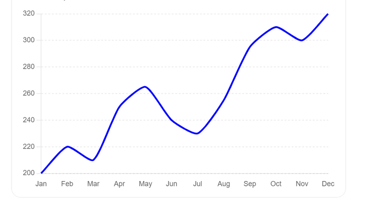
Example: Line Chart of Monthly Sales Data
Let's create a line chart visualizing the monthly sales data for a company. This will help illustrate how sales have trended over a year.
import pandas as pd
import matplotlib.pyplot as plt

# Sample data: Monthly sales data for one year
data = {
    'Month': ['Jan', 'Feb', 'Mar', 'Apr', 'May', 'Jun', 'Jul', 'Aug', 'Sep', 'Oct', 'Nov', 'Dec'],
    'Sales': [200, 220, 210, 250, 265, 240, 230, 255, 295, 310, 300, 320]
}
df = pd.DataFrame(data)

# Creating the line chart
plt.figure(figsize=(10, 6))
plt.plot(df['Month'], df['Sales'], marker='o', linestyle='-', color='b')
plt.title('Monthly Sales Data')
plt.xlabel('Month')
plt.ylabel('Sales ($)')
plt.grid(True)
plt.savefig('/mnt/data/line_chart_sales.png')
plt.show()
This script will generate a line chart that looks like this:
Explanation of the Line Chart:
The x-axis represents the months of the year, from January to December.
The y-axis shows the sales figures.
The line connects each data point, clearly showing the trend in sales over the year.
The use of markers at each data point makes it easier to see the exact sales values for each month.
Why Use This Line Chart:
Trend Analysis: The line chart clearly displays the upward trend in sales, particularly noticeable in the latter half of the year.
Decision Making: Based on this trend, a company might decide to increase production or invest more in marketing during months with historically higher sales.
Conclusion
Line charts are incredibly useful for visualizing how something changes over time, making them applicable across various fields for temporal data analysis. They help in understanding trends, making predictions, and deriving insights, which are critical for effective decision-making and strategic planning.

Top comments (0)