Seaborn is built on top of Matplotlib and provides a higher-level interface for creating visually appealing and informative plots. Here are some advantages of using Seaborn over Matplotlib:
Improved Aesthetics: Seaborn provides aesthetically pleasing default styles and color palettes, making it easier to create visually appealing plots without much customization.
Simplified Plotting Functions: Seaborn offers simplified plotting functions that require fewer lines of code compared to Matplotlib. It automates many common plot settings and annotations, reducing the need for manual configuration.
Statistical Data Visualization: Seaborn specializes in statistical data visualization and offers specific plot types to explore relationships and distributions in your data. It provides convenient functions for visualizing categorical data, linear relationships, distributions, and more.
Integration with Pandas: Seaborn seamlessly integrates with the Pandas library, allowing you to directly pass DataFrame objects as data sources. It simplifies the process of plotting data stored in DataFrames and enables quick exploration and analysis.
Automatic Plot Customization: Seaborn automatically applies sensible default settings and provides convenient options for customizing plots. It handles things like axis labels, legends, gridlines, and plot aesthetics, saving you time and effort.
Advanced Plot Types: Seaborn offers advanced plot types not readily available in Matplotlib, such as violin plots, swarm plots, and categorical scatter plots. These specialized plot types help in visualizing complex relationships and distributions.
Facet Grids: Seaborn's facet grids allow for easy creation of multi-plot grids based on subsets of your data. This facilitates the comparison of different subsets or categories within your dataset, providing a more comprehensive view of the data.
Statistical Estimation: Seaborn incorporates statistical estimation techniques, such as kernel density estimation and bootstrapping, to enhance the visualization of data. These techniques help in gaining insights into underlying distributions and relationships.
Example:
import seaborn as sns
import matplotlib.pyplot as plt
# Generate a random dataset
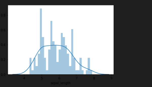
data = sns.load_dataset('iris')
# Create a histogram using Seaborn
sns.histplot(data=data, x='sepal_length', kde=True)
plt.show()
In this example, Seaborn's histplot function is used to create a histogram with a kernel density estimation (KDE) overlay. This provides a more informative visualization of the distribution compared to a basic histogram. The plot is generated with just a single line of code, thanks to Seaborn's simplified plotting functions and built-in statistical estimation capabilities.
Different Visualization technique
Scatter Plot: A scatter plot shows the relationship between two variables by displaying individual data points as dots on a graph.
import seaborn as sns
import matplotlib.pyplot as plt

# Create a scatter plot
sns.scatterplot(x='sepal_length', y='sepal_width', data=iris_df)
plt.show()
import seaborn as sns
import matplotlib.pyplot as plt
%matplotlib inline
df = sns.load_dataset('iris')
df.head()
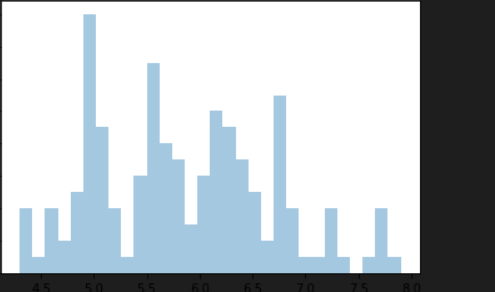
sns.distplot(df['sepal_length'],bins=30)
OUTPUT
sns.distplot(df['sepal_length'],bins=30,kde=False)
OUTPUT
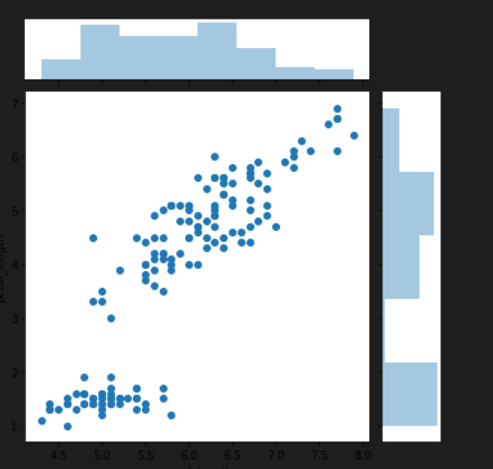
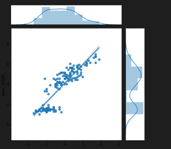
sns.jointplot(x='sepal_length',y='petal_length',data=df,kind='scatter')
sns.jointplot(x='sepal_length',y='petal_length',data=df,kind='reg')
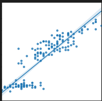
sns.lmplot(x='sepal_length',y='petal_length',data=df)
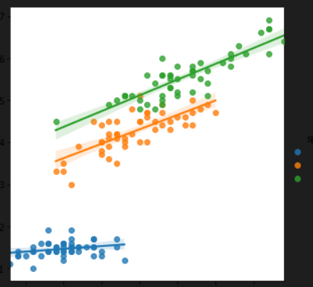
sns.lmplot(x='sepal_length',y='petal_length',data=df,hue='species')
Line Plot: A line plot represents data points connected by straight lines, useful for visualizing trends over time or continuous variables.
# Create a line plot
sns.lineplot(x='year', y='value', data=data_df)
plt.show()
Bar Plot: A bar plot displays categorical data with rectangular bars, representing the frequency or value of each category.
# Create a bar plot
sns.barplot(x='category', y='count', data=data_df)
plt.show()
Histogram: A histogram shows the distribution of a continuous variable by dividing it into bins and counting the number of observations in each bin.
# Create a histogram
sns.histplot(data=data_df, x='age', bins=10)
plt.show()
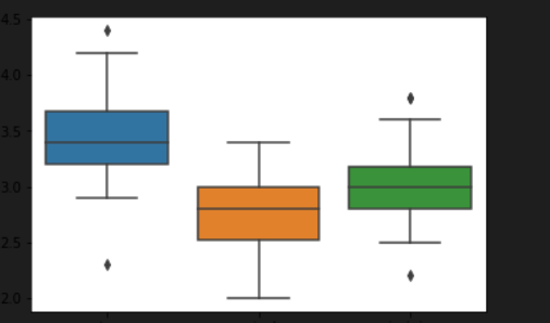
Box Plot: A box plot displays the distribution of a continuous variable, showing the median, quartiles, and any outliers.
# Create a box plot
sns.boxplot(x='species', y='sepal_length', data=iris_df)
plt.show()
import seaborn as sns
%matplotlib inline
df = sns.load_dataset('iris')
df.head()
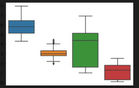
sns.boxplot(data=df)
sns.boxplot('sepal_width',data=df)
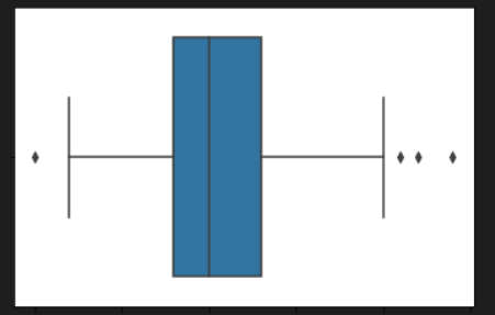
sns.boxplot('species','sepal_width',data=df)
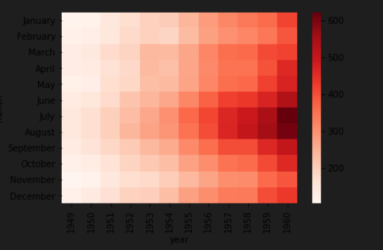
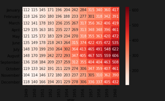
Heatmap: A heatmap represents data as a color-encoded matrix, useful for visualizing correlations or matrices.
# Create a heatmap
sns.heatmap(data=correlation_matrix, annot=True, cmap='coolwarm')
plt.show()
import seaborn as sns
%matplotlib inline
df = sns.load_dataset('flights')
df.head()
df_mat = df.pivot_table(values='passengers',index='month', columns='year')
df_mat
sns.heatmap(df_mat,cmap='Reds')
sns.heatmap(df_mat,cmap='Reds',annot=True)
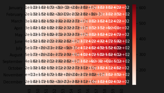
sns.heatmap(df_mat,cmap='Reds',annot=True,fmt='d') #'d' is integer
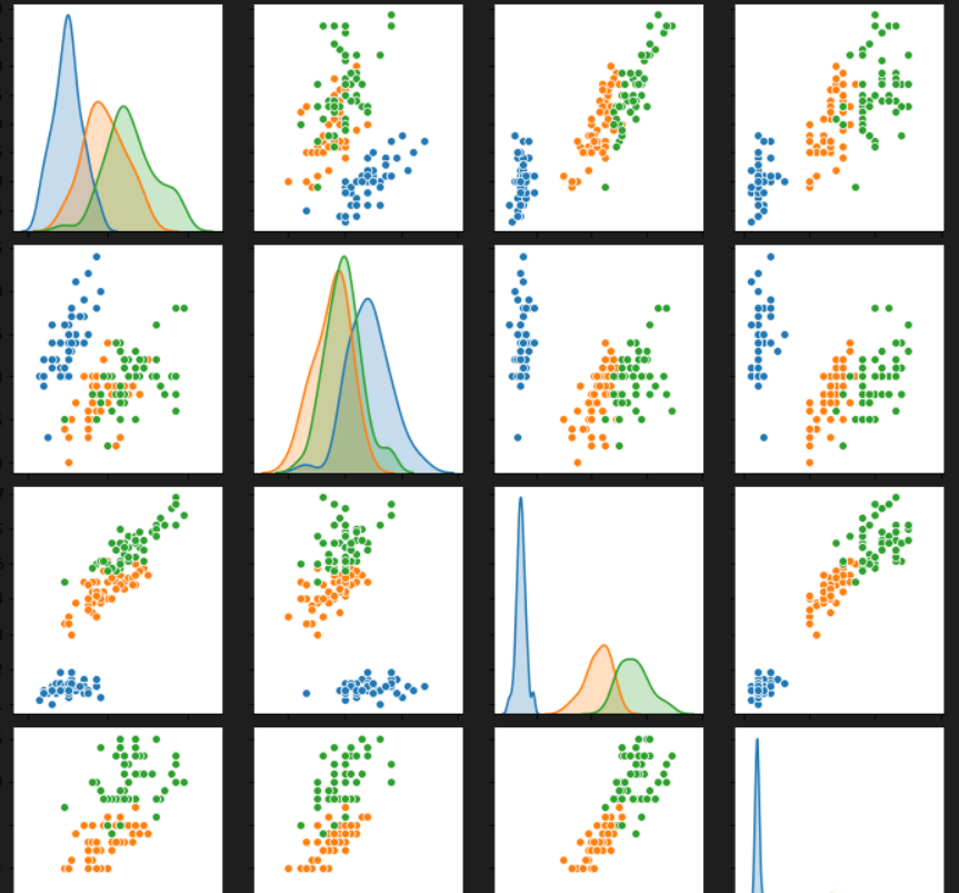
Pair Plot: A pair plot displays pairwise relationships between multiple variables, combining scatter plots and histograms.
# Create a pair plot
sns.pairplot(data=iris_df, hue='species')
plt.show()
sns.pairplot(df)
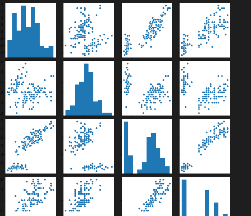
sns.pairplot(df, hue='species')
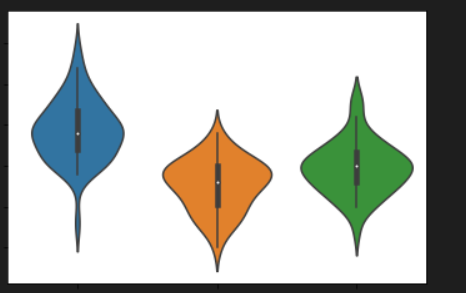
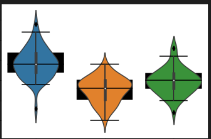
Violin Plot: A violin plot combines a box plot with a kernel density estimation, providing insights into the distribution of a continuous variable across different categories.
Create a violin plot
sns.violinplot(x='species', y='sepal_length', data=iris_df)
plt.show()
sns.violinplot('species','sepal_width',data=df) #shows KDE
sns.boxplot('species','sepal_width',data=df,color='black')
sns.violinplot('species','sepal_width',data=df)

Top comments (0)