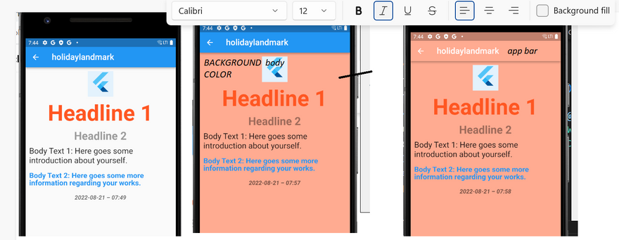
1.How to use Themes in Flutter: - Click here
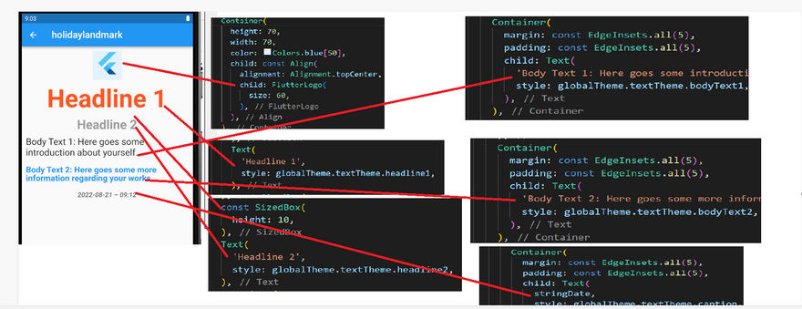
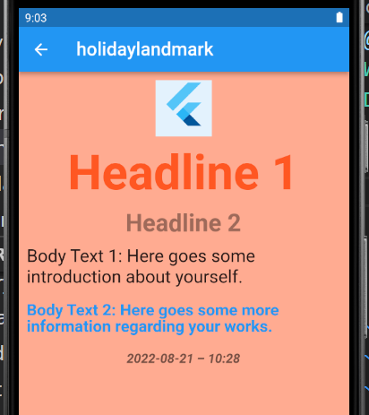
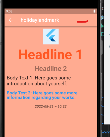
Output Screenshot:
change themes inside Scaffold,AppBar for body and appbar resp
apply theme text and body
SOLUTION
To do that, we will create a new ThemeData object first.
Step 1:
final globalTheme = ThemeData(
  primarySwatch: Colors.deepOrange,
  textTheme: const TextTheme(
    bodyText1: TextStyle(
      fontSize: 22,
      height: 1.2,
    ),
    bodyText2: TextStyle(
      color: Colors.blue,
      fontSize: 20,
      fontWeight: FontWeight.bold,
      height: 1.0,
    ),
    caption: TextStyle(
      fontSize: 16,
      fontWeight: FontWeight.bold,
      fontStyle: FontStyle.italic,
      height: 1.2,
    ),
    headline1: TextStyle(
      color: Colors.deepOrange,
      fontFamily: 'Allison',
      fontWeight: FontWeight.bold,
      fontSize: 60,
    ),
    headline2: TextStyle(
      color: Colors.black38,
      fontSize: 30,
      fontWeight: FontWeight.bold,
    ),
  ),
  appBarTheme: const AppBarTheme(
    backgroundColor: Colors.amber,
    // This will control the "back" icon
    iconTheme: IconThemeData(color: Colors.red),
    // This will control action icon buttons that locates on the right
    actionsIconTheme: IconThemeData(color: Colors.blue),
    centerTitle: false,
    elevation: 15,
    titleTextStyle: TextStyle(
      color: Colors.deepPurple,
      fontFamily: 'Allison',
      fontWeight: FontWeight.bold,
      fontSize: 40,
    ),
  ),
);
Text(
            'Headline 1',
            style: globalTheme.textTheme.headline1,
          ),
Text(
            'Headline 2',
            style: globalTheme.textTheme.headline2,
          ),
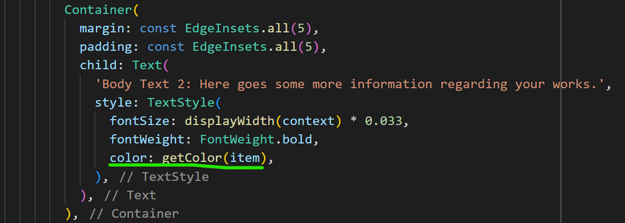
 Container(
            margin: const EdgeInsets.all(5),
            padding: const EdgeInsets.all(5),
            child: Text(
              'Body Text 2: Here goes some more information regarding your works.',
              style: globalTheme.textTheme.bodyText2,
            ),
          ),
Full code
import 'package:flutter/src/foundation/key.dart';
import 'package:flutter/src/widgets/framework.dart';
import 'dart:io';
import 'package:flutter/material.dart';
import 'package:holidaylandmark/main.dart';
import 'package:intl/intl.dart';
class Experiment extends StatefulWidget {
Experiment({Key? key}) : super(key: key);
@override
State<Experiment> createState() => _ExperimentState();
}
class _ExperimentState extends State<Experiment> {
final globalTheme = ThemeData(
primarySwatch: Colors.deepOrange,
textTheme: const TextTheme(
bodyText1: TextStyle(
fontSize: 22,
height: 1.2,
),
bodyText2: TextStyle(
color: Colors.blue,
fontSize: 20,
fontWeight: FontWeight.bold,
height: 1.0,
),
caption: TextStyle(
fontSize: 16,
fontWeight: FontWeight.bold,
fontStyle: FontStyle.italic,
height: 1.2,
),
headline1: TextStyle(
color: Colors.deepOrange,
fontFamily: 'Allison',
fontWeight: FontWeight.bold,
fontSize: 60,
),
headline2: TextStyle(
color: Colors.black38,
fontSize: 30,
fontWeight: FontWeight.bold,
),
),
appBarTheme: const AppBarTheme(
backgroundColor: Colors.amber,
// This will control the "back" icon
iconTheme: IconThemeData(color: Colors.red),
// This will control action icon buttons that locates on the right
actionsIconTheme: IconThemeData(color: Colors.blue),
centerTitle: false,
elevation: 15,
titleTextStyle: TextStyle(
color: Colors.deepPurple,
fontFamily: 'Allison',
fontWeight: FontWeight.bold,
fontSize: 40,
),
),
);
@override
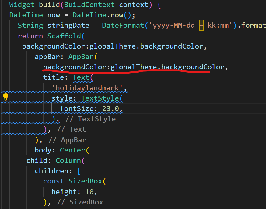
Widget build(BuildContext context) {
DateTime now = DateTime.now();
String stringDate = DateFormat('yyyy-MM-dd – kk:mm').format(now);
return Scaffold(
// backgroundColor:globalTheme.backgroundColor,
appBar: AppBar(
// backgroundColor:globalTheme.backgroundColor,
title: Text(
'holidaylandmark',
style: TextStyle(
fontSize: 23.0,
),
),
),
body: Center(
child: Column(
children: [
const SizedBox(
height: 10,
),
Container(
height: 70,
width: 70,
color: Colors.blue[50],
child: const Align(
alignment: Alignment.topCenter,
child: FlutterLogo(
size: 60,
),
),
),
const SizedBox(
height: 10,
),
Text(
'Headline 1',
style: globalTheme.textTheme.headline1,
),
const SizedBox(
height: 10,
),
Text(
'Headline 2',
style: globalTheme.textTheme.headline2,
),
Container(
margin: const EdgeInsets.all(5),
padding: const EdgeInsets.all(5),
child: Text(
'Body Text 1: Here goes some introduction about yourself.',
style: globalTheme.textTheme.bodyText1,
),
),
Container(
margin: const EdgeInsets.all(5),
padding: const EdgeInsets.all(5),
child: Text(
'Body Text 2: Here goes some more information regarding your works.',
style: globalTheme.textTheme.bodyText2,
),
),
Container(
margin: const EdgeInsets.all(5),
padding: const EdgeInsets.all(5),
child: Text(
stringDate,
style: globalTheme.textTheme.caption,
),
),
],
),
));
}
}
class T {}
Output:
Change backgroundColor of body
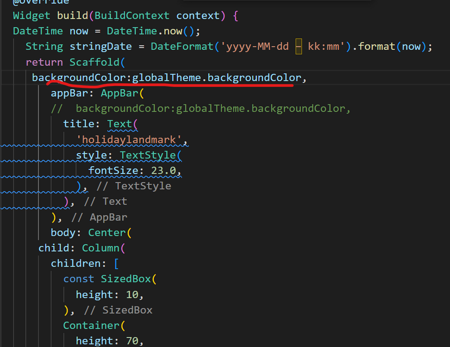
Change backgroundColor of appbar
Output:
** output**
** SOLUTION**
import 'package:flutter/src/foundation/key.dart';
import 'package:flutter/src/widgets/framework.dart';

import 'dart:io';

import 'package:flutter/material.dart';
import 'package:holidaylandmark/main.dart';

class Experiment extends StatefulWidget {
  Experiment({Key? key}) : super(key: key);

  @override
  State<Experiment> createState() => _ExperimentState();
}

class _ExperimentState extends State<Experiment> {

  @override
  Widget build(BuildContext context) {
    return Theme(
      data: Theme.of(context).copyWith(
        cardColor: Colors.white,
        textTheme: Theme.of(context).textTheme.apply(bodyColor: Colors.black),
      ),
      child: Builder(
        builder: (context) {
          return RaisedButton(
            child: Text("Show menu"),
            onPressed: () {
              showMenu(
                context: context,
                position: RelativeRect.fromLTRB(0, 100, 0, 0),
                items: [
                  PopupMenuItem(child: Text("Item 0"), value: 0),
                  PopupMenuItem(child: Text("Item 1"), value: 1),
                  PopupMenuItem(child: Text("Item 2"), value: 2),
                ],
              );
            },
          );
        },
      ),
    );
  }
}
*SOLUTION *
OUTPUT
*SOLUTION *
Full Summary:
`
- Inside Container-Colors.colorName.withOpacity(opacity).
- Inside Appbar-backgroundColor: Color.fromRGBO.
- Inside opacity-opacity,Container.
- Inside Widget build--Appbar,body-Container
- Appbar--Title,backgroundColor
- body-Container---Color,Stack-children-Image,Container(width,color,margin,padding,child: Text)`
Refrence
Click here
Click here
Click here
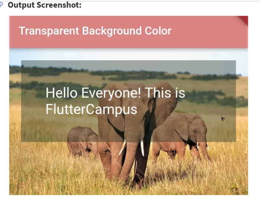
How to set Transparent Background Color in Flutter:
Output Screenshot:
SOLUTION
 Method 1:
Container(
  color: Colors.redAccent.withOpacity(0.5)
)
You can use Colors.colorName.withOpacity(opacity) method to set the transparent background color. Here, 0.5 is an opacity value, which ranges from 0-1.
 Method 2:
AppBar(
  backgroundColor: Color.fromRGBO(24,233, 111, 0.6),
)
You can use Color.fromRGBO(Red, Green, Blue, Opacity) method to set the transparent background color.
 Method 3:
Container(
   color: Color.fromARGB(100, 22, 44, 33),
)
You can use Color.fromARGB(Alpha, Red, Green, Blue) method to set the transparent background color. The alpha value ranges from 0-255.
 Method 4:
Opacity(
    opacity: 0.5, //from 0-1, 0.5 = 50% opacity
    child:Container(
        //widget tree
    )
)
You can wrap your widget tree with Opacity() widget, it will set the opacity to your widget including its content.
 Full Flutter Code Example:
import 'package:flutter/material.dart';

void main(){
  runApp(MyApp());
}

class MyApp extends StatelessWidget{
  @override
  Widget build(BuildContext context) {
    return MaterialApp(
      home: Home(),
    );
  }
}
class Home extends StatefulWidget{
  @override
  _HomeState createState() => _HomeState();
}

class _HomeState extends State<Home> {
  @override
  Widget build(BuildContext context) {
    return  Scaffold(
          appBar: AppBar(
             title: "Text(\"Transparent Background Color\"),"
             backgroundColor: Colors.redAccent.withOpacity(0.5),
                              //0.5 is transparency
          ),
          body: Container(
             color: Colors.redAccent,
             child: Stack(
                 children: [
                     Image.asset("assets/images/elephant.jpg"),
                     Container(
                        width: double.infinity,
                        color: Color.fromARGB(100, 22, 44, 33),
                        margin: EdgeInsets.all(20),
                        padding: EdgeInsets.all(40),
                        child: Text("Hello Everyone! This is FlutterCampus",
                             style: TextStyle(fontSize: 25, color: Colors.white),),
                     ),
                 ],
             ),
          )
       );
  }
}
Here, we have made an overlapping widgets tree where the Image is set at the bottom and another container at top of the image with transparent background. The output of the above code will look like below:
Full Summary:
`
- Inside Container-Colors.colorName.withOpacity(opacity).
- Inside Appbar-backgroundColor: Color.fromRGBO.
- Inside opacity-opacity,Container.
- Inside Widget build--Appbar,body-Container
- Appbar--Title,backgroundColor
- body-Container---Color,Stack-children-Image,Container(width,color,margin,padding,child: Text)`
Refrence
Click here
How to set Gradient Background on ElevetedButton in Flutter
Output Screenshot:
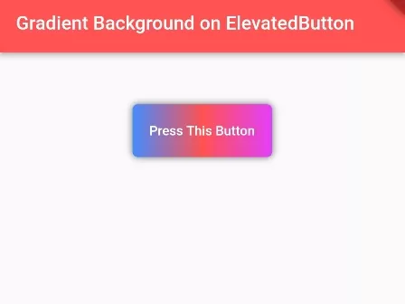
SOLUTION
DecoratedBox(
    decoration: BoxDecoration(
          gradient: LinearGradient(
            colors: [
              Colors.blueAccent,
              Colors.redAccent,
              Colors.purpleAccent
              //add more colors
            ]),
          borderRadius: BorderRadius.circular(5),
          boxShadow: <BoxShadow>[
            BoxShadow(
                color: Color.fromRGBO(0, 0, 0, 0.57), //shadow for button
                blurRadius: 5) //blur radius of shadow
          ]
      ),
    child:ElevatedButton(
      style: ElevatedButton.styleFrom(
          primary: Colors.transparent,
          onSurface: Colors.transparent,
          shadowColor: Colors.transparent,
          //make color or elevated button transparent
      ),

      onPressed: (){
          print("You pressed Elevated Button");
      },
      child: Padding(
        padding:EdgeInsets.only(
          top: 18,
          bottom: 18,
        ),
        child:Text("Press This Button"),
      )
    )
)
Full Dart/Flutter Code Example:
import 'package:flutter/material.dart';

void main() {
  runApp(MyApp());
}

class MyApp extends StatelessWidget{
  @override
  Widget build(BuildContext context) {
     return MaterialApp(
         home: Home()
      );
  }
}

class Home extends  StatefulWidget {
  @override
  State<Home> createState() => _HomeState();
}

class _HomeState extends State<Home> {
  @override
  Widget build(BuildContext context) {
    return Scaffold(
         appBar: AppBar(
            title: Text("Gradient Background on ElevatedButton"),
            backgroundColor: Colors.redAccent
         ),
          body: Container(
            alignment: Alignment.center,
            padding: EdgeInsets.all(50),
             child: Column(
                children: [

                    DecoratedBox(
                        decoration: BoxDecoration(
                             gradient: LinearGradient(
                               colors: [
                                  Colors.blueAccent,
                                  Colors.redAccent,
                                  Colors.purpleAccent
                                  //add more colors
                                ]),
                              borderRadius: BorderRadius.circular(5),
                              boxShadow: <BoxShadow>[
                                BoxShadow(
                                    color: Color.fromRGBO(0, 0, 0, 0.57), //shadow for button
                                    blurRadius: 5) //blur radius of shadow
                              ]
                         ),
                        child:ElevatedButton(
                          style: ElevatedButton.styleFrom(
                             primary: Colors.transparent,
                             onSurface: Colors.transparent,
                             shadowColor: Colors.transparent,
                             //make color or elevated button transparent
                          ),

                          onPressed: (){
                              print("You pressed Elevated Button");
                          },
                          child: Padding(
                            padding:EdgeInsets.only(
                              top: 18,
                              bottom: 18,
                            ),
                            child:Text("Press This Button"),
                          )
                        )
                    )

                ]
              )
          )
    );
  }
}
Full Summary:
DecoratedBox-BoxDecoration,ElevatedButton
BoxDecoration-
gradient: LinearGradient(color),borderRadius,boxShadow.
ElevatedButton-
style,onPressed,Padding(text).
Refrence
Click here
How to set Linear Gradient Background on Container in Flutter App: -Output Screenshot:
SOLUTION
To set Linear Gradient Background on Container:
Container(
    height: 200,
    width:double.infinity,
    decoration: BoxDecoration(
        gradient:LinearGradient(
            colors: [
            Colors.orange,
            Colors.orangeAccent,
            Colors.red,
            Colors.redAccent
            //add more colors for gradient
            ],
            begin: Alignment.topLeft, //begin of the gradient color
            end: Alignment.bottomRight, //end of the gradient color
            stops: [0, 0.2, 0.5, 0.8] //stops for individual color
            //set the stops number equal to numbers of color
        ),
    ),
)
 Full Dart Code:
import 'package:flutter/material.dart';
import 'package:flutter/widgets.dart';

void main() {
  runApp(MyApp());
}

class MyApp extends StatelessWidget{
  @override
  Widget build(BuildContext context) {
    return MaterialApp(
        title: "Test App",
        home: ContainerStyle(),
    );
  }
}

class ContainerStyle extends StatelessWidget{
  @override
  Widget build(BuildContext context) {
    return Scaffold(
        appBar: AppBar(
         title: Text("Beautiful Linear Background"),
         backgroundColor: Colors.redAccent,
       ),
       body:Container(
          margin: EdgeInsets.all(20),
          height: 200,
          width:double.infinity,
          decoration: BoxDecoration(
             gradient:LinearGradient(
                  colors: [
                    Colors.orange,
                    Colors.orangeAccent,
                    Colors.red,
                    Colors.redAccent
                    //add more colors for gradient
                   ],
                  begin: Alignment.topLeft, //begin of the gradient color
                  end: Alignment.bottomRight, //end of the gradient color
                  stops: [0, 0.2, 0.5, 0.8] //stops for individual color
                  //set the stops number equal to numbers of color
             ),

             borderRadius: BorderRadius.circular(30), //border corner radius

          ),
       ),
    );
  }
}
Full Summary:
Container--BoxDecoration--gradient:LinearGradient
Container--height,width
gradient:LinearGradient-colors(orange,orangeAccent,red,redAccent),begin,end,stops
Refrence
Click here
How to flutter image positioned center horizontally:Click here
Full Summary:
How to flutter image positioned center horizontally

Stack--alignment, children(Text)

How to set backgroundcolor of text in flutter

Container---decoration,Text

Text--style(fontSize,color,fontWeight)

How to add substring range in Flutter if the word is less than the range
Refrence
Click here
HOW TO CHANGE THE TEXT COLOR BASED ON CONTAINER BACKGROUND COLOR?-FLUTTER
Output Screenshot:
SOLUTION
 Text(
                'text message',
                style: TextStyle(
                    color: ThemeData.estimateBrightnessForColor(_bgColor) ==
                            Brightness.light
                        ? Colors.green
                        : Colors.white),
              ),
Full Summary:
Text--ThemeData.estimateBrightnessForColor-ternary operator
Refrence
Click here
Flutter: Dynamic Text Color Based on Background Brightness: -
Output Screenshot:
SOLUTION
1. The computeLuminance() method from the Color class.
Text(
                'Hello',
                style: TextStyle(
                    fontSize: 80,
                    color: _backgroundColor.computeLuminance() > 0.5
                        ? Colors.black
                        : Colors.white),
              ),
2. The estimateBrightnessForColor() method from the ThemeData class.
Text(
                'Hello',
                style: TextStyle(
                    fontSize: 80,
                    color: ThemeData.estimateBrightnessForColor(_bgColor) ==
                            Brightness.light
                        ? Colors.black
                        : Colors.white),
              ),
The Complete Code
// main.dart
import 'package:flutter/material.dart';

void main() {
  runApp(const MyApp());
}

class MyApp extends StatelessWidget {
  const MyApp({Key? key}) : super(key: key);

  @override
  Widget build(BuildContext context) {
    return const MaterialApp(
      // Remove the debug banner
      debugShowCheckedModeBanner: false,
      title: 'Kindacode.com',
      home: HomePage(),
    );
  }
}
class HomePage extends StatefulWidget {
  const HomePage({Key? key}) : super(key: key);

  @override
  _HomePageState createState() => _HomePageState();
}

class _HomePageState extends State<HomePage> {
  // Background color of the box
  // In the beginning, it is blue
  Color _bgColor = Colors.blue;

  @override
  Widget build(BuildContext context) {
    return Scaffold(
      appBar: AppBar(
        title: const Text('Kindacode.com'),
      ),
      body: Column(
        children: [
          const SizedBox(
            height: 50,
          ),
          Container(
            width: 300,
            height: 300,
            color: _bgColor,
            child: Center(
              child: Text(
                'Hello',
                style: TextStyle(
                    fontSize: 80,
                    color: _bgColor.computeLuminance() > 0.5
                        ? Colors.black
                        : Colors.white),
              ),
            ),
          ),
          const SizedBox(
            height: 50,
          ),

          // The buttons below used to change the box color
          Row(
            mainAxisAlignment: MainAxisAlignment.spaceAround,
            children: [
              // Green Acent
              MaterialButton(
                onPressed: () {
                  setState(() {
                    _bgColor = Colors.greenAccent;
                  });
                },
                color: Colors.greenAccent,
              ),

              // Orange
              MaterialButton(
                onPressed: () {
                  setState(() {
                    _bgColor = Colors.orange;
                  });
                },
                color: Colors.orange,
              ),

              // Yellow
              MaterialButton(
                onPressed: () {
                  setState(() {
                    _bgColor = Colors.yellow;
                  });
                },
                color: Colors.yellow,
              ),

              // Black
              MaterialButton(
                onPressed: () {
                  setState(() {
                    _bgColor = Colors.black;
                  });
                },
                color: Colors.black,
              )
            ],
          )
        ],
      ),
    );
  }
}
Full Summary:
Step1: assign variable
` Color _bgColor = Colors.blue;
@override
Widget build(BuildContext context) `
Step2:For upper image
body: Column----Container---child: Center-----child: Text
Step3:For below image
row(MainAxisAlignment.spaceAround)---children---four materialButton---

step 4:inside materialButton---set _bgColor = Colors.yellow
Refrence
Click here
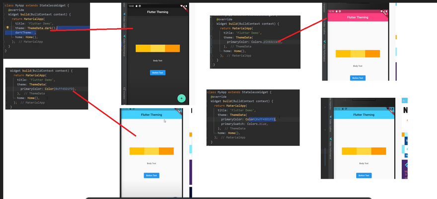
HOW TO CHANGE THE ENTIRE THEME'S TEXT COLOR IN FLUTTER?-FLUTTER
Output Screenshot:
SOLUTION
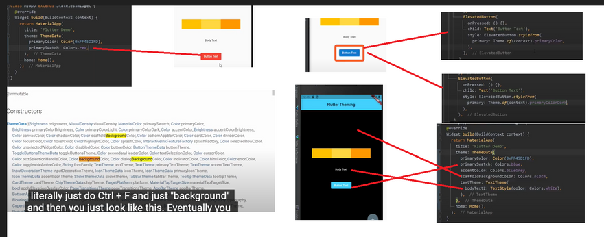
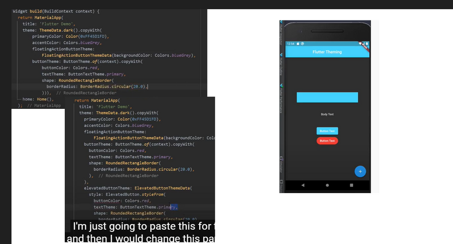
I think TextTheme.apply is what you want. bodyColor will be applied to headline, title, subhead, button, body1, and body2. displayColor will be applied to display1 through display4, and caption. If you specify both bodyColor and displayColor and use the same color value, that will effectively change text colors on all text styles.
Example:
final newTextTheme = Theme.of(context).textTheme.apply(
  bodyColor: Colors.pink,
  displayColor: Colors.pink,
);
I found using copyWith() on the TextTheme works well, as you can just change specific properties like fontsize - leaving everthing else unchanged.
 textTheme: TextTheme().copyWith(
      bodyText2: TextStyle(
        fontSize: 30,
        fontWeight: FontWeight.bold
      )
    ),
mine is working with this:
return MaterialApp(
  theme: ThemeData(
    textTheme: TextTheme(
      bodyText2: TextStyle(
        color: Colors.white,
      ),
    ),
  ),
);
ThemeData(
    primaryTextTheme: Typography(platform: TargetPlatform.iOS).white,
    textTheme: Typography(platform: TargetPlatform.iOS).white,
)
To provide an alternative that seems to work without setting all the Text styles directly is to change the style of the DefaultTextStyle at the place in the Widget tree to take effect
return DefaultTextStyle(
  style: TextStyle(color: Colors.pink),
  child: _YOUR_WIDGETS_
)
For the entire app, you can set textTheme property in the Material app widget.
MaterialApp(
  theme: ThemeData(
    textTheme: TextTheme(
      bodyText1: TextStyle(),
      bodyText2: TextStyle(),
    ).apply(
      bodyColor: Colors.orange,
      displayColor: Colors.blue,
    ),
  ),
)
Full Summary:
Theme.of(context).textTheme.apply--bodyColor,displayColor
bodyText2: TextStyle--fontSize,fontWeight
ThemeData--textTheme---bodyText2--color
ThemeData--primaryTextTheme,textTheme
DefaultTextStyle--style,child: _YOUR_WIDGETS
-
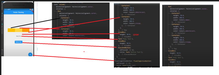
** Image des**
body:colunm(MainAxisAlignment.center) and floating button
body:colunm(MainAxisAlignment.center)--children--row(MainAxisAlignment.center) and sized box and text and elevated button
row(MainAxisAlignment.center)-- four Container inside row
theme data--primary
Refrence
Click here
Click here
Click here
Click here
Click here
HOW CAN I CHANGE THE BACKGROUND COLOR OF A TEXTBUTTON IN FLUTTER?-FLUTTER
Output Screenshot:
SOLUTION
TextButton(
    child: Text('test'),
    style: ButtonStyle(backgroundColor: MaterialStateProperty.all(Colors.red)),
    onPressed: () {},
),
TextButton( style: TextButton.styleFrom(backgroundColor: Colors.red), ),
TextButton(
  onPressed: () {},
  child: Container(
    padding: EdgeInsets.fromLTRB(30, 10, 30, 10),
    color: Colors.red,
    child: Text(""),
  ),
)
TextButton(
  child: Text('Example'),
  onPressed: () {},
  style: TextButton.styleFrom(backgroundColor: Colors.red),
)
Full Summary:
style: ButtonStyle--backgroundColor: MaterialStateProperty.all
TextButton.styleFrom
TextButton--Container
TextButton---TextButton.styleFrom
Refrence
Click here
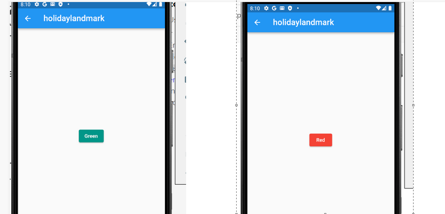
HOW TO CHANGE THE BACKGROUND COLOR OF RAISED BUTTON DYNAMICALLY IN ONPRESSED()-FLUTTER
Output Screenshot:
SOLUTION
Full Code
import 'package:flutter/src/foundation/key.dart';
import 'package:flutter/src/widgets/framework.dart';

import 'dart:io';

import 'package:flutter/material.dart';
import 'package:holidaylandmark/main.dart';
import 'package:intl/intl.dart';


class Experiment extends StatefulWidget {
   Experiment({Key? key}) : super(key: key);

  @override
  State<Experiment> createState() => _ExperimentState();
}
class _ExperimentState extends State<Experiment> {
  final globalTheme = ThemeData(
  primarySwatch: Colors.deepOrange,
  textTheme: const TextTheme(
    bodyText1: TextStyle(
      fontSize: 22,
      height: 1.2,
    ),
    bodyText2: TextStyle(
      color: Colors.blue,
      fontSize: 20,
      fontWeight: FontWeight.bold,
      height: 1.0,
    ),
    caption: TextStyle(
      fontSize: 16,
      fontWeight: FontWeight.bold,
      fontStyle: FontStyle.italic,
      height: 1.2,
    ),
    headline1: TextStyle(
      color: Colors.deepOrange,
      fontFamily: 'Allison',
      fontWeight: FontWeight.bold,
      fontSize: 60,
    ),
    headline2: TextStyle(
      color: Colors.black38,
      fontSize: 30,
      fontWeight: FontWeight.bold,
    ),
  ),
  appBarTheme: const AppBarTheme(
    backgroundColor: Colors.amber,
    // This will control the "back" icon
    iconTheme: IconThemeData(color: Colors.red),
    // This will control action icon buttons that locates on the right
    actionsIconTheme: IconThemeData(color: Colors.blue),
    centerTitle: false,
    elevation: 15,
    titleTextStyle: TextStyle(
      color: Colors.deepPurple,
      fontFamily: 'Allison',
      fontWeight: FontWeight.bold,
      fontSize: 40,
    ),
  ),
);
   bool _flag = true;

  @override
  Widget build(BuildContext context) {
    return Scaffold(
      appBar: AppBar(
        //  backgroundColor:globalTheme.backgroundColor,
          title: Text(
            'holidaylandmark',
            style: TextStyle(
              fontSize: 23.0,
            ),
          ),
      ),
      body: Center(
        child: ElevatedButton(
          onPressed: () => setState(() => _flag = !_flag),
          child: Text(_flag ? 'Red' : 'Green'),
          style: ElevatedButton.styleFrom(
            primary: _flag ? Colors.red : Colors.teal, // This is what you need!
          ),
        ),
      ),
    );
  }
}
output
class _MyState extends State<MyPage> {
  bool _flag = true;

  @override
  Widget build(BuildContext context) {
    return Scaffold(
      body: Center(
        child: ElevatedButton(
          onPressed: () => setState(() => _flag = !_flag),
          child: Text(_flag ? 'Red' : 'Green'),
          style: ElevatedButton.styleFrom(
            primary: _flag ? Colors.red : Colors.teal, // This is what you need!
          ),
        ),
      ),
    );
  }
}
List<bool> _list = [true, false, true, false];

@override
Widget build(BuildContext context) {
  return Scaffold(
    appBar: AppBar(title: Text("Title")),
    body: ListView(children: _buildButtons()),
  );
}
List<Widget> _buildButtons() {
  List<Widget> listButtons = List.generate(_list.length, (i) {
    return RaisedButton(
      color: _list[i] ? Colors.green : Colors.red,
      onPressed: () {
        setState(() {
          _list[i] = !_list[i];
        });
      },
      child: Text("Button #${i}"),
    );
  });
  return listButtons;
}
List<Widget> _createButton(BuildContext context, List<Zone> zones) {
    return zones.map((Zone zone) {
      return RaisedButton(
        onPressed: () {
          setState(() {
            if (!zone.isSelected) {
              zone.color = AppColors.white;
            }
          });
        },
        color: zone.color ??= Theme.of(context).primaryColor,
        child: Text(zone.text),
      );
    }).toList();
  }
bool isButtonPressed = false;

RaisedButton(
            color: isButtonPressed ? Colors.green : Colors.red,
            onPressed: () {
              setState(() {
                isButtonPressed =!isButtonPressed;
              });
            },
          ),
Full Summary:
using flag inside onpress button
body: ListView(children: _buildButtons()),--color: _list[i] ? Colors.green : Colors.red,
Refrence
Click here
HOW TO CHANGE THE BACKGROUND COLOR OF BOTTOMSHEET IN FLUTTER?-FLUTTER
Output Screenshot:
SOLUTION
bottomSheetTheme: BottomSheetThemeData(backgroundColor: Colors.black54)
 GestureDetector(onTap: () => showModalBottomSheet(
                                backgroundColor: Colors.transparent,
                                context: context,
                                builder: (BuildContext contxt) => Theme(
                                      data: Theme.of(context).copyWith(
                                        canvasColor: Colors.transparent,
                                      ),
                                      child: Container(
                                        decoration: BoxDecoration(
                                            color: Colors.white,
                                            borderRadius: BorderRadius.only(
                                                topRight: Radius.circular(20),
                                                topLeft: Radius.circular(20))),
                                        height: 360,
                                        child: ChildWidgetOfBottomSheetYouWantToImplement.....
 showModalBottomSheet(
    context: context,
    backgroundColor: Colors.transparent,
    builder: (BuildContext bc){
      return Container(
        height: 430,
        child: BottomSheetWidget(name, test, images),
      );
    }
);
Full Summary:
Refrence
Click here
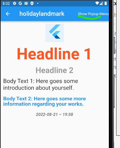
HOW TO CHANGE THE BACKGROUND COLOR OF POPUP MENUBUTTON BULLET WINDOW?-FLUTTER
Output Screenshot:
SOLUTION
import 'package:flutter/src/foundation/key.dart';
import 'package:flutter/src/widgets/framework.dart';

import 'dart:io';

import 'package:flutter/material.dart';
import 'package:holidaylandmark/main.dart';
import 'package:intl/intl.dart';


class Experiment extends StatefulWidget {
   Experiment({Key? key}) : super(key: key);

  @override
  State<Experiment> createState() => _ExperimentState();
}
class _ExperimentState extends State<Experiment> {
  final globalTheme = ThemeData(
  primarySwatch: Colors.deepOrange,
  textTheme: const TextTheme(
    bodyText1: TextStyle(
      fontSize: 22,
      height: 1.2,
    ),
    bodyText2: TextStyle(
      color: Colors.blue,
      fontSize: 20,
      fontWeight: FontWeight.bold,
      height: 1.0,
    ),
    caption: TextStyle(
      fontSize: 16,
      fontWeight: FontWeight.bold,
      fontStyle: FontStyle.italic,
      height: 1.2,
    ),
    headline1: TextStyle(
      color: Colors.deepOrange,
      fontFamily: 'Allison',
      fontWeight: FontWeight.bold,
      fontSize: 60,
    ),
    headline2: TextStyle(
      color: Colors.black38,
      fontSize: 30,
      fontWeight: FontWeight.bold,
    ),
  ),
  appBarTheme: const AppBarTheme(
    backgroundColor: Colors.amber,
    // This will control the "back" icon
    iconTheme: IconThemeData(color: Colors.red),
    // This will control action icon buttons that locates on the right
    actionsIconTheme: IconThemeData(color: Colors.blue),
    centerTitle: false,
    elevation: 15,
    titleTextStyle: TextStyle(
      color: Colors.deepPurple,
      fontFamily: 'Allison',
      fontWeight: FontWeight.bold,
      fontSize: 40,
    ),
  ),
);
  @override
  Widget build(BuildContext context) {
  DateTime now = DateTime.now();
    String stringDate = DateFormat('yyyy-MM-dd – kk:mm').format(now);
    return Scaffold(
    //  backgroundColor:globalTheme.backgroundColor,
        appBar: AppBar(
        //  backgroundColor:globalTheme.backgroundColor,
          title: Text(
            'holidaylandmark',
            style: TextStyle(
              fontSize: 23.0,
            ),
          ),
           actions: [
            Center(
      child: Theme(
        data: Theme.of(context).copyWith(
          cardColor: Colors.red,
        ),
        child: PopupMenuButton(
          child: Text("Show Popup Menu"),
          itemBuilder: (context) => [
                PopupMenuItem(
                  child: Text("InduceSmile.com"),
                ),
                PopupMenuItem(
                  child: Text("Flutter.io"),
                ),
                PopupMenuItem(
                  child: Text("Google.com"),
                ),
              ],
        ),
      ),
            ),
            ],
        ),
        body: Center(
      child: Column(
        children: [
          const SizedBox(
            height: 10,
          ),
          Container(
            height: 70,
            width: 70,
            color: Colors.blue[50],
            child: const Align(
              alignment: Alignment.topCenter,
              child: FlutterLogo(
                size: 60,
              ),
            ),
          ),
          const SizedBox(
            height: 10,
          ),
          Text(
            'Headline 1',
            style: globalTheme.textTheme.headline1,
          ),
          const SizedBox(
            height: 10,
          ),
          Text(
            'Headline 2',
            style: globalTheme.textTheme.headline2,
          ),
          Container(
            margin: const EdgeInsets.all(5),
            padding: const EdgeInsets.all(5),
            child: Text(
              'Body Text 1: Here goes some introduction about yourself.',
              style: globalTheme.textTheme.bodyText1,
            ),
          ),
          Container(
            margin: const EdgeInsets.all(5),
            padding: const EdgeInsets.all(5),
            child: Text(
              'Body Text 2: Here goes some more information regarding your works.',
              style: globalTheme.textTheme.bodyText2,
            ),
          ),
          Container(
            margin: const EdgeInsets.all(5),
            padding: const EdgeInsets.all(5),
            child: Text(
              stringDate,
              style: globalTheme.textTheme.caption,
            ),
          ),
        ],
      ),
    ));
  }
}

class T {}
output
 Theme(
                data: Theme.of(context).copyWith(
                  cardColor: Colors.red,
                ),
                child: new PopupMenuButton(
                       ...
Center(
      child: Theme(
        data: Theme.of(context).copyWith(
          cardColor: Colors.red,
        ),
        child: PopupMenuButton(
          child: Text("Show Popup Menu"),
          itemBuilder: (context) => [
                PopupMenuItem(
                  child: Text("InduceSmile.com"),
                ),
                PopupMenuItem(
                  child: Text("Flutter.io"),
                ),
                PopupMenuItem(
                  child: Text("Google.com"),
                ),
              ],
        ),
      ),
Full Summary:
Refrence
Click here
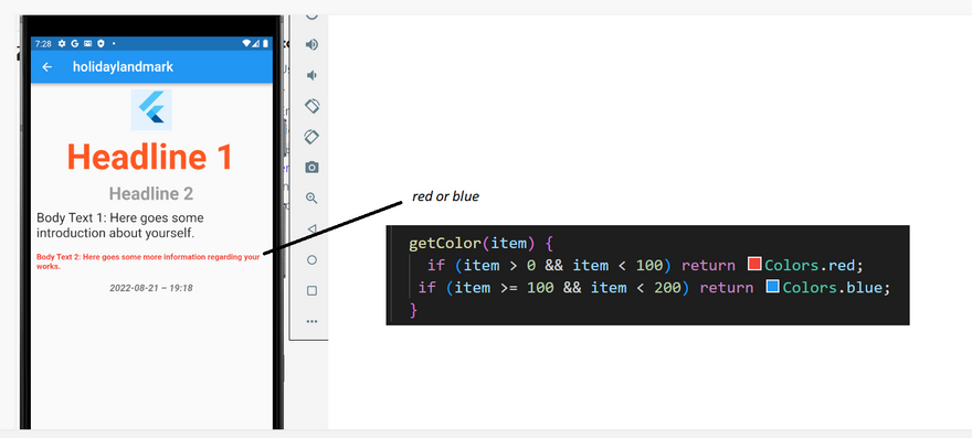
HOW TO CHANGE THE COLOR OF TEXT DYNAMICALLY IN FLUTTER?-FLUTTER
Output Screenshot:
SOLUTION
Color getColor(number) {
   if (number > 0 && number < 100) return Colors.red;
   if (number >= 100 && number < 200) return Colors.blue;
   ...
}
color: getColor(item),
Color textColor = Colors.black; // Default color
TextStyle(
  fontWeight: FontWeight.bold,
  color: textColor,
),
FlatButton(
  onPressed: () {
    setState(() => textColor =
        Color((Random().nextDouble() * 0xFFFFFF).toInt() << 0)
            .withOpacity(1.0)); // this is generate random color, u can use your own..
  },
  child: Text("change color"),
),
Full Summary:
Refrence
Click here
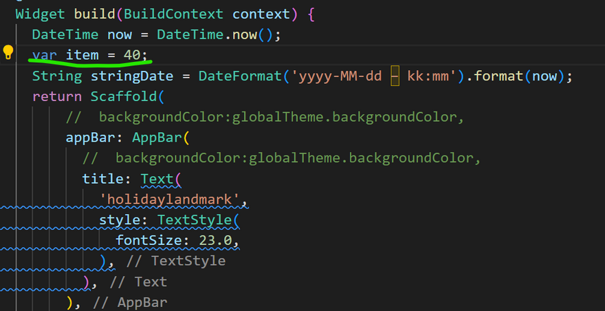
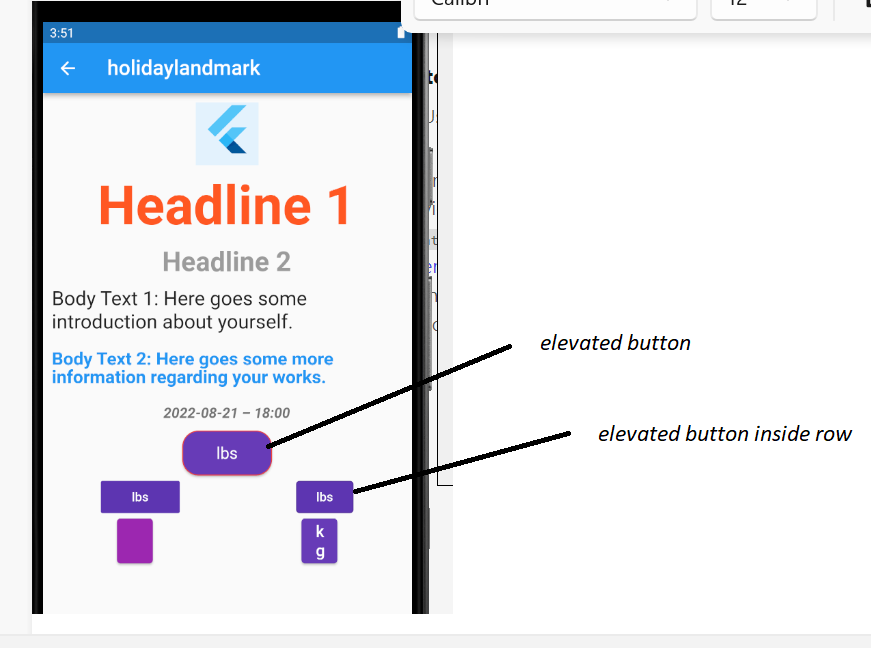
HOW TO CHANGE SIZE AND TEXT COLOR OF THE ELEVATED BUTTONS IN FLUTTER-FLUTTER
Output Screenshot:
SOLUTION
step1:declare variable
call function name
define function name
Full Code
import 'package:flutter/src/foundation/key.dart';
import 'package:flutter/src/widgets/framework.dart';
import 'dart:io';
import 'package:flutter/material.dart';
import 'package:holidaylandmark/main.dart';
import 'package:intl/intl.dart';
class Experiment extends StatefulWidget {
Experiment({Key? key}) : super(key: key);
@override
State<Experiment> createState() => _ExperimentState();
}
class _ExperimentState extends State<Experiment> {
final globalTheme = ThemeData(
primarySwatch: Colors.deepOrange,
textTheme: const TextTheme(
bodyText1: TextStyle(
fontSize: 22,
height: 1.2,
),
bodyText2: TextStyle(
color: Colors.blue,
fontSize: 20,
fontWeight: FontWeight.bold,
height: 1.0,
),
caption: TextStyle(
fontSize: 16,
fontWeight: FontWeight.bold,
fontStyle: FontStyle.italic,
height: 1.2,
),
headline1: TextStyle(
color: Colors.deepOrange,
fontFamily: 'Allison',
fontWeight: FontWeight.bold,
fontSize: 60,
),
headline2: TextStyle(
color: Colors.black38,
fontSize: 30,
fontWeight: FontWeight.bold,
),
),
appBarTheme: const AppBarTheme(
backgroundColor: Colors.amber,
// This will control the "back" icon
iconTheme: IconThemeData(color: Colors.red),
// This will control action icon buttons that locates on the right
actionsIconTheme: IconThemeData(color: Colors.blue),
centerTitle: false,
elevation: 15,
titleTextStyle: TextStyle(
color: Colors.deepPurple,
fontFamily: 'Allison',
fontWeight: FontWeight.bold,
fontSize: 40,
),
),
);
@override
Widget build(BuildContext context) {
DateTime now = DateTime.now();
var item = 40;
String stringDate = DateFormat('yyyy-MM-dd – kk:mm').format(now);
return Scaffold(
// backgroundColor:globalTheme.backgroundColor,
appBar: AppBar(
// backgroundColor:globalTheme.backgroundColor,
title: Text(
'holidaylandmark',
style: TextStyle(
fontSize: 23.0,
),
),
),
body: Center(
child: Column(
children: [
const SizedBox(
height: 10,
),
Container(
height: 70,
width: 70,
color: Colors.blue[50],
child: const Align(
alignment: Alignment.topCenter,
child: FlutterLogo(
size: 60,
),
),
),
const SizedBox(
height: 10,
),
Text(
'Headline 1',
style: globalTheme.textTheme.headline1,
),
const SizedBox(
height: 10,
),
Text(
'Headline 2',
style: globalTheme.textTheme.headline2,
),
Container(
margin: const EdgeInsets.all(5),
padding: const EdgeInsets.all(5),
child: Text(
'Body Text 1: Here goes some introduction about yourself.',
style: globalTheme.textTheme.bodyText1,
),
),
Container(
margin: const EdgeInsets.all(5),
padding: const EdgeInsets.all(5),
child: Text(
'Body Text 2: Here goes some more information regarding your works.',
style: TextStyle(
fontSize: displayWidth(context) * 0.033,
fontWeight: FontWeight.bold,
color: getColor(item),
),
),
),
Container(
margin: const EdgeInsets.all(5),
padding: const EdgeInsets.all(5),
child: Text(
stringDate,
style: globalTheme.textTheme.caption,
),
),
],
),
));
}
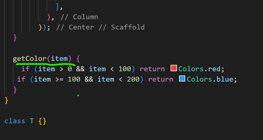
getColor(item) {
if (item > 0 && item < 100) return Colors.red;
if (item >= 100 && item < 200) return Colors.blue;
}
}
class T {}
output
SizedBox( // Change the button size
   width: 100,
   height: 50,
   child: ElevatedButton(
      style: ElevatedButton.styleFrom( // ElevatedButton styles
          primary: Colors.deepPurple,
          padding: EdgeInsets.fromLTRB(20, 10, 20, 10), // Some padding example
          shape: RoundedRectangleBorder( // Border
            borderRadius: BorderRadius.circular(18.0),
            side: BorderSide(color: Colors.red),
          ),
          [...]
       ),
       textStyle: TextStyle( // Text styles
          color: Colors.white,
          fontSize: 18,
          overflow: TextOverflow.ellipsis,
          [...]
       ),
       onPressed: () {},
       child: Text("lbs"),
   ),
),
FlatButton(
            color: Colors.deepPurple[600],
            child: const Text('lbs'),
              textColor: Colors.white10,
            onPressed: () {},
          );
Widget btn() => OutlinedButton(
      child: const Text(
        'lbs',
        style: TextStyle(color: Colors.white),
      ),
      style: OutlinedButton.styleFrom(
        backgroundColor: Colors.deepPurple[600],
      ),
      onPressed: () {},
    );
ElevatedButton(
 style: ElevatedButton.styleFrom(
   textStyle: TextStyle(color: Colors.white),
   primary: Colors.purple,
   shape: RoundedRectangleBorder
     borderRadius: BorderRadius.circular(30),
   ),
 ),
);
SizedBox(
 width: 30,
 height: 20,
 child: ElevatedButton(
  style: ElevatedButton.styleFrom(
   textStyle: TextStyle(color: Colors.white),
   primary: Colors.purple,
  ),
 ),
)
ElevatedButton(
            onPressed: () {},
            child: Text('kg',
                   style:TextStyle(color:Colors.black,fontSize:18),
                        ),
            style: ButtonStyle(
              backgroundColor:
                  MaterialStateProperty.all<Color>(Colors.deepPurple),
            ),
          );
Full Code
import 'package:flutter/src/foundation/key.dart';
import 'package:flutter/src/widgets/framework.dart';

import 'dart:io';

import 'package:flutter/material.dart';
import 'package:holidaylandmark/main.dart';
import 'package:intl/intl.dart';


class Experiment extends StatefulWidget {
   Experiment({Key? key}) : super(key: key);

  @override
  State<Experiment> createState() => _ExperimentState();
}
class _ExperimentState extends State<Experiment> {
  final globalTheme = ThemeData(
  primarySwatch: Colors.deepOrange,
  textTheme: const TextTheme(
    bodyText1: TextStyle(
      fontSize: 22,
      height: 1.2,
    ),
    bodyText2: TextStyle(
      color: Colors.blue,
      fontSize: 20,
      fontWeight: FontWeight.bold,
      height: 1.0,
    ),
    caption: TextStyle(
      fontSize: 16,
      fontWeight: FontWeight.bold,
      fontStyle: FontStyle.italic,
      height: 1.2,
    ),
    headline1: TextStyle(
      color: Colors.deepOrange,
      fontFamily: 'Allison',
      fontWeight: FontWeight.bold,
      fontSize: 60,
    ),
    headline2: TextStyle(
      color: Colors.black38,
      fontSize: 30,
      fontWeight: FontWeight.bold,
    ),
  ),
  appBarTheme: const AppBarTheme(
    backgroundColor: Colors.amber,
    // This will control the "back" icon
    iconTheme: IconThemeData(color: Colors.red),
    // This will control action icon buttons that locates on the right
    actionsIconTheme: IconThemeData(color: Colors.blue),
    centerTitle: false,
    elevation: 15,
    titleTextStyle: TextStyle(
      color: Colors.deepPurple,
      fontFamily: 'Allison',
      fontWeight: FontWeight.bold,
      fontSize: 40,
    ),
  ),
);
  @override
  Widget build(BuildContext context) {
  DateTime now = DateTime.now();
    String stringDate = DateFormat('yyyy-MM-dd – kk:mm').format(now);
    return Scaffold(
    //  backgroundColor:globalTheme.backgroundColor,
        appBar: AppBar(
        //  backgroundColor:globalTheme.backgroundColor,
          title: Text(
            'holidaylandmark',
            style: TextStyle(
              fontSize: 23.0,
            ),
          ),
        ),
        body: Center(
      child: Column(
        children: [
          const SizedBox(
            height: 10,
          ),
          Container(
            height: 70,
            width: 70,
            color: Colors.blue[50],
            child: const Align(
              alignment: Alignment.topCenter,
              child: FlutterLogo(
                size: 60,
              ),
            ),
          ),
          const SizedBox(
            height: 10,
          ),
          Text(
            'Headline 1',
            style: globalTheme.textTheme.headline1,
          ),
          const SizedBox(
            height: 10,
          ),
          Text(
            'Headline 2',
            style: globalTheme.textTheme.headline2,
          ),
          Container(
            margin: const EdgeInsets.all(5),
            padding: const EdgeInsets.all(5),
            child: Text(
              'Body Text 1: Here goes some introduction about yourself.',
              style: globalTheme.textTheme.bodyText1,
            ),
          ),
          Container(
            margin: const EdgeInsets.all(5),
            padding: const EdgeInsets.all(5),
            child: Text(
              'Body Text 2: Here goes some more information regarding your works.',
              style: globalTheme.textTheme.bodyText2,
            ),
          ),
          Container(
            margin: const EdgeInsets.all(5),
            padding: const EdgeInsets.all(5),
            child: Text(
              stringDate,
              style: globalTheme.textTheme.caption,
            ),
          ),
          SizedBox( // Change the button size
   width: 100,
   height: 50,
   child: ElevatedButton(
      style: ElevatedButton.styleFrom( // ElevatedButton styles
          primary: Colors.deepPurple,
          padding: EdgeInsets.fromLTRB(20, 10, 20, 10), // Some padding example
          shape: RoundedRectangleBorder( // Border
            borderRadius: BorderRadius.circular(18.0),
            side: BorderSide(color: Colors.red),
          ),
     textStyle: TextStyle( // Text styles
          color: Colors.white,
          fontSize: 18,
          overflow: TextOverflow.ellipsis,

       ),
       ),

       onPressed: () {},
       child: Text("lbs"),
   ),
),
                    Row(
                mainAxisAlignment: MainAxisAlignment.spaceAround ,
                crossAxisAlignment:CrossAxisAlignment.start,
  children: [
        FlatButton(

                color: Colors.deepPurple[600],

                child: const Text('lbs'),

                  textColor: Colors.white,

                onPressed: () {},

              ),
                OutlinedButton(
      child: const Text(
        'lbs',
        style: TextStyle(color: Colors.white),
      ),
      style: OutlinedButton.styleFrom(
        backgroundColor: Colors.deepPurple[600],
      ),
      onPressed: () {},
    ),
  ],
),

    Row(
      mainAxisAlignment: MainAxisAlignment.spaceAround ,
      crossAxisAlignment:CrossAxisAlignment.start,
      children: [
        SizedBox(
 width: 40,
 height: 50,
 child: ElevatedButton(
  style: ElevatedButton.styleFrom(
   textStyle: TextStyle(color: Colors.white),
   primary: Colors.purple,
  ), onPressed: () {  },
  child: null,
 ),
),
SizedBox(
 width: 40,
 height: 50,
 child: ElevatedButton(
            onPressed: () {},
            child: Text('kg',
                   style:TextStyle(color:Colors.white,fontSize:18),
                        ),
            style: ButtonStyle(
              backgroundColor:
                  MaterialStateProperty.all<Color>(Colors.deepPurple),
            ),
          )
)
      ],
    ),

        ],
      ),
    ));
  }
}

class T {}

class T {}
OUTPUT
Full Summary:
Refrence
Click here
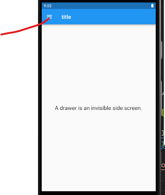
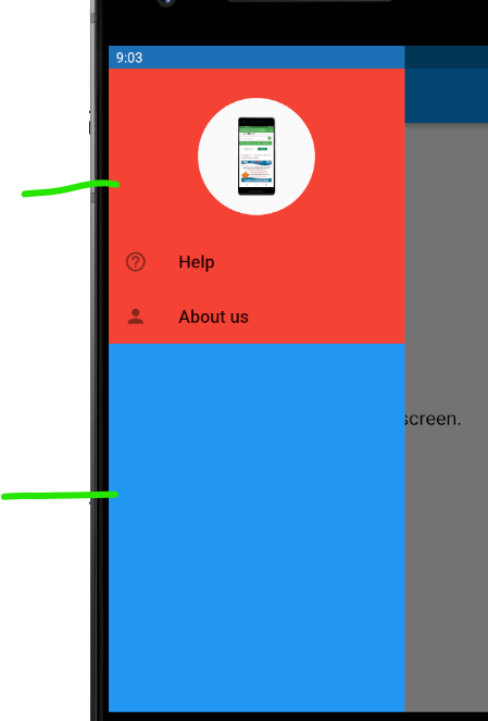
HOW TO CHANGE THE WHOLE BACKGROUND COLOR OF DRAWER IN FLUTTER-FLUTTER
Output Screenshot:
SOLUTION
class MyDrawer extends StatelessWidget {
@override
  Widget build(BuildContext context) {
    return Drawer(
        elevation: 0,
        child: Container(
          color: Colors.blue,
        child: ListView(
          children: <Widget>[
            Container(
              height: 170,
              width: 170,
              padding: EdgeInsets.only(top:30),
              color: Colors.red,
              child: Column(children: <Widget>[
              Material(
                  borderRadius: BorderRadius.all(Radius.circular(100)),
                  child: Padding(padding: EdgeInsets.all(20.0),
                  child:  Image.network(
                  'https://static.javatpoint.com/tutorial/flutter/images/flutter-creating-android-platform-specific-code3.png',
                  height: 80,
                  width: 80
              ),),
                ),
              ],),
            ),
            Container(
              color: Colors.red,
              child: Column(
                children: <Widget>[
                  ListTile(
                    leading: Icon(Icons.help_outline_sharp),
                    title: Text('Help', style: TextStyle(fontSize: 18,),),
                    onTap: () {},
                  ),
                  ListTile(
                    leading: Icon(Icons.person),
                    title: Text('About us', style: TextStyle(fontSize: 18,),),
                    onTap: () {},
                  ),
                ],
              ),
            ),
          ],
        ),
      ),
    );
  }
}
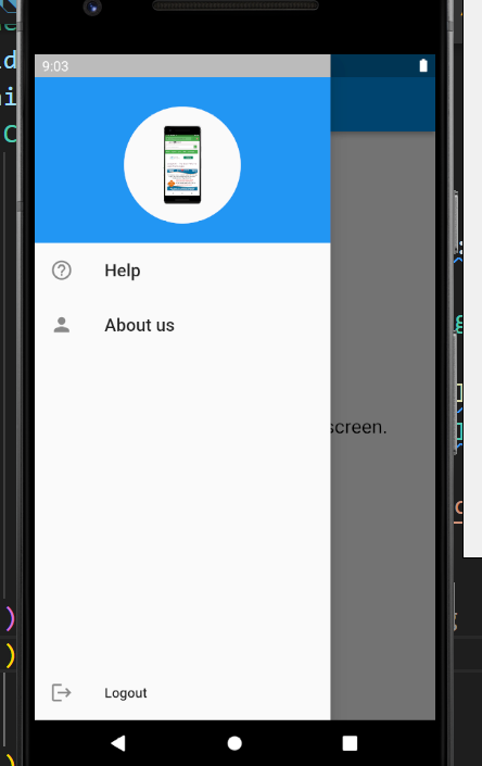
output
after click drawer
class MyDrawer extends StatelessWidget {
 @override
  Widget build(BuildContext context) {
    return Drawer(
      child: Column(
        children: <Widget>[
          Expanded(
            child: ListView(
              children: <Widget>[
                Container(
                  height: 170,
                  width: 170,
                  padding: EdgeInsets.only(top:30),
                  color: Colors.blue,
                  child: Column(children: <Widget>[
                   Material(
                  borderRadius: BorderRadius.all(Radius.circular(100)),
                  child: Padding(padding: EdgeInsets.all(20.0),
                  child:  Image.network(
                  'https://static.javatpoint.com/tutorial/flutter/images/flutter-creating-android-platform-specific-code3.png',
                  height: 80,
                  width: 80
              ),),
                ),
                  ],
                 ),
                ),
                ListTile(
                  leading: Icon(Icons.help_outline_sharp),
                  title: Text('Help', style: TextStyle(fontSize: 18,),),
                  onTap: () {},
                ),
                ListTile(
                  leading: Icon(Icons.person),
                  title: Text('About us', style: TextStyle(fontSize: 18,),),
                  onTap: () {},
                ),
              ],
            ),
          ),
          Align(
            alignment: Alignment.bottomCenter,
            child: ListTile(
              leading: Icon(Icons.logout),
              title: Text('Logout')
            ),
          ),
        ],
      ),
    );
  }
}
output
Scaffold(
  drawer:Theme(
    data:Theme.of(context).copyWith(
     canvasColor://the desired color will go here
    ),
    child:Drawer(/*drawer content*/)
  )
)
Full Code:
import 'package:flutter/src/foundation/key.dart';
import 'package:flutter/src/widgets/framework.dart';
import 'dart:io';
import 'package:flutter/material.dart';
import 'package:holidaylandmark/main.dart';
import 'package:intl/intl.dart';


class Experiment extends StatefulWidget {
   Experiment({Key? key}) : super(key: key);

  @override
  State<Experiment> createState() => _ExperimentState();
}
class _ExperimentState extends State<Experiment> {

  Widget build(BuildContext context) {
    return Scaffold(
      appBar: AppBar(title: Text('title')),
      body: Center(child: Text(
          'A drawer is an invisible side screen.',
          style: TextStyle(fontSize: 20.0),
          )
      ),
      drawer: Drawer(
      child: Column(
        children: <Widget>[
          Expanded(
            child: ListView(
              children: <Widget>[
                Container(
                  height: 170,
                  width: 170,
                  padding: EdgeInsets.only(top:30),
                  color: Colors.blue,
                  child: Column(children: <Widget>[
                 Material(
                  borderRadius: BorderRadius.all(Radius.circular(100)),
                  child: Padding(padding: EdgeInsets.all(20.0),
                  child:  Image.network(
                  'https://static.javatpoint.com/tutorial/flutter/images/flutter-creating-android-platform-specific-code3.png',
                  height: 80,
                  width: 80
              ),),
                ),
                  ],
                 ),
                ),
                ListTile(
                  leading: Icon(Icons.help_outline_sharp),
                  title: Text('Help', style: TextStyle(fontSize: 18,),),
                  onTap: () {},
                ),
                ListTile(
                  leading: Icon(Icons.person),
                  title: Text('About us', style: TextStyle(fontSize: 18,),),
                  onTap: () {},
                ),
              ],
            ),
          ),
          Align(
            alignment: Alignment.bottomCenter,
            child: ListTile(
              leading: Icon(Icons.logout),
              title: Text('Logout')
            ),
          ),
        ],
      ),
      ),
    );
  }
}
Full Summary:
Refrence
Click here
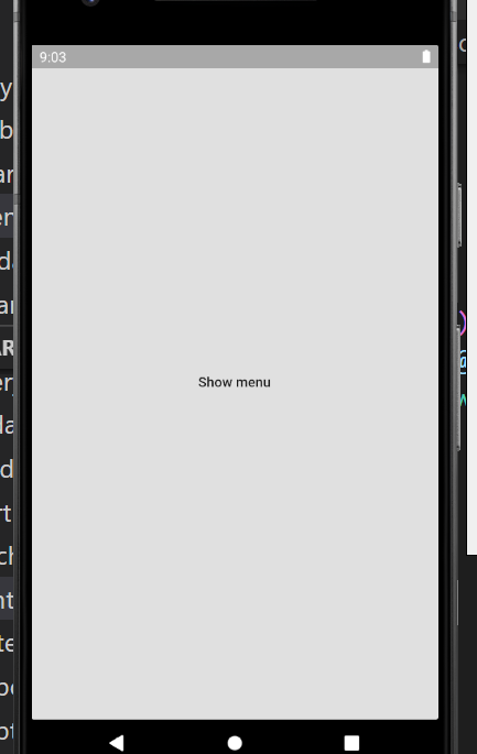
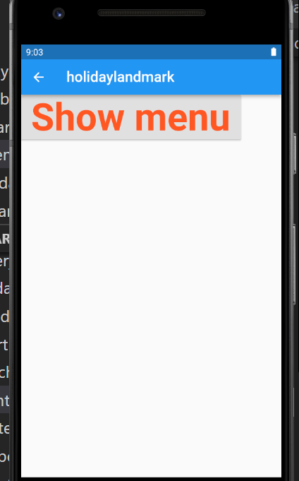
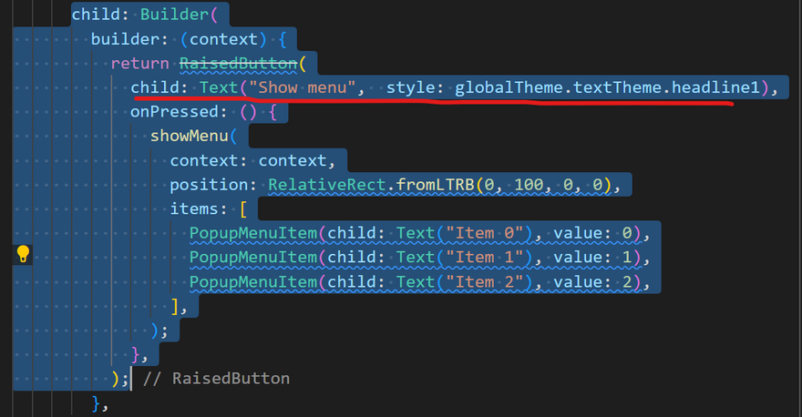
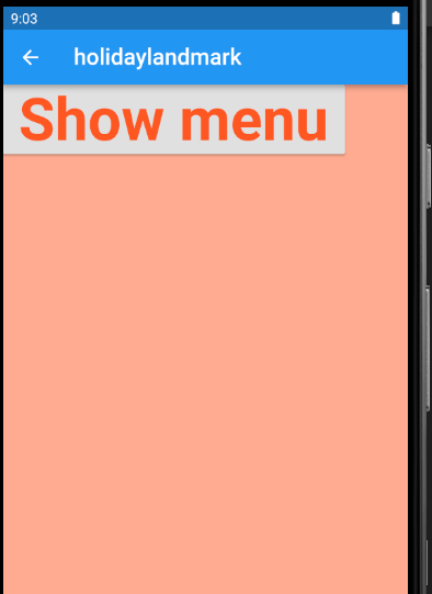
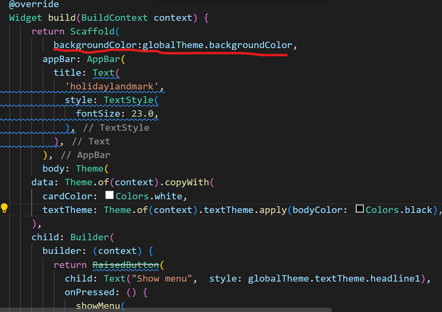
HOW TO CHANGE THE BACKGROUND COLOR OF POPUPMENUITEM UNDER THE SHOWMENU?-FLUTTER
Output Screenshot:
SOLUTION
@override
Widget build(BuildContext context) {
  return Theme(
    data: Theme.of(context).copyWith(
      cardColor: Colors.white,
      textTheme: Theme.of(context).textTheme.apply(bodyColor: Colors.black),
    ),
    child: Builder(
      builder: (context) {
        return RaisedButton(
          child: Text("Show menu"),
          onPressed: () {
            showMenu(
              context: context,
              position: RelativeRect.fromLTRB(0, 100, 0, 0),
              items: [
                PopupMenuItem(child: Text("Item 0"), value: 0),
                PopupMenuItem(child: Text("Item 1"), value: 1),
                PopupMenuItem(child: Text("Item 2"), value: 2),
              ],
            );
          },
        );
      },
    ),
  );
}
OUTPUT
after click showmenu
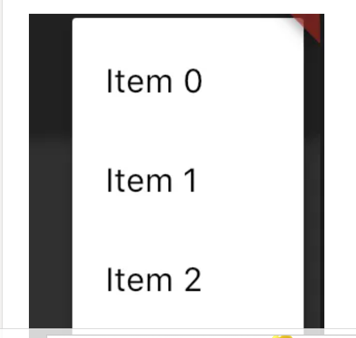
Full Summary:
return Theme--child: Builder--return RaisedButton--onPressed--showMenu()
Theme--cardColor(white),textTheme(black)
Refrence
Click here
HOW TO CHANGE TEXT COLOR BASED ON USER ID IN FLUTTER?-FLUTTER
Output Screenshot:
SOLUTION
Text(name,
     style: TextStyle(
            ccccccccccccccccccc: (user_id == 1)? Colors.red : (user_id) == 2 ?Colors.blue : Colors.black,
            fontWeight: FontWeight.bold
       ),),
 var backgroundColor = Colors.red;


    FutureBuilder(
    future: http.get('http://google.com')
    builder:(context,snapshot){
    backgroundColor =  snapshot.data[index].color

    return AwesomeData(snapshot.data)
    }
    ),
Full Summary:
inside TextStyle in color,apply ternary operato
Refrence
Click here
how-to-create-Searchable Dropdown
How to set timer using CircularProgressIndicator?
click here
click here
click here
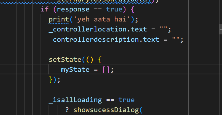
How to make drop down list and textfield empty.
click here
click here
click here
How to remove certain char from string in flutter
click here
click here
click here
click here
click here
How to show and hide/dismiss keyboard
click here
click here
click here
How to use Conditional statement in widget in flutter?
Make favorite function button on flutter app ?
click here
click here
click here
How to sort by alphabetical flutter app?
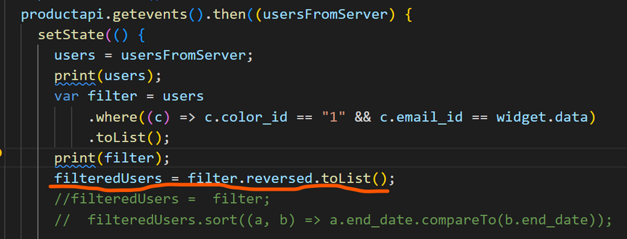
click here
click here
click here
click here
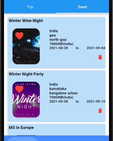
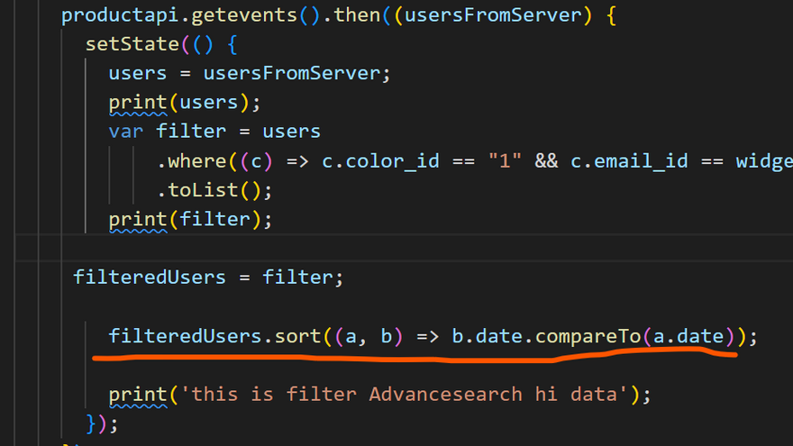
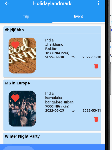
How to sort by date flutter app?
Verify Email | Firebase Authentication ?
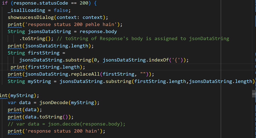
how-to-do-api-calling-in-flutter/
how-to-do-api-calling-in-flutter/

Top comments (0)