
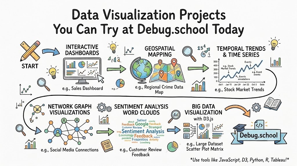
Data visualization is the practice of turning raw numbers, records, and patterns into charts, dashboards, maps, and visual stories that people can understand quickly. It helps you move from “I have data” to “I know what this data means.” That is why data visualization matters in almost every field, from business and finance to education, healthcare, operations, marketing, and software development. If you want to build practical skills instead of only reading theory, project-based learning gives you the fastest path. Platforms like debug.school can be a useful starting point because they encourage hands-on practice, experimentation, and problem-solving rather than passive learning.
The best part about data visualization projects is that they train multiple skills at once. You do not just learn how to draw a chart. You learn how to clean messy data, ask the right questions, choose the correct visual format, highlight trends, and explain results in plain language. That makes visualization one of the most practical ways to improve both technical and analytical thinking. Whether you are a beginner learning spreadsheets and dashboards or a developer exploring Python and BI tools, working on real projects helps you connect data with decisions.
In this guide, you will explore data visualization projects you can try, how to choose the right project for your level, what concepts matter most, and how these projects can build a strong career foundation. The goal is not only to show you what to create, but also to help you understand why each project matters, what skills it develops, and how to turn small practice work into a serious portfolio.
Why Data Visualization Projects Matter for Learning
Most people understand data visualization better when they build something with a real purpose. Reading about bar charts, pie charts, scatter plots, and dashboards can help, but the learning becomes deeper when you use those visuals to answer real questions. For example, if you build a student performance dashboard, you must think about attendance, marks, subjects, trends, and comparisons. That forces you to connect data design with human understanding. In other words, a project teaches judgment, not just software features.
Projects also help you understand the full journey of working with data. In real life, data rarely arrives in a perfect table. You often need to fix column names, remove duplicates, handle missing values, standardize dates, and group records before you can visualize anything useful. Once you start doing that repeatedly, you begin to understand the difference between attractive charts and meaningful charts. A project-based approach also gives you confidence because each completed dashboard or report becomes proof of skill that you can show to employers, clients, or your own team.
Another reason projects matter is that they reveal how communication works in data work. A chart is not useful simply because it looks polished. It becomes useful when it helps someone make a decision, spot a problem, or understand performance. A sales dashboard might help a manager identify weak regions. A support ticket report might help an operations team detect recurring failures. A student analytics dashboard might help a teacher see which learners need extra attention. Good projects train you to think about audience, action, and clarity.
How to Choose the Right Data Visualization Project
The right project is not always the biggest or most advanced one. It is the one that matches your current skill level while still stretching your thinking. If you are a beginner, start with clean datasets and simple business questions. For example, build a dashboard that tracks monthly expenses, product sales, movie ratings, or website traffic. These topics are easier to understand, which means you can focus on chart selection, layout, and storytelling instead of getting lost in domain complexity.
If you already know spreadsheet formulas, SQL basics, or Python libraries, move to projects that involve multiple tables, time-series trends, category filters, and user interaction. You can build dashboards for customer churn, employee performance, marketing campaigns, app usage, or bug tracking. These projects teach you how to combine data from different sources and present it in a way that supports decision-making. The more advanced your project becomes, the more important your thinking process becomes. You must decide what to include, what to hide, and what the user should notice first.
A strong project should meet three conditions. First, it should answer a real question rather than only display numbers. Second, it should include some data cleaning or transformation so you learn beyond chart creation. Third, it should produce an output that another person could understand without needing your constant explanation. If a dashboard can guide someone through performance, problems, and opportunities on its own, then you are building the right kind of project.
Beginner Data Visualization Projects You Can Try
Personal Expense Tracker Dashboard
A personal expense dashboard is one of the best beginner projects because the logic is simple, but the learning is deep. You can create a dataset with date, category, amount, payment method, and notes. Then you can visualize monthly spending, category breakdowns, savings trends, and unusual expenses. This project teaches you how to work with time-based data, category comparisons, and summary metrics. It also introduces you to the idea of filtering by month, category, or payment type.
The real value of this project is that it forces you to think about user behavior. What would help someone manage money better? Maybe a monthly spending trend line, a category-wise bar chart, and a card showing top expense categories. You can also add a budget versus actual comparison. That small step introduces performance tracking, which is useful in business dashboards as well. Even a simple personal dashboard can teach layout design, visual hierarchy, and metric selection.
Student Performance Analysis Dashboard
This project works well for learners because the data is easy to imagine and easy to explain. You can build a dashboard using student marks, attendance, subject-wise scores, assignment completion, and overall ranking. Then you can compare class averages, identify top performers, and track progress over time. This project helps you practice bar charts, line charts, heatmaps, and score distribution visuals. It also teaches you how to group records by student, subject, or class section.
More importantly, it trains you to think beyond totals. A good student dashboard should not only show marks. It should help answer questions like which subjects are hardest, whether attendance affects performance, and which students need support. That is where visualization becomes more than decoration. It becomes a decision tool. If you can build a dashboard that helps a teacher or school coordinator understand learning outcomes quickly, you are already thinking like a data professional.
Movie Ratings and Genre Insights Dashboard
A movie ratings dashboard is a fun project because it combines entertainment with useful analysis. You can use data such as movie title, genre, release period, audience rating, critic score, runtime, and revenue. Then you can visualize top genres, highest-rated titles, average rating by genre, or the relationship between runtime and rating. This project helps you explore scatter plots, ranking charts, and category-level comparisons while working with a dataset that feels less intimidating than business data.
This project also teaches an important lesson about framing the story. A chart showing top-rated movies is not enough. You can ask better questions: Which genres get the best ratings? Do longer movies perform better? Does popularity match quality? By turning a casual dataset into a question-driven dashboard, you build stronger analytical habits. That habit matters because professional data work is rarely about making charts. It is about helping people understand patterns they would otherwise miss.
Intermediate Data Visualization Projects for Skill Growth
Sales Performance Dashboard
A sales dashboard is one of the most practical intermediate projects because it mirrors real business reporting. You can include region, salesperson, product category, revenue, discount, profit, and order date. With that data, you can create monthly revenue trends, top-performing regions, product category contribution, and salesperson comparison charts. This project teaches you how to mix operational metrics with business context. It also introduces the idea of combining KPIs with drill-down analysis in one view.
The challenge in a sales project is not just building charts. It is deciding which metrics matter most. Revenue alone does not tell the full story. Profit margin, average order value, discount impact, and sales growth rate all add context. Once you start balancing these metrics, you learn how dashboards support business decisions rather than only display results. That is a major step forward in your learning journey because it moves you from visual design to performance analysis.
Website Traffic and User Engagement Dashboard
This project is excellent for anyone interested in digital marketing, product analytics, or web performance. You can work with data like page views, sessions, bounce rate, traffic source, device type, conversion events, and session duration. Then you can visualize traffic trends, source performance, landing page success, and user engagement patterns. This kind of project helps you understand funnel thinking because users do not just visit a site, they move through stages like landing, browsing, clicking, and converting.
It also helps you practice audience-focused reporting. A marketing manager may want campaign performance, while a product owner may care about user drop-off. A good dashboard must make both the summary and the details easy to read. You can add filters by channel, device, or page type to make the report more interactive. As a result, this project becomes a strong bridge between technical dashboarding and real business storytelling.
Customer Support Ticket Analysis Dashboard
A support ticket dashboard is a strong project for operations, product, and service teams. You can analyze ticket type, priority, issue category, assigned team, response time, resolution time, and customer satisfaction. Then you can visualize backlog size, average resolution time, frequent issue categories, and team-wise workload. This project teaches you how to represent operational efficiency visually, which is different from simple reporting. It also introduces service quality metrics and process bottlenecks.
The best part of this project is that it naturally leads to action-oriented insights. If ticket volume spikes in one category, maybe the product has a recurring issue. If resolution time increases for a specific team, maybe staffing or training is a problem. A dashboard like this helps you see the operational side of data visualization. It shows how charts can support workload balancing, escalation planning, and service improvement rather than just weekly reporting.
Advanced Data Visualization Projects for Portfolio Building
Business Intelligence Dashboard for Multi-Department Reporting
This project combines multiple business functions into one analytical system. You can connect sales, marketing, support, finance, and operations data into a unified dashboard. The challenge here is not only visual complexity but also data modeling. You need to align dates, categories, department names, and business metrics so they can be compared meaningfully. This teaches you how dashboards work at an organizational level rather than in isolated reports.
A strong multi-department dashboard can include revenue trends, campaign ROI, support workload, budget performance, and operational bottlenecks. It can also include filters for department, region, or time period. Building such a project shows that you understand both technical structure and business context. It is one of the best portfolio pieces because it demonstrates scale, clarity, and the ability to handle interconnected data rather than one simple table.
Public Data Storytelling Project
Public datasets are excellent for advanced projects because they let you work with real-world issues. You can create dashboards around air quality, road accidents, health outcomes, unemployment, education access, or population growth. These projects help you build storytelling skills because public data often needs more explanation than business dashboards. You must provide context, define measures clearly, and choose visuals that help readers understand social or civic patterns without confusion.
This type of project also improves your sense of responsibility as a data communicator. When data relates to people, regions, health, or public services, poor visualization can mislead readers. That is why you must be careful with scale, labels, and comparisons. If you can present public data in a way that is accurate, respectful, and understandable, you show maturity as a visualization practitioner. It proves that you can handle both technical work and communication ethics.
Product Analytics Dashboard for Feature Usage
If you are interested in software, SaaS, or digital products, this project is highly valuable. You can track feature usage, active users, retention, session frequency, click behavior, and user drop-off across the product journey. Then you can build visuals around feature adoption, retention curves, usage by customer segment, and common exit points. This project teaches product thinking because the goal is not only to report usage but to understand product value and friction.
A product analytics dashboard also helps you learn how to connect metrics with business outcomes. If one feature has high usage but low retention, what does that mean? If one user segment converts well but never uses advanced features, what should the product team improve? These questions move you beyond dashboard building into analytical reasoning. That is exactly what makes an advanced project powerful in interviews, freelancing, or internal reporting roles.
Key Operational Concepts You Must Know
Data visualization is not only about chart types. It also depends on a set of operational concepts that shape how data becomes insight. The first concept is data quality. If your data has missing values, duplicate rows, inconsistent labels, or broken date formats, your charts may look fine while still telling the wrong story. That is why cleaning, validation, and consistency checks are part of visualization work. A chart is only as trustworthy as the data behind it.
The second concept is metric definition. Terms like revenue, active users, conversion rate, ticket resolution time, and customer churn sound simple, but each one must be defined clearly. If two teams calculate the same metric differently, the dashboard loses credibility. You also need to understand granularity, which means the level of detail in your data. Daily records, monthly summaries, and transaction-level logs all create different kinds of visual possibilities. Finally, context matters. A number alone is rarely enough. Good dashboards compare actual values with targets, previous periods, categories, or benchmarks so the viewer can understand what the result really means.
Platform Implementation vs. Culture — What's the Real Difference?
Platform implementation is the technical side of visualization work. It includes choosing tools, importing data, building models, creating dashboards, setting filters, writing calculations, and managing refresh schedules. In simple terms, it is about building the system. Culture, on the other hand, is about how people use data in daily work. A company can have beautiful dashboards and still make poor decisions if teams ignore the data, misunderstand the metrics, or treat reporting as a formality.
That is the real difference. Platform implementation answers the question, “Can we build it?” Culture answers, “Will people use it well?” A strong data culture encourages curiosity, regular review, honest discussion, and action based on evidence. It also values clarity over complexity. In practical terms, this means a visualization project succeeds when users trust the dashboard, understand the metrics, and use the findings to improve work. So when you build projects, think beyond tools. Ask how the dashboard would fit into a real meeting, workflow, or decision process. That mindset makes your project more realistic and far more valuable.
Real-World Use Cases of Modern Operations
Modern operations teams rely heavily on dashboards because they need quick visibility into changing conditions. In customer support, a dashboard can show open tickets, average resolution time, and issue categories so managers can allocate work faster. In software operations, visualization helps teams monitor incidents, deployment trends, bug volume, and service performance. In marketing operations, dashboards track campaign spend, conversions, lead quality, and channel performance so teams can shift budget with better confidence.
In finance operations, visualization supports cash flow analysis, expense tracking, forecasting, and budget variance reviews. In HR operations, dashboards can show hiring pipeline progress, attrition trends, and training completion. In supply and logistics operations, teams use dashboards to monitor delivery time, inventory movement, supplier delays, and order fulfillment. These use cases matter because they show that data visualization is not a side skill. It is part of how modern organizations run, measure, and improve work. When you choose a project, it helps to tie it to one of these real use cases because that makes your portfolio feel practical and job-ready.
Common Mistakes in Operations Engineering
One common mistake is building a dashboard before defining the problem clearly. Many learners jump into chart creation without asking what decision the dashboard should support. As a result, the report looks busy but feels directionless. Another mistake is choosing visuals based on appearance instead of meaning. For example, a pie chart with too many categories or a stacked chart with unclear labels can make interpretation harder rather than easier. Good visualization depends on clarity, not decoration.
A second major mistake is ignoring data preparation. If dates are inconsistent, categories are duplicated, or totals are calculated incorrectly, the final dashboard becomes unreliable. Another frequent issue is overloading one page with too many metrics, colors, and filters. When everything is important, nothing stands out. Operations-focused dashboards must guide attention quickly because users often need fast answers. Finally, many beginners forget the audience. A dashboard for analysts can be more detailed, but a dashboard for managers should focus on decisions, exceptions, and trends. Matching the design to the user is a core skill in operations engineering and data visualization alike.
How to Become an Operations Expert — Career Roadmap
If you want to grow from visualization learner to operations expert, start by building a strong foundation in data handling. Learn spreadsheets well, especially sorting, filtering, lookup logic, pivots, and chart basics. Then move into SQL so you can query data directly. After that, learn one visualization platform deeply, whether that is Power BI, Tableau, Looker Studio, or a Python-based workflow. Your goal at this stage is not to know every tool. It is to understand how data flows from raw records to decisions.
Next, build domain understanding. Operations expertise is not only technical. You need to understand how businesses run, how teams measure performance, and what problems managers actually face. That means studying workflows like sales tracking, support management, website analytics, project delivery, and product performance. Once you have that context, your dashboards become sharper because you know what matters. Then start creating portfolio projects that reflect real operational problems rather than random chart collections.
A practical roadmap looks like this:
- Learn spreadsheet analysis and chart design fundamentals
- Practice SQL for filtering, joins, grouping, and metric creation
- Build 5 to 8 visualization projects across different domains
- Learn one BI tool deeply and one scripting workflow for automation
- Study KPI design, dashboard usability, and data storytelling
- Understand operations use cases in support, sales, marketing, finance, and product
- Present your projects with business questions, insights, and recommendations
- Keep improving through feedback, case studies, and repeated iteration
If you want to move into higher-value roles, add communication and problem framing to your skill set. The best operations experts do not just report numbers. They translate numbers into action. They can explain what changed, why it matters, and what should happen next. That combination of technical skill, operational understanding, and communication is what turns a dashboard builder into a trusted decision partner.
FAQ Section
What is the best first data visualization project for a beginner?
A personal expense tracker or student performance dashboard is usually the best starting point because the data structure is simple and the questions are easy to understand.
Do I need programming knowledge to start data visualization projects?
No, you can begin with spreadsheets or BI tools, but learning SQL and basic Python later will make your projects more powerful and flexible.
How many projects should I build for a strong portfolio?
A good target is 5 to 8 projects with different business problems, datasets, and dashboard styles so you can show range as well as depth.
What matters more, design or analysis?
Both matter, but analysis comes first. A clean dashboard is valuable only when it helps the viewer understand patterns, performance, or decisions clearly.
Can data visualization help in operations roles?
Yes, operations teams depend on dashboards for tracking performance, finding bottlenecks, monitoring service quality, and making faster decisions.
Which datasets are best for practice?
Start with datasets that are easy to understand, such as sales, expenses, student records, website traffic, or support tickets, then move to more complex business or public datasets.
How do I know if my dashboard is good?
Ask whether it answers a real question, whether the metrics are trustworthy, whether the visuals are easy to interpret, and whether another person can use it without confusion.
Final Summary
Data visualization projects are one of the best ways to build practical data skills because they combine analysis, communication, and problem-solving in one workflow. They teach you how to clean data, choose meaningful metrics, create useful visuals, and turn information into action. More importantly, they train you to think like someone who solves real problems instead of someone who only arranges charts on a page. That difference matters if you want to become valuable in analytics, operations, product, marketing, finance, or software teams.
If you are just starting, begin with projects like expense tracking, student performance analysis, or movie insights. If you already know the basics, move into sales, website analytics, and support dashboards. If you want a portfolio that stands out, build advanced projects around multi-department reporting, public data storytelling, or product analytics. Along the way, keep learning the operational concepts behind good dashboards, understand how platform work differs from data culture, and avoid the common mistakes that make reports confusing or untrustworthy.



Top comments (0)