Customizing Figure and Axes with plt.axes
Simple Visualization Commands
Customizing Figure and Axes with plt.axes()
import matplotlib.pyplot as plt


fig = plt.figure()

#[left, bottom, width, height]
ax = plt.axes([0.1, 0.1, 0.8, 0.8])
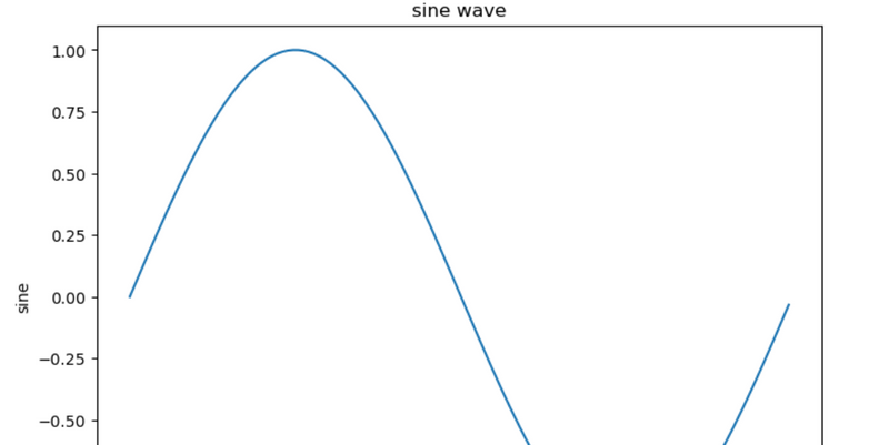
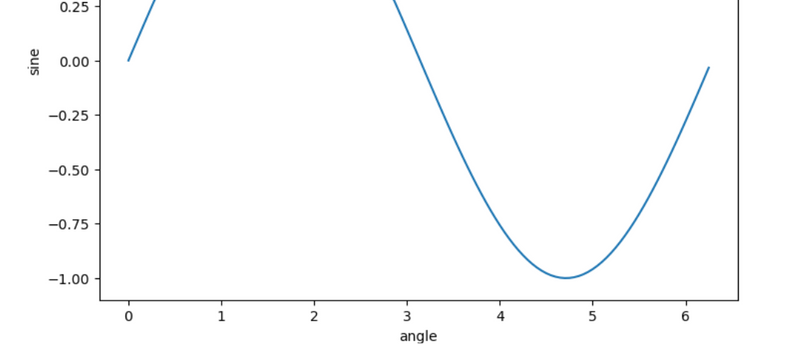
from matplotlib import pyplot as plt
import numpy as np
import math
x = np.arange(0, math.pi*2, 0.05)
y = np.sin(x)
fig = plt.figure()
ax = fig.add_axes([0,0,1,1])
ax.plot(x,y)
ax.set_title("sine wave")
ax.set_xlabel('angle')
ax.set_ylabel('sine')
plt.show()
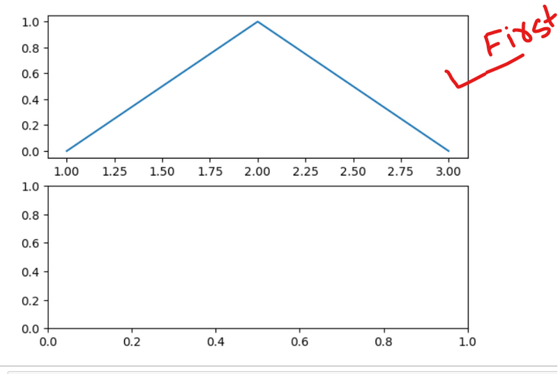
Utilizing plt.subplots() for Multi-Plot Figures
# importing library
import matplotlib.pyplot as plt

# Some data to display
x = [1, 2, 3]
y = [0, 1, 0]
z = [1, 0, 1]

# Creating 2 subplots
fig, ax = plt.subplots(2)
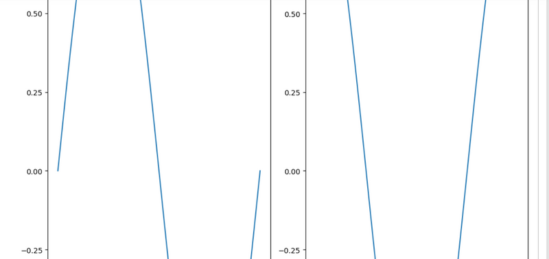
Creating Subplots with Matplotlib and Plotting Data on the First Subplot
# importing library
import matplotlib.pyplot as plt

# Some data to display
x = [1, 2, 3]
y = [0, 1, 0]
z = [1, 0, 1]

# Creating 2 subplots
fig, ax = plt.subplots(2)
ax[0].plot(x, y)
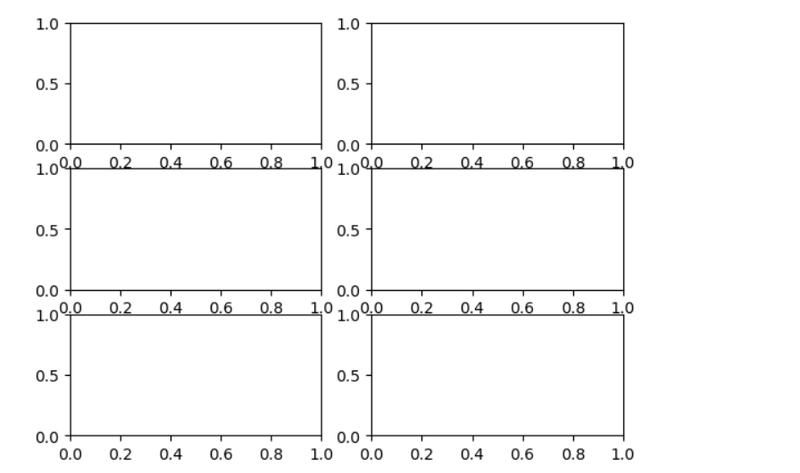
Creating a Grid of 6 Subplots with Matplotlib and Numpy
import matplotlib.pyplot as plt
import numpy as np

# Data for plotting
x = np.arange(0.0, 2.0, 0.01)
y = 1 + np.sin(2 * np.pi * x)

# Creating 6 subplots and unpacking the output array immediately
fig, ((ax1, ax2), (ax3, ax4), (ax5, ax6)) = plt.subplots(3, 2)
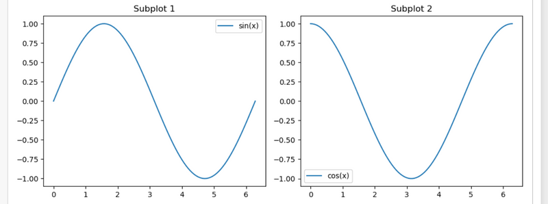
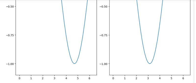
Visualizing Sine and Cosine Functions in a 1x2 Grid with Matplotlib and Numpy
import numpy as np
Create some sample data
x = np.linspace(0, 2 * np.pi, 100)
y1 = np.sin(x)
y2 = np.cos(x)
Create a figure with 2 subplots in a 1x2 grid figsize=(10, 4): This parameter specifies the width and height of the figure in inches. In this example, the figure is set to be 10 inches wide and 4 inches tall.
plt.figure(figsize=(10, 4))

# Subplot 1
plt.subplot(1, 2, 1)
plt.plot(x, y1, label='sin(x)')
plt.title('Subplot 1')
plt.legend()

# Subplot 2
plt.subplot(1, 2, 2)
plt.plot(x, y2, label='cos(x)')
plt.title('Subplot 2')
plt.legend()

# Adjust layout to prevent overlapping
plt.tight_layout()

# Show the plot
plt.show()
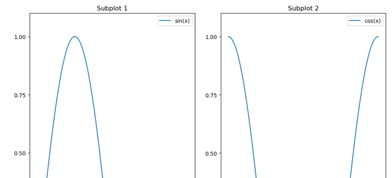
Visualizing Sine and Cosine Functions in a 1x2 Grid with Matplotlib and Numpy
import matplotlib.pyplot as plt
import numpy as np

# Create some sample data
x = np.linspace(0, 2 * np.pi, 100)
y1 = np.sin(x)
y2 = np.cos(x)

# Create a figure with 2 subplots in a 1x2 grid figsize=(10, 4): This parameter specifies the width and height of the figure in inches. In this example, the figure is set to be 10 inches wide and 4 inches tall.
plt.figure(figsize=(10, 14))

# Subplot 1
plt.subplot(1, 2, 1)
plt.plot(x, y1, label='sin(x)')
plt.title('Subplot 1')
plt.legend()

# Subplot 2
plt.subplot(1, 2, 2)
plt.plot(x, y2, label='cos(x)')
plt.title('Subplot 2')
plt.legend()

# Adjust layout to prevent overlapping
plt.tight_layout()

# Show the plot
plt.show()
syntax:
seaborn.heatmap(data, *, vmin=None, vmax=None, cmap=None, center=None, annot_kws=None, linewidths=0, linecolor=’white’, cbar=True, **kwargs)
Important Parameters:
data: 2D dataset that can be coerced into an ndarray.
vmin, vmax: Values to anchor the colormap, otherwise they are inferred from the data and other keyword arguments.
cmap: The mapping from data values to color space.
center: The value at which to center the colormap when plotting divergent data.
annot: If True, write the data value in each cell.
fmt: String formatting code to use when adding annotations.
linewidths: Width of the lines that will divide each cell.
linecolor: Color of the lines that will divide each cell.
cbar: Whether to draw a colorbar.
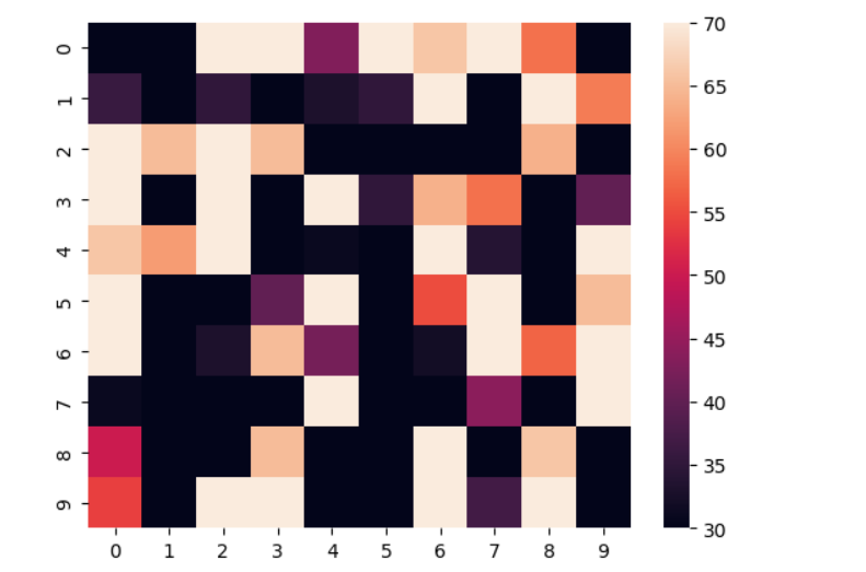
Visualizing a 10x10 Matrix of Random Numbers Using Heatmap
# importing the modules
import numpy as np
import seaborn as sn
import matplotlib.pyplot as plt

# generating 2-D 10x10 matrix of random numbers
# from 1 to 100
data = np.random.randint(low=1,
                         high=100,
                         size=(10, 10))

# setting the parameter values
vmin = 30
vmax = 70

# plotting the heatmap
hm = sn.heatmap(data=data,
                vmin=vmin,
                vmax=vmax)

# displaying the plotted heatmap
plt.show()
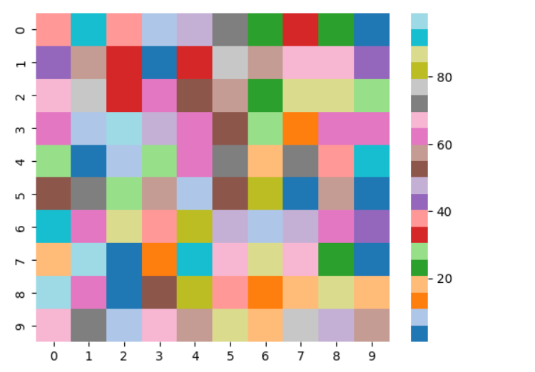
Visualizing a 2-D Matrix with a Heatmap Using Matplotlib and Seaborn in Python
# importing the modules
# Matplotlib provides us with multiple colormaps
import numpy as np
import seaborn as sn
import matplotlib.pyplot as plt

# generating 2-D 10x10 matrix of random numbers
# from 1 to 100
data = np.random.randint(low=1,
                         high=100,
                         size=(10, 10))

# setting the parameter values
cmap = "tab20"

# plotting the heatmap
hm = sn.heatmap(data=data,
                cmap=cmap)

# displaying the plotted heatmap
plt.show()
output
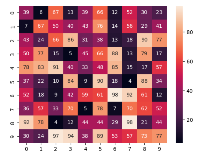
Enhancing Heatmap Visualization in Python with Cell Annotations Using Matplotlib and Seaborn
# importing the modules
# If we want to display the value of the cells, then we pass the parameter annot as True. fmt is used to select the datatype of the contents of the cells displayed.
import numpy as np
import seaborn as sn
import matplotlib.pyplot as plt

# generating 2-D 10x10 matrix of random numbers
# from 1 to 100
data = np.random.randint(low=1,
                         high=100,
                         size=(10, 10))

# setting the parameter values
annot = True

# plotting the heatmap
hm = sn.heatmap(data=data,
                annot=annot)

# displaying the plotted heatmap
plt.show()
output
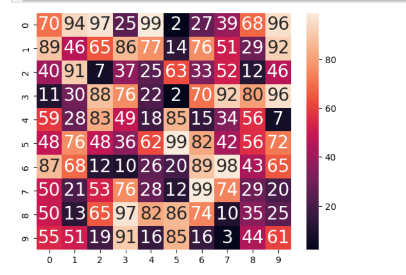
Customizing Heatmap Cell Annotations Size in Python with Matplotlib and Seaborn
# importing the modules
# If we want to display the value of the cells, then we pass the parameter annot as True. fmt is used to select the datatype of the contents of the cells displayed.
import numpy as np
import seaborn as sn
import matplotlib.pyplot as plt

# generating 2-D 10x10 matrix of random numbers
# from 1 to 100
data = np.random.randint(low=1,
                         high=100,
                         size=(10, 10))

# setting the parameter values
annot = True

# plotting the heatmap
hm = sn.heatmap(data=data,annot=True,
                annot_kws={'size':20})

# displaying the plotted heatmap
plt.show()
output
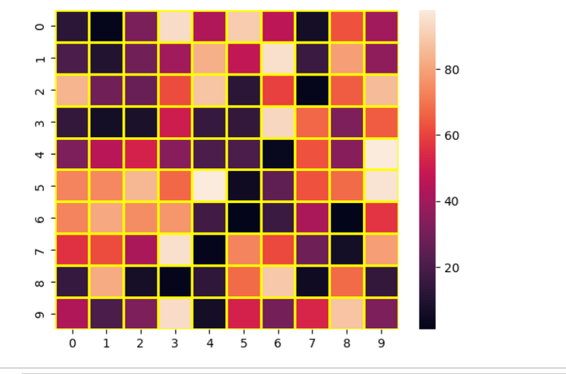
Styling Heatmap Grid Lines in Python Using Matplotlib and Seaborn
# importing the modules
import numpy as np
import seaborn as sn
import matplotlib.pyplot as plt

# generating 2-D 10x10 matrix of random numbers
# from 1 to 100
data = np.random.randint(low=1,
                         high=100,
                         size=(10, 10))

# setting the parameter values
linewidths = 2
linecolor = "yellow"

# plotting the heatmap
hm = sn.heatmap(data=data,
                linewidths=linewidths,
                linecolor=linecolor)

# displaying the plotted heatmap
plt.show()
output
Some More Examples
plt.figure(figsize=(26, 14))
sns.heatmap(df.corr(),annot=True,fmt='0.2f',linewidth=0.2,linecolor='black',cmap='Spectral')
plt.xlabel('Figure',fontsize=14)
plt.ylabel('Feature_Name',fontsize=14)
plt.title('Descriptive Graph',fontsize=20)
plt.show()
hm = sn.heatmap(data=data,annot=True,
                annot_kws={'size':20})
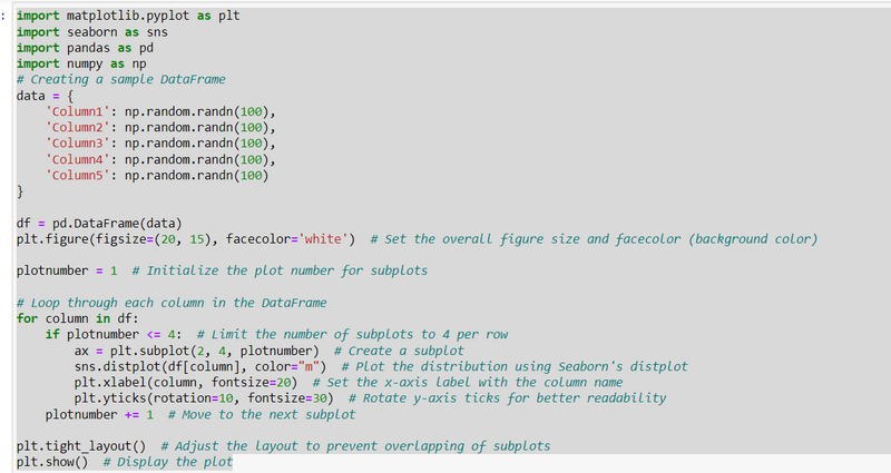
"Exploring Distributions of Multiple Variables with Subplots in Python using Matplotlib and Seaborn
Distribution Plots for Multiple Features:
"Understanding Feature Distributions: Multiple Distplots in a Pandas DataFrame"
"Utilizing Distplot to Visualize the Distribution of Features"
"Optimizing Subplot Arrangement for Clarity"
import matplotlib.pyplot as plt
import seaborn as sns
import pandas as pd
import numpy as np
# Creating a sample DataFrame
data = {
    'Column1': np.random.randn(100),
    'Column2': np.random.randn(100),
    'Column3': np.random.randn(100),
    'Column4': np.random.randn(100),
    'Column5': np.random.randn(100)
}

df = pd.DataFrame(data)
plt.figure(figsize=(20, 15), facecolor='white')  # Set the overall figure size and facecolor (background color)

plotnumber = 1  # Initialize the plot number for subplots

# Loop through each column in the DataFrame
for column in df:
    if plotnumber <= 4:  # Limit the number of subplots to 4 per row
        ax = plt.subplot(2, 4, plotnumber)  # Create a subplot
        sns.distplot(df[column], color="m")  # Plot the distribution using Seaborn's distplot
        plt.xlabel(column, fontsize=20)  # Set the x-axis label with the column name
        plt.yticks(rotation=10, fontsize=30)  # Rotate y-axis ticks for better readability
    plotnumber += 1  # Move to the next subplot

plt.tight_layout()  # Adjust the layout to prevent overlapping of subplots
plt.show()  # Display the plot
output
plt.figure(figsize=(20, 15), facecolor='red')
plotnumber = 1

# Adjust the subplot grid to accommodate more subplots
for column in df:
    if plotnumber <= 12:
        ax = plt.subplot(3, 4, plotnumber)  # Adjusted to a 3x4 grid
        sns.distplot(df[column])
        plt.xlabel(column, fontsize=20)
    plotnumber += 1

plt.tight_layout()
plt.show()
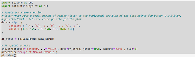
Visualizing Categorical Data with Stripplot in Python using Seaborn
import seaborn as sns
import matplotlib.pyplot as plt

# Sample DataFrame creation
#jitter=True: Adds a small amount of random jitter to the horizontal position of the data points for better visibility.
# palette='Set1': Sets the color palette for the plot.
data_strip = {
    'Category': ['A', 'A', 'B', 'B', 'C', 'C', 'C'],
    'Value': [1.2, 1.5, 2.0, 1.8, 0.5, 0.8, 1.0]
}

df_strip = pd.DataFrame(data_strip)

# Stripplot example
sns.stripplot(x='Category', y='Value', data=df_strip, jitter=True, palette='Set1', size=8)
plt.title('Stripplot Manual Example')
plt.show()
output
Visualizing Relationships with Scatterplot in Python using Seaborn
# Sample DataFrame creation
data_scatter = {
    'X': [1.2, 2.5, 3.0, 4.2, 5.5, 6.8, 7.0],
    'Y': [2.0, 3.5, 4.0, 1.8, 5.5, 2.8, 4.0]
}

df_scatter = pd.DataFrame(data_scatter)

# Scatterplot example
sns.scatterplot(x='X', y='Y', data=df_scatter, marker='o', color='coral', s=80)
plt.title('Scatterplot Manual Example')
plt.show()
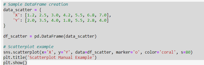
output
Creating Informative Barplots in Python with Seaborn: A Palette Exploration
import seaborn as sns
import matplotlib.pyplot as plt

# Sample DataFrame creation
# https://www.debug.school/rakeshdevcotocus_468/explain-different-type-of-palette-in-seabborn-pgd
data_bar = {
    'Category': ['A', 'B', 'C', 'D'],
    'Value': [15, 28, 20, 35]
}

df_bar = pd.DataFrame(data_bar)

# Barplot example
sns.barplot(x='Category', y='Value', data=df_bar, palette='pastel', ci=None)
plt.title('Barplot Example')
plt.show(

)
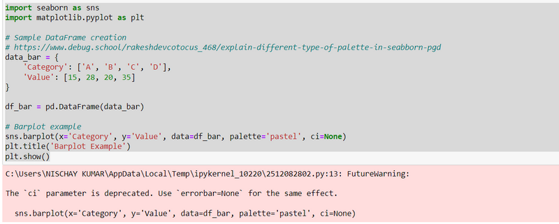
output
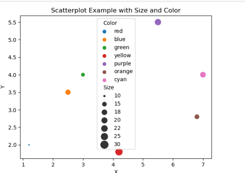
"Enhancing Scatterplot Visualization with Size and Color in Python using Seaborn
# Sample DataFrame creation
data_scatter = {
    'X': [1.2, 2.5, 3.0, 4.2, 5.5, 6.8, 7.0],
    'Y': [2.0, 3.5, 4.0, 1.8, 5.5, 2.8, 4.0],
    'Size': [10, 20, 15, 30, 25, 18, 22],
    'Color': ['red', 'blue', 'green', 'yellow', 'purple', 'orange', 'cyan']
}

df_scatter = pd.DataFrame(data_scatter)

# Scatterplot example with size and color parameters
sns.scatterplot(x='X', y='Y', size='Size', hue='Color', data=df_scatter, sizes=(10, 200), legend='full')
plt.title('Scatterplot Example with Size and Color')
plt.show()
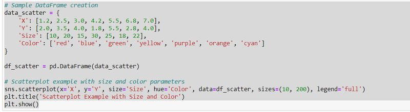
output
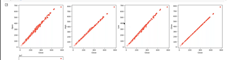
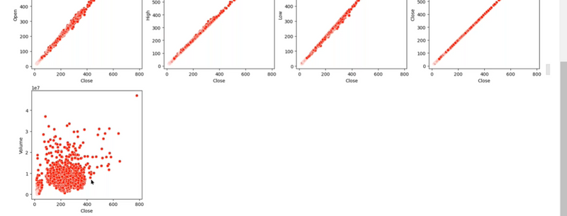
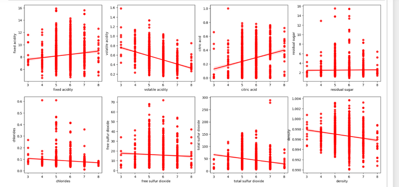
Scatter Plots with Quality as Target:
"Visualizing Scatter Plots: Quality as Target Variable in a Pandas DataFrame"
"Examining Feature Relationships with Quality through Scatter Plots"
"Identifying Patterns and Trends in the Data
plt.figure(figsize=(20, 25))
p = 1
for i in df:
    if p <= 17:
        # Distplot
        plt.subplot(5, 4, p)
        sns.scatterplot(x='quality',y=i,data=df,color='r')
        plt.xlabel(i)
    p += 1
plt.show()
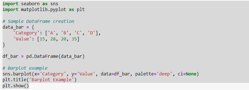
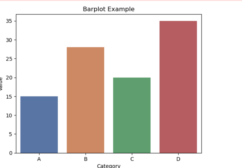
Creating Striking Barplots in Python with Seaborn: Exploring the 'deep' Palette
import seaborn as sns
import matplotlib.pyplot as plt

# Sample DataFrame creation
data_bar = {
    'Category': ['A', 'B', 'C', 'D'],
    'Value': [15, 28, 20, 35]
}

df_bar = pd.DataFrame(data_bar)

# Barplot example
sns.barplot(x='Category', y='Value', data=df_bar, palette='deep', ci=None)
plt.title('Barplot Example')
plt.show()
output
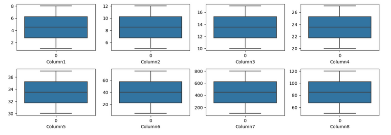
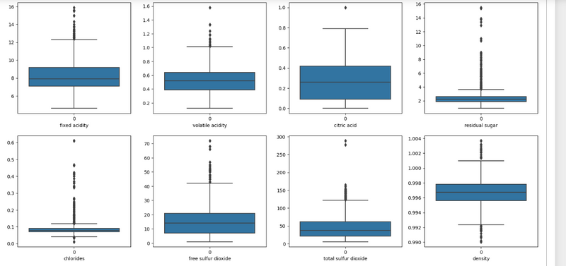
Visualizing Data Distribution with Box Plots for Multiple Features in a Pandas DataFrame
Utilizing Seaborn to Create Box Plots and Identify Outliers
Optimizing Subplot Arrangement for Better Visualization
import pandas as pd
import seaborn as sns
import matplotlib.pyplot as plt

# Assuming you have a dataset named df
# You can create a sample DataFrame for illustration purposes
data = {
    'Column1': [1, 2, 3, 4, 5, 6, 7, 8],
    'Column2': [5, 6, 7, 8, 9, 10, 11, 12],
    'Column3': [10, 11, 12, 13, 14, 15, 16, 17],
    'Column4': [20, 21, 22, 23, 24, 25, 26, 27],
    'Column5': [30, 31, 32, 33, 34, 35, 36, 37],
    'Column6': [5, 15, 25, 35, 45, 55, 65, 75],
    'Column7': [100, 200, 300, 400, 500, 600, 700, 800],
    'Column8': [50, 60, 70, 80, 90, 100, 110, 120]
}

df = pd.DataFrame(data)

# Set up the subplot grid
plt.figure(figsize=(12, 10))
p = 1

# Loop through the columns and create boxplots
for i in df:
    if p <= 8:
        plt.subplot(5, 4, p)
        sns.boxplot(df[i])
        plt.xlabel(i)
    p += 1

# Adjust layout to prevent overlapping
plt.tight_layout()

# Show the boxplot
plt.show()
plt.figure(figsize=(20, 25))
p = 1
for i in df:
    if p <= 8:
        # Distplot
        plt.subplot(5, 4, p)
        sns.boxplot(df[i])
        plt.xlabel(i)
    p += 1
plt.show()
output
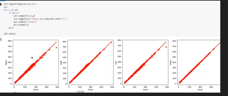
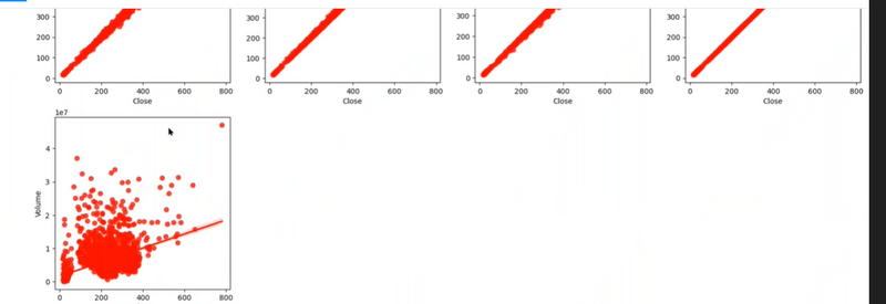
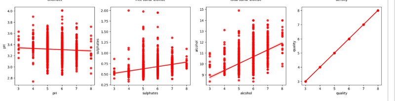
Analyzing Regression Patterns: Quality as Target Variable in a Pandas DataFrame"
"Creating Regression Plots for Multiple Features Against Quality"
"Assessing Relationship Strength and Direction
plt.figure(figsize=(20, 25))
p = 1
for i in df:
    if p <= 17:
        # Distplot
        plt.subplot(5, 4, p)
        sns.regplot(x='quality',y=i,data=df,color='r')
        plt.xlabel(i)
    p += 1
plt.show()
plt.figure(figsize=(20, 25))
p = 1
for i in df:
    if p <= 17:

        plt.subplot(5, 4, p)
        sns.regplot(x='quality',y=i,data=df,color='r')
        plt.xlabel(i)
    p += 1
plt.show()
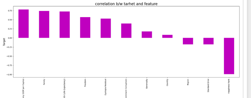
Correlation Bar Plot:
"Exploring Feature Correlation with Happiness Score in Pandas DataFrame"
"Creating a Bar Plot to Visualize Correlation Strengths"
"Analyzing the Relationship Between Features and Happiness Score"
plt.figure(figsize=(22, 7))
df.corr()['Happiness Score'].sort_values(ascending=False).drop(['Happiness Score']).plot(kind="bar",color="m")
plt.xlabel('Feature',fontsize=14)
plt.ylabel('Target',fontsize=14)
plt.title('correlation b/w tarhet and feature',fontsize=20)
plt.show()
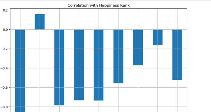
df.drop('Happiness Rank', axis=1).corrwith(df['Happiness Rank']).plot(kind='bar', grid=True, figsize=(10, 7), title='Correlation with Happiness Rank')
plt.show()
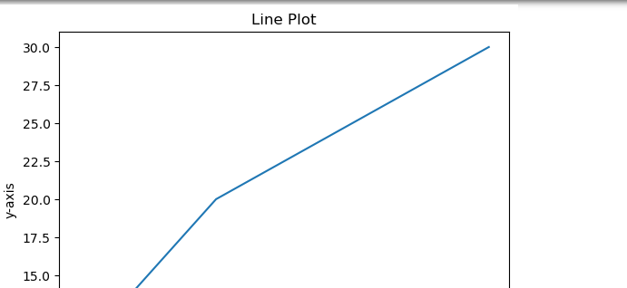
Simple Visualization Commands
import matplotlib.pyplot as plt

x = [1, 2, 3, 4]
y = [10, 20, 25, 30]

plt.plot(x, y)
plt.title('Line Plot')
plt.xlabel('x-axis')
plt.ylabel('y-axis')
plt.show()
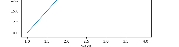
import matplotlib.pyplot as plt

x = [1, 2, 3, 4]
y = [10, 20, 25, 30]

plt.scatter(x, y)
plt.title('Scatter Plot')
plt.xlabel('x-axis')
plt.ylabel('y-axis')
plt.show()
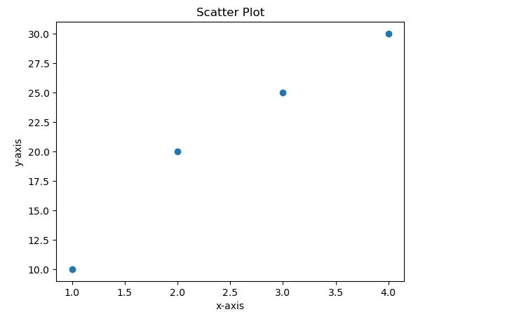
import matplotlib.pyplot as plt

categories = ['A', 'B', 'C', 'D']
values = [3, 7, 8, 5]

plt.bar(categories, values)
plt.title('Bar Plot')
plt.xlabel('Categories')
plt.ylabel('Values')
plt.show()
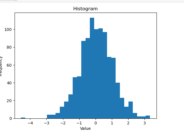
import matplotlib.pyplot as plt
import numpy as np

data = np.random.randn(1000)

plt.hist(data, bins=30)
plt.title('Histogram')
plt.xlabel('Value')
plt.ylabel('Frequency')
plt.show()
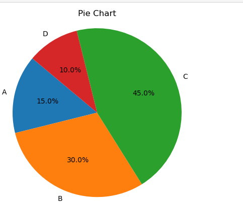
import matplotlib.pyplot as plt

labels = 'A', 'B', 'C', 'D'
sizes = [15, 30, 45, 10]

plt.pie(sizes, labels=labels, autopct='%1.1f%%', startangle=140)
plt.title('Pie Chart')
plt.axis('equal')  # Equal aspect ratio ensures that pie is drawn as a circle.
plt.show()
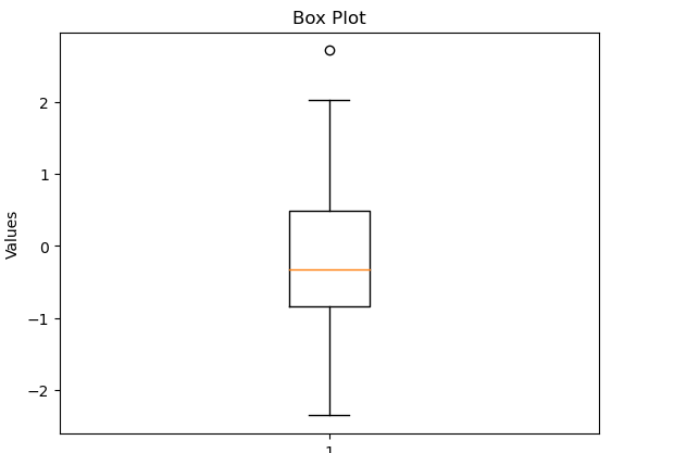
import matplotlib.pyplot as plt
import numpy as np

data = np.random.randn(100)

plt.boxplot(data)
plt.title('Box Plot')
plt.ylabel('Values')
plt.show()
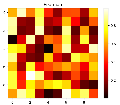
import matplotlib.pyplot as plt
import numpy as np

data = np.random.rand(10, 10)

plt.imshow(data, cmap='hot', interpolation='nearest')
plt.title('Heatmap')
plt.colorbar()
plt.show()
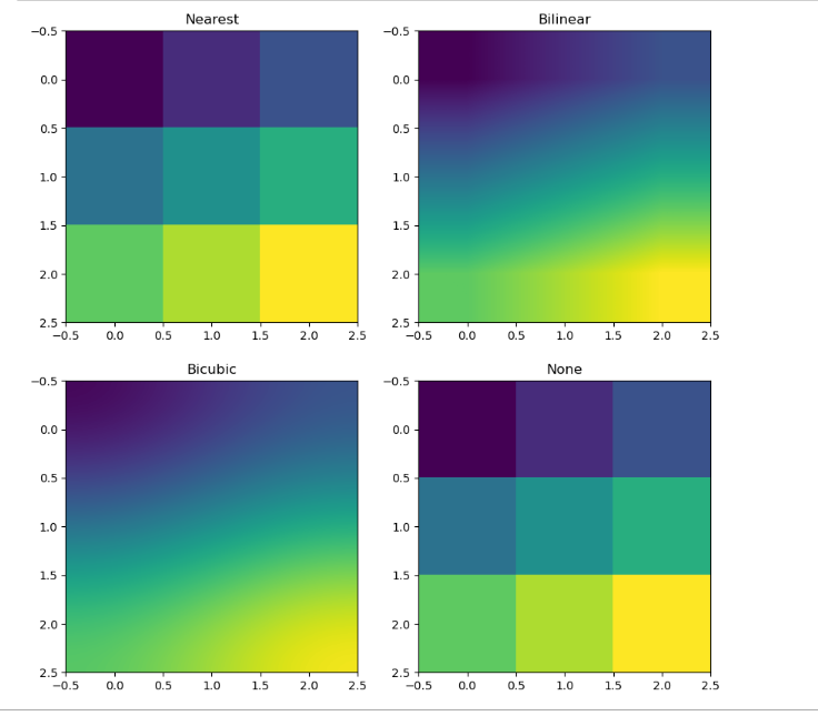
import matplotlib.pyplot as plt
import numpy as np

# Create a small image with a few pixels
img = np.array([[0, 1, 2], [3, 4, 5], [6, 7, 8]])

# Display the image with different interpolation methods
fig, axs = plt.subplots(2, 2, figsize=(10, 10))

axs[0, 0].imshow(img, interpolation='nearest')
axs[0, 0].set_title('Nearest')

axs[0, 1].imshow(img, interpolation='bilinear')
axs[0, 1].set_title('Bilinear')

axs[1, 0].imshow(img, interpolation='bicubic')
axs[1, 0].set_title('Bicubic')

axs[1, 1].imshow(img, interpolation='none')
axs[1, 1].set_title('None')

plt.show()
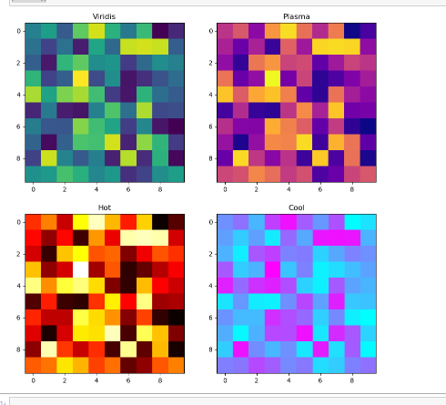
import matplotlib.pyplot as plt
import numpy as np

# Create a 2D array of random data
data = np.random.rand(10, 10)

# Display the data with different colormaps
fig, axs = plt.subplots(2, 2, figsize=(10, 10))

axs[0, 0].imshow(data, cmap='viridis')
axs[0, 0].set_title('Viridis')

axs[0, 1].imshow(data, cmap='plasma')
axs[0, 1].set_title('Plasma')

axs[1, 0].imshow(data, cmap='hot')
axs[1, 0].set_title('Hot')

axs[1, 1].imshow(data, cmap='cool')
axs[1, 1].set_title('Cool')

plt.show()
http://localhost:8888/notebooks/visualization-practice1.ipynb#
http://localhost:8888/notebooks/visualization-practice2.ipynb
http://localhost:8888/notebooks/data%20visulization%203rd.ipynb

Top comments (0)