In Seaborn, palettes are color schemes that can be applied to enhance the visual appeal of plots. Below are some different types of palettes that can be used in Seaborn:
Default palettes:
Seaborn has default color palettes that can be used without specifying a specific palette name. Examples include
'deep', 'muted', 'bright', 'pastel', 'dark', and 'colorblind'.
sns.barplot(x='Category', y='Value', data=df_bar, palette='pastel')
import seaborn as sns
import matplotlib.pyplot as plt
# Sample DataFrame creation
data_bar = {
'Category': ['A', 'B', 'C', 'D'],
'Value': [15, 28, 20, 35]
}
df_bar = pd.DataFrame(data_bar)
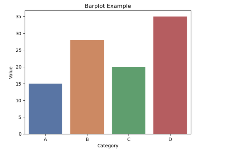
# Barplot example
sns.barplot(x='Category', y='Value', data=df_bar, palette='deep', ci=None)
plt.title('Barplot Example')
plt.show()
import seaborn as sns
import matplotlib.pyplot as plt
# Sample DataFrame creation
data_bar = {
'Category': ['A', 'B', 'C', 'D'],
'Value': [15, 28, 20, 35]
}
df_bar = pd.DataFrame(data_bar)
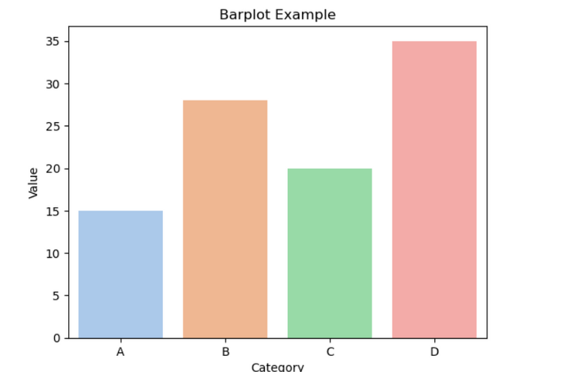
# Barplot example
sns.barplot(x='Category', y='Value', data=df_bar, palette='pastel', ci=None)
plt.title('Barplot Example')
plt.show()
Categorical color palettes:
These palettes are suitable for categorical data and include options like
'Set1', 'Set2', 'Set3', 'husl', and 'hls'.
sns.barplot(x='Category', y='Value', data=df_bar, palette='Set1')
Sequential color palettes:
These palettes are suitable for ordered data and vary from light to dark. Examples include
'Blues', 'Greens', 'Oranges', and 'Purples'.
sns.scatterplot(x='X', y='Y', size='Size', hue='Color', data=df_scatter, palette='Blues')
Diverging color palettes:
These palettes use two contrasting colors and are suitable for data with a meaningful middle point. Examples include
'RdBu', 'PuOr', and 'BrBG'.
sns.scatterplot(x='X', y='Y', size='Size', hue='Color', data=df_scatter, palette='RdBu')
Custom palettes:
You can create custom palettes using a list of colors or a colormap.
custom_palette = ['red', 'green', 'blue']
sns.barplot(x='Category', y='Value', data=df_bar, palette=custom_palette)
custom_colormap = sns.color_palette("coolwarm", as_cmap=True)
sns.scatterplot(x='X', y='Y', size='Size', hue='Color', data=df_scatter, palette=custom_colormap)
These are just a few examples, and Seaborn provides a variety of other palettes and options to customize the appearance of your plots. You can explore the Seaborn documentation for more details

Top comments (0)