my external css
#content main {
    width: 100%;
    /* padding: 36px 24px; */
    font-family: var(--poppins);
    max-height: calc(100vh - 56px);
     overflow-y: auto !important;
}
To remove or override the external CSS rule:
content main { overflow-y: auto; }
inline blade file
<style>
  #content main {
    overflow-y: unset !important;
  }
</style>
 #content main {
            overflow-y: unset !important;
        }
full code
    <style>

.week-availability {
    font-family: 'Arial', sans-serif; /* Choose a modern, clean font */
    font-size: 1.5rem; /* Slightly larger text for prominence */
    color: #2c3e50; /* Dark blue-gray color for elegance */
    background-color: #ecf0f1; /* Light gray background to contrast text */
    padding: 15px; /* Space around the text */
    border-radius: 8px; /* Rounded corners for a soft look */
    border: 1px solid #bdc3c7; /* Subtle border for definition */
    text-align: center; /* Center-align the text */
    margin: 20px auto; /* Space above and below, centering horizontally */
    width: fit-content; /* Shrinks the container to the content width */
    box-shadow: 0px 4px 6px rgba(0, 0, 0, 0.1); /* Adds a subtle shadow */
  }

  .week-availability:hover {
    background-color: #007bff; /* Slightly darker gray on hover */
    transition: background-color 0.3s ease; /* Smooth color transition */
  }


        .availability-list {
            display: flex;
            flex-wrap: wrap;
            gap: 10px;
            justify-content: center;
        }

        .availability-item {
            padding: 10px 15px;
            border: 1px solid #ddd;
            border-radius: 5px;
            text-align: center;
            width: 150px;
            font-size: 14px;
            background-color: #f9f9f9;
        }

        .availability-item p {
            margin: 0;
            font-weight: bold;
        }

        .availability-item p:nth-child(2) {
            color: green;
        }


        .vehicle-title {
            text-align: center;
            font-weight: bold;
            font-size: 1.5rem;
            color: #333;
            margin-bottom: 20px;
            padding: 10px 0;
            border-bottom: 2px solid #007bff;
            display: flex;
            align-items: center;
            justify-content: center;
            gap: 10px;
        }

        .vehicle-count {
            font-size: 1rem;
            font-weight: normal;
            color: #007bff;
            background-color: #e9f5ff;
            padding: 5px 10px;
            border-radius: 5px;
        }

        .available {
            background-color: #e8f5e9;
            color: green;
            border: 1px solid #ccc;
        }

        .not-available {
            background-color: #ffebee;
            color: red;
            border: 1px solid #ccc;
            cursor: pointer;
        }

        /* =============== */
        /* Base styling for the availability-item container */
        .availability-item {
            padding: 15px;
            border: 1px solid #ddd;
            border-radius: 8px;
            text-align: center;
            width: 150px;
            transition: all 0.3s ease-in-out;
            /* Smooth transitions */
            font-family: Arial, sans-serif;
            font-size: 14px;
            cursor: pointer;
        }

        /* Styling for AVAILABLE items */
        .availability-item.available {
            background-color: #e8f5e9;
            /* Light green */
            color: #2e7d32;
            /* Dark green */
            border: 1px solid #c8e6c9;
            /* Green border */
            box-shadow: 0 2px 5px rgba(0, 0, 0, 0.1);
            /* Light shadow */
        }

        /* Styling for NOT AVAILABLE items */
        .availability-item.not-available {
            background-color: #ffebee;
            /* Light red */
            color: #c62828;
            /* Dark red */
            border: 1px solid #ef9a9a;
            /* Red border */
            box-shadow: 0 2px 5px rgba(0, 0, 0, 0.1);
            /* Light shadow */
        }

        /* Hover effects for all items */
        .availability-item:hover {
            transform: scale(1.05);
            /* Slight zoom on hover */
            box-shadow: 0 4px 10px rgba(0, 0, 0, 0.2);
            /* Darker shadow on hover */
        }

        /* Styling for text inside the availability item */
        .availability-item p {
            margin: 5px 0;
            font-weight: bold;
        }

        /* Styling for tooltips (optional) */
        .tooltip {
            font-size: 12px;
            line-height: 1.5;
            background-color: #333;
            color: #fff;
            border-radius: 5px;
            padding: 8px;
            max-width: 200px;
            text-align: left;
        }

        /* Add some spacing between availability items */
        .availability-list {
            display: flex;
            flex-wrap: wrap;
            gap: 15px;
            justify-content: center;
        }

        /* =============== */
        /* ======pagination css========= */
        .pagination-list {
        list-style: none;
        padding: 0;
        display: inline-flex;
        align-items: center;
    }

    .pagination-list li {
        margin: 0 5px;
    }

    .pagination-list li a {
        text-decoration: none;
        color: #000;
    }

    .pagination-list li.active a {
        font-weight: bold;
        color: red;
        /* Change color to highlight the active page */
    }

    .pagination-list li.disabled span {
        color: #ccc;
        /* Styling for disabled previous/next */
        cursor: not-allowed;
    }

        /* ======pagination css========= */

.responsivebtn {
  display: flex;
  flex-direction: column;
  gap: 12px; /* space between buttons */
  max-width: 400px; /* optional: limits group width */
  margin: 0 auto;   /* optional: centers group */
}

.responsivebtn .btn {
  width: 100%;
  box-sizing: border-box;
  padding: 10px 16px;
  font-size: 1rem;
  border: none;
  border-radius: 4px;
  background: #007bff;
  color: #fff;
  text-align: center;
  text-decoration: none;
  transition: background 0.2s;
}

.responsivebtn .btn:hover {
  background: #0056b3;
}

@media (min-width: 576px) {
  .responsivebtn {
    flex-direction: row;
  }
}

 #content main {
            overflow-y: unset !important;
        }
#responsivebtn{
    width: 100%;
  box-sizing: border-box;
  padding: 10px 16px;
  font-size: 1rem;
  border: none;
  border-radius: 4px;
  background: #007bff;
  color: #fff;
  text-align: center;
  text-decoration: none;
  transition: background 0.2s;
}
    </style>
</head>

<body>
    @php
   $domain = env('SELECTED_COUNTRY');
  @endphp


    <!-- SIDEBAR -->
    @include('vender/layouts/sidebar')


    <!-- CONTENT -->
    <section id="content">
        <!-- NAVBAR -->
        @include('vender/layouts/nav')
        <!-- body contant css -->
        @include('vender/layouts/css_links')
        <main style="
    margin-left: -300px;
">
       @if (isset($paymenttab) && $paymenttab == "vehical_detail")
            @include('vender/layouts/bookings_navbar')

            <div class="container-fluid">
                <!-- React will render the entire vehicle availability section here -->
                <div id="react-vehicle-availability"
                    data-vehicles="{{ json_encode($vehicles) }}"
                    data-all-vehicles-availability="{{ json_encode($allVehiclesAvailability) }}"
                    data-week-offset="{{ $weekOffset }}"
                    data-today="{{ \Carbon\Carbon::today()->addWeeks($weekOffset)->startOfWeek()->format('d M Y') }}"
                ></div>
            </div>
        @endif
        </main>
        <!-- MAIN -->
    </section>
external css so horizontal scroolbar present below image
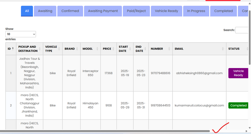
Internal css removed horizontal scrollbar by overriding

Top comments (0)