What is Pyplot in Matplotlib
Parameters in Matplotlib
Examples of Matplotlib
show plot function==take 2 array as x and y parameter
Linear Plot==plotting 2 plot in single figure displaying year, population,color and label
Linear Plot==plotting 2 plot in single figure displaying year, population, with attribute color and label,marker,markersize,linestyle,linewidth,
multiple plot display muliple trignometric sine,cosine with differen color red,green,blue
Difference between Pyplot and simpleplot
Index
plot.axis([xmin, xmax, ymin, ymax])
marker,linestyle,linewidth,markersize
What is Pyplot in Matplotlib
Pyplot is a Matplotlib module that provides a MATLAB-like interface. Matplotlib is designed to be as usable as MATLAB, with the ability to use Python and the advantage of being free and open-source. Each pyplot function makes some changes to a figure: e.g., creates a figure, creates a plotting area in a figure, plots some lines in a plotting area, decorates the plot with labels, etc. The various plots we can utilize using Pyplot are Line Plot, Histogram, Scatter, 3D Plot, Image, Contour, and Polar.
Parameters in Matplotlib
matplotlib.pyplot.plot(*args, scalex=True, scaley=True, data=None, **kwargs)
Parameters:
This function accepts parameters that enable us to set axes scales and format the graphs. These parameters are mentioned below :-
plot(x, y): plot x and y using default line style and color.
plot.axis([xmin, xmax, ymin, ymax]): scales the x-axis and y-axis from minimum to maximum values
plot.(x, y, color=’green’, marker=’o’, linestyle=’dashed’, linewidth=2, markersize=12):
x and y co-ordinates are marked using circular markers of size 12 and green color line with — style of width 2
plot.xlabel(‘X-axis’): names x-axis
plot.ylabel(‘Y-axis’): names y-axis
plot(x, y, label = ‘Sample line ‘): plotted Sample Line will be displayed as a legend
Examples
Plotting in Matplotlib
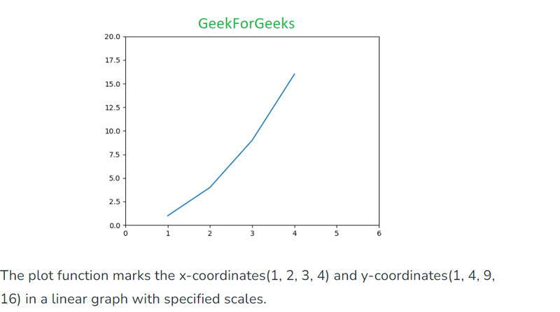
# Python program to show plot function

import matplotlib.pyplot as plt

plt.plot([1, 2, 3, 4], [1, 4, 9, 16])
plt.axis([0, 6, 0, 20])
plt.show()
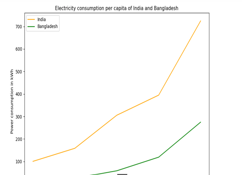
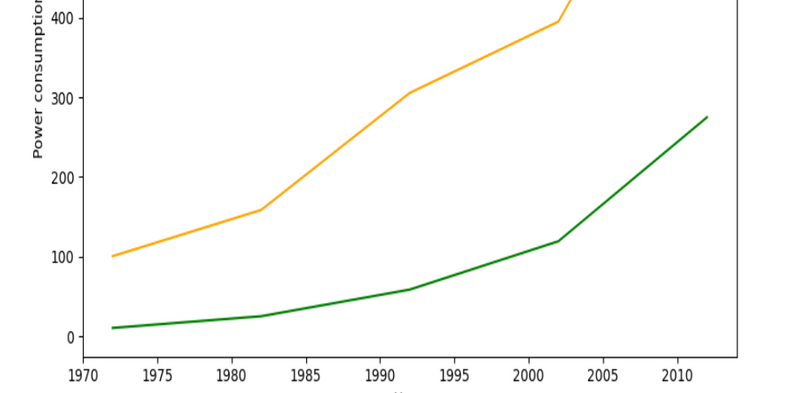
Linear Plot
# Python Program to illustrate Linear Plotting
import matplotlib.pyplot as plt

# year contains the x-axis values
# and e-india & e-bangladesh
# are the y-axis values for plotting

year = [1972, 1982, 1992, 2002, 2012]
e_india = [100.6, 158.61, 305.54, 394.96, 724.79]
e_bangladesh = [10.5, 25.21, 58.65, 119.27, 274.87]

# plotting of x-axis(year) and
# y-axis(power consumption)
with different colored labels of two countries

plt.plot(year, e_india, color ='orange',
         label ='India')

plt.plot(year, e_bangladesh, color ='g',
         label ='Bangladesh')

# naming of x-axis and y-axis
plt.xlabel('Years')
plt.ylabel('Power consumption in kWh')

# naming the title of the plot
plt.title('Electricity consumption per capita\
 of India and Bangladesh')

plt.legend()
plt.show()
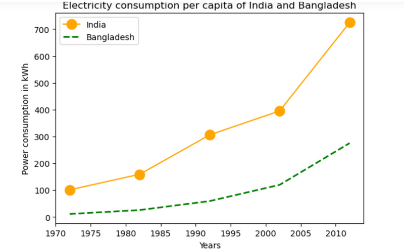
Linear Plot with line formatting
# Python Program to illustrate Linear Plotting
import matplotlib.pyplot as plt

year = [1972, 1982, 1992, 2002, 2012]
e_india = [100.6, 158.61, 305.54,
           394.96, 724.79]

e_bangladesh = [10.5, 25.21, 58.65,
                119.27, 274.87]

# formatting of line style and
# plotting of co-ordinates
plt.plot(year, e_india, color ='orange',
         marker ='o', markersize = 12,
         label ='India')

plt.plot(year, e_bangladesh, color ='g',
         linestyle ='dashed', linewidth = 2,
         label ='Bangladesh')

plt.xlabel('Years')
plt.ylabel('Power consumption in kWh')

plt.title('Electricity consumption per \
capita of India and Bangladesh')

plt.legend()
plt.show()
Difference between Pyplot and simpleplot
The terms "PyLab" and "SimplePlot" are related to different approaches to using the Matplotlib library in Python for plotting and visualization. Let's break down the differences between them:
PyLab:
- PyLab refers to a MATLAB-like interface for Matplotlib, where commands for creating plots and visualizations closely resemble those used in MATLAB.
- It provides a simplified and interactive way of creating plots, making it suitable for quick data exploration and visualization.
PyLab mode can be enabled by importing the pylab module, typically done using the following import statement: from pylab import *
.
SimplePlot:SimplePlot is not a specific feature or mode in Matplotlib but rather a concept or approach to using the library.
It involves using Matplotlib's basic plotting functions directly without relying on any additional high-level interfaces or modes.
While SimplePlot does not have a dedicated mode or import statement, it emphasizes writing clear and explicit code to create plots, making it suitable for more advanced or customized plotting tasks
.
Now, let's provide coding examples to illustrate the differences:
Using PyLab:
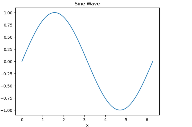
from pylab import *

# Generate sample data
x = linspace(0, 2*pi, 100)
y = sin(x)

# Create a plot
plot(x, y)
xlabel('x')
ylabel('y')
title('Sine Wave')
show()
In this example, we use PyLab mode (from pylab import *) to create a simple sine wave plot. PyLab provides functions like plot(), xlabel(), ylabel(), and title() that closely resemble their counterparts in MATLAB.
Using SimplePlot (Direct Matplotlib Usage):
import matplotlib.pyplot as plt
import numpy as np

# Generate sample data
x = np.linspace(0, 2*np.pi, 100)
y = np.sin(x)

# Create a plot using Matplotlib's basic functions
plt.plot(x, y)
plt.xlabel('x')
plt.ylabel('y')
plt.title('Sine Wave')
plt.show()
In this example, we use Matplotlib's basic plotting functions directly (plt.plot(), plt.xlabel(), plt.ylabel(), plt.title()) without relying on PyLab mode. This approach provides more explicit control over the plotting process and is generally considered cleaner for more complex plotting tasks.
Some More Example of pyplot
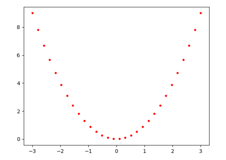
from pylab import *
x = linspace(-3, 3, 30)
y = x**2
plot(x, y, 'r.')
show()
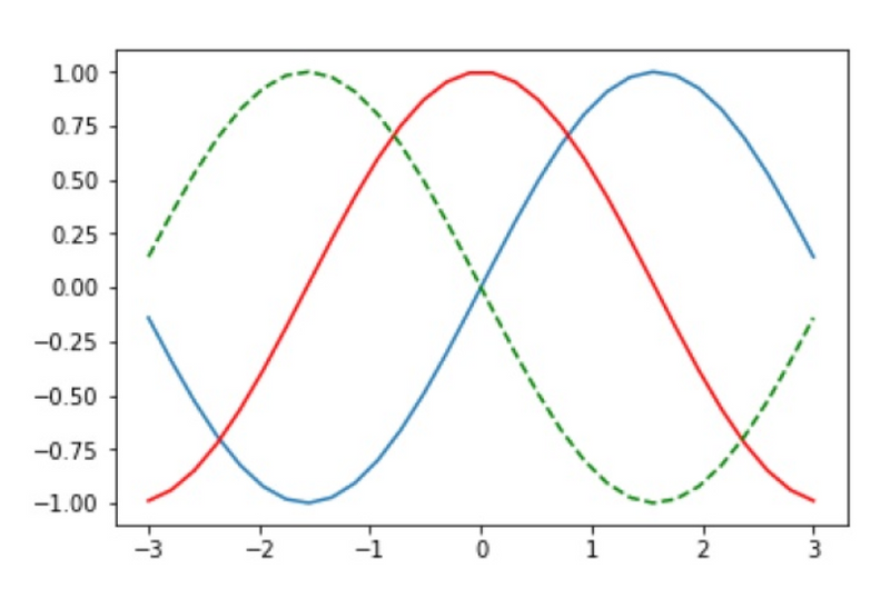
from pylab import *
plot(x, sin(x))
plot(x, cos(x), 'r-')
plot(x, -sin(x), 'g--')
show()
Command summary
plt.plot([1, 2, 3, 4], [1, 4, 9, 16])
plt.axis([0, 6, 0, 20])
plt.plot(year, e_india, color ='orange',
         label ='India')
plt.xlabel('Years')
plt.title('Electricity consumption per capita')
plt.legend()
plt.show()
plt.plot(x, y)
plt.xlabel('x')
plt.ylabel('y')
plot(x, y)
xlabel('x')
ylabel('y'
Summary
plt.plot||plt.axis||plt.show||plt.xlabel||plt.ylabel||plt.title||plt.legend
plt.plot==>x,y,color,label,marker,markersize,linestyle,linewidth
plot(x, y)||xlabel('x')||ylabel('y')||title('Sine Wave')||show()
plot(year, e_india, 'orange',label ='India')
plot(x, y, 'r.')


Top comments (0)