Step 1: add class name when u click any question and also add classname
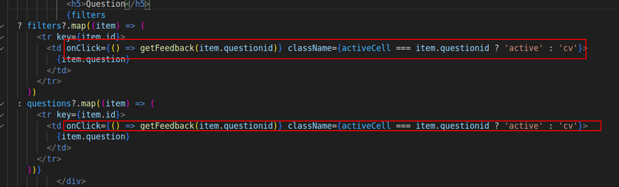
 {filters
  ? filters?.map((item) => (
      <tr key={item.id}>
        <td onClick={() => getFeedback(item.questionid)} className={activeCell === item.questionid ? 'active' : 'cv'}>
          {item.question}
        </td>
      </tr>
    ))
  : questions?.map((item) => (
      <tr key={item.id}>
        <td onClick={() => getFeedback(item.questionid)} className={activeCell === item.questionid ? 'active' : 'cv'}>
          {item.question}
        </td>
      </tr>
    ))}
step2
Add css
.active {
  background:var(--grey-100) !important; /* Replace 'yellow' with your desired background color */
}
step3
use state
const [activeCell, setActiveCell] = useState(null);
step4: while click then call function and set active cell
 const getFeedback = async (questionId) => {

    console.log(questionId)
    const item = { questionId }
    setActiveCell(questionId);
    await getMyFeedback(item).then((data) => {
      setfeedback(data.feedback)
    })
    console.log("all here data")
  };
Another way
const YourComponent = () => {
  const [activeCell, setActiveCell] = useState(null);

  // Rest of your component code

  return (
    <table>
      <tbody>
        {yourData.map((item) => (
          <tr key={item.id}>
            <td
              onClick={() => setActiveCell(item.questionid)}
              style={{
                backgroundColor: activeCell === item.questionid ? 'blue' : 'inherit'
              }}
            >
              {item.question}
            </td>
          </tr>
        ))}
      </tbody>
    </table>
  );
};
apply dynamically while button click
Here are 8 different ways to change styles dynamically when you click a button in React.js:
Using inline styles:
const [color, setColor] = useState('red');

<button onClick={() => setColor('blue')}>Change Color</button>
<div style={{ color }}>Text with dynamically changed color</div>
Using CSS classes:
const [isHighlighted, setIsHighlighted] = useState(false);

<button onClick={() => setIsHighlighted(true)}>Highlight</button>
<div className={isHighlighted ? 'highlighted' : ''}>Text with dynamically applied highlight</div>
Using CSS Modules:
const [isBold, setIsBold] = useState(false);

<button onClick={() => setIsBold(true)}>Make Bold</button>
<div className={isBold ? styles.boldText : ''}>Text with dynamically applied bold style</div>
Using CSS-in-JS libraries like styled-components:
const [isVisible, setIsVisible] = useState(true);

const StyledDiv = styled.div`
  display: ${props => props.isVisible ? 'block' : 'none'};
`;

<button onClick={() => setIsVisible(false)}>Hide</button>
<StyledDiv isVisible={isVisible}>Text that can be dynamically hidden</StyledDiv>
Using CSS variables:
const [backgroundColor, setBackgroundColor] = useState('#fff');

<button onClick={() => setBackgroundColor('#f0f')}>Change Background</button>
<div style={{ '--bg-color': backgroundColor }}>Text with dynamically changed background color</div>
Using CSS transition properties:
const [isExpanded, setIsExpanded] = useState(false);

<button onClick={() => setIsExpanded(true)}>Expand</button>
<div className={`panel ${isExpanded ? 'expanded' : ''}`}>Content with dynamically applied expand animation</div>
Using JavaScript object for inline styles:
const [customStyle, setCustomStyle] = useState({});

<button onClick={() => setCustomStyle({ fontSize: '24px', fontWeight: 'bold' })}>Apply Style</button>
<div style={customStyle}>Text with dynamically applied custom style</div>
Using third-party animation libraries like react-spring:
const [isAnimated, setIsAnimated] = useState(false);

const animationProps = useSpring({
  opacity: isAnimated ? 1 : 0,
});

<button onClick={() => setIsAnimated(true)}>Animate</button>
<animated.div style={animationProps}>Text with dynamically applied animation</animated.div>
These are just a few examples of how you can dynamically change styles in React.js. You can choose the approach that best fits your project and requirements.
Dropdown selection
Using inline styles:
const [color, setColor] = useState('red');

<select onChange={(e) => setColor(e.target.value)}>
  <option value="red">Red</option>
  <option value="blue">Blue</option>
</select>
<div style={{ color }}>Text with dynamically changed color</div>
Using CSS classes:
const [selectedOption, setSelectedOption] = useState('');

<select onChange={(e) => setSelectedOption(e.target.value)}>
  <option value="">Select</option>
  <option value="highlighted">Highlighted</option>
</select>
<div className={selectedOption}>Text with dynamically applied highlight</div>
Using CSS Modules:
const [selectedOption, setSelectedOption] = useState('');

<select onChange={(e) => setSelectedOption(e.target.value)}>
  <option value="">Select</option>
  <option value={styles.boldText}>Bold</option>
</select>
<div className={selectedOption}>Text with dynamically applied bold style</div>
Using CSS-in-JS libraries like styled-components:
const [selectedOption, setSelectedOption] = useState('');

const StyledDiv = styled.div`
  color: ${(props) => props.color};
`;

<select onChange={(e) => setSelectedOption(e.target.value)}>
  <option value="">Select</option>
  <option value="red">Red</option>
  <option value="blue">Blue</option>
</select>
<StyledDiv color={selectedOption}>Text with dynamically changed color</StyledDiv>
Using CSS variables:
const [backgroundColor, setBackgroundColor] = useState('#fff');

<select onChange={(e) => setBackgroundColor(e.target.value)}>
  <option value="#fff">Default</option>
  <option value="#f0f">Purple</option>
</select>
<div style={{ '--bg-color': backgroundColor }}>Text with dynamically changed background color</div>
Using CSS transition properties:
const [animation, setAnimation] = useState('');

<select onChange={(e) => setAnimation(e.target.value)}>
  <option value="">None</option>
  <option value="fade">Fade</option>
</select>
<div className={`panel ${animation}`}>Content with dynamically applied animation</div>
Using JavaScript object for inline styles:
const [customStyle, setCustomStyle] = useState({});

<select onChange={(e) => setCustomStyle({ fontSize: e.target.value })}>
  <option value="">Default</option>
  <option value="24px">Large</option>
</select>
<div style={customStyle}>Text with dynamically applied custom style</div>
Using third-party animation libraries like react-spring:
const [isAnimated, setIsAnimated] = useState(false);

const animationProps = useSpring({
  opacity: isAnimated ? 1 : 0,
});

<select onChange={(e) => setIsAnimated(e.target.value === 'animate')}>
  <option value="">None</option>
  <option value="animate">Animate</option>
</select>
<animated.div style={animationProps}>Text with dynamically applied animation</animated.div>
**Note**
inspect td
use important to active td

Top comments (0)