LayoutBuilder is a widget in Flutter that builds a widget tree based on the parent widget's constraints. It provides a BoxConstraints object, which allows you to dynamically build widgets that adapt to the available space. Here are some reasons and advantages of using LayoutBuilder in Flutter, along with examples to illustrate its use.
Why Use LayoutBuilder
Responsive Layouts: LayoutBuilder allows you to build responsive layouts that adapt to different screen sizes and orientations.
Adaptive Design: It helps in designing adaptive UIs that change based on the constraints provided by the parent widget.
Dynamic Layouts: You can create dynamic layouts that change their structure or appearance based on the available space.
Optimization: It can help in optimizing the layout by avoiding unnecessary rebuilds when constraints don't change.
Advantages of LayoutBuilder
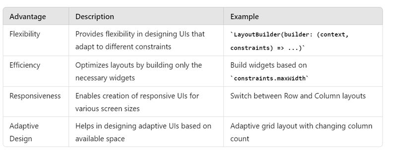
Flexibility: Provides flexibility in designing UIs that adapt to different screen sizes and constraints.
Efficiency: Helps in optimizing layouts by building only the necessary widgets based on the available space.
Responsiveness: Enables the creation of responsive UIs that work well on various devices with different screen sizes.
Examples
Example 1: Simple Responsive Layout
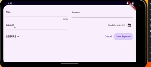
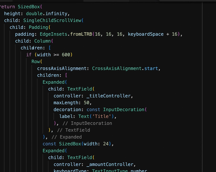
In this example, the layout changes based on the available width. If the width is more than 600 pixels, it shows a horizontal layout; otherwise, it shows a vertical layout.
import 'package:flutter/material.dart';

void main() {
  runApp(MyApp());
}

class MyApp extends StatelessWidget {
  @override
  Widget build(BuildContext context) {
    return MaterialApp(
      home: Scaffold(
        appBar: AppBar(title: Text('LayoutBuilder Example')),
        body: LayoutBuilder(
          builder: (BuildContext context, BoxConstraints constraints) {
            if (constraints.maxWidth > 600) {
              // Horizontal layout
              return Row(
                mainAxisAlignment: MainAxisAlignment.center,
                children: [
                  Container(width: 100, height: 100, color: Colors.red),
                  SizedBox(width: 20),
                  Container(width: 100, height: 100, color: Colors.green),
                  SizedBox(width: 20),
                  Container(width: 100, height: 100, color: Colors.blue),
                ],
              );
            } else {
              // Vertical layout
              return Column(
                mainAxisAlignment: MainAxisAlignment.center,
                children: [
                  Container(width: 100, height: 100, color: Colors.red),
                  SizedBox(height: 20),
                  Container(width: 100, height: 100, color: Colors.green),
                  SizedBox(height: 20),
                  Container(width: 100, height: 100, color: Colors.blue),
                ],
              );
            }
          },
        ),
      ),
    );
  }
}
Example 2: Adaptive Grid Layout
This example demonstrates how to create an adaptive grid layout that changes the number of columns based on the available width.
dart
Copy code
import 'package:flutter/material.dart';
void main() {
runApp(MyApp());
}
class MyApp extends StatelessWidget {
@override
Widget build(BuildContext context) {
return MaterialApp(
home: Scaffold(
appBar: AppBar(title: Text('Adaptive Grid Layout')),
body: LayoutBuilder(
builder: (BuildContext context, BoxConstraints constraints) {
int columns = constraints.maxWidth > 600 ? 4 : 2;
        return GridView.builder(
          gridDelegate: SliverGridDelegateWithFixedCrossAxisCount(
            crossAxisCount: columns,
            crossAxisSpacing: 10,
            mainAxisSpacing: 10,
          ),
          itemCount: 20,
          itemBuilder: (BuildContext context, int index) {
            return Container(
              color: Colors.blue,
              child: Center(
                child: Text(
                  'Item $index',
                  style: TextStyle(color: Colors.white, fontSize: 20),
                ),
              ),
            );
          },
        );
      },
    ),
  ),
);
}
}
When to Use LayoutBuilder
Adaptive UI: When you need to adapt your UI to different screen sizes or orientations.
Responsive Design: When you want your widgets to respond to changes in the layout constraints.
Complex Layouts: When you have complex layout requirements that depend on the available space.
Summary
LayoutBuilder is a powerful widget in Flutter that allows you to create responsive and adaptive layouts by providing the parent constraints to the builder function. It helps in optimizing layouts, creating flexible UIs, and handling dynamic layouts efficiently. Here is a summary table:
LayoutBuilder is a powerful widget in Flutter that allows you to create responsive and adaptive layouts by providing the parent constraints to the builder function. It helps in optimizing layouts, creating flexible UIs, and handling dynamic layouts efficiently. Here is a summary table:

Top comments (0)