Step1: initializes the Alpine component with a JavaScript object
<div class="col-6 p-3 mt-2">
<div class="msa-wrapper mt-4" x-data="multiselectComponent()" x-init="$watch('selected', value => selectedString = value.join(','))">
<input
x-model="selectedString"
type="text" id="msa-input"
aria-hidden="true"
x-bind:aria-expanded="listActive.toString()"
aria-haspopup="tag-list"
hidden>
<div class="input-presentation" @click="listActive = !listActive" @click.away="listActive = false" x-bind:class="{'active': listActive}">
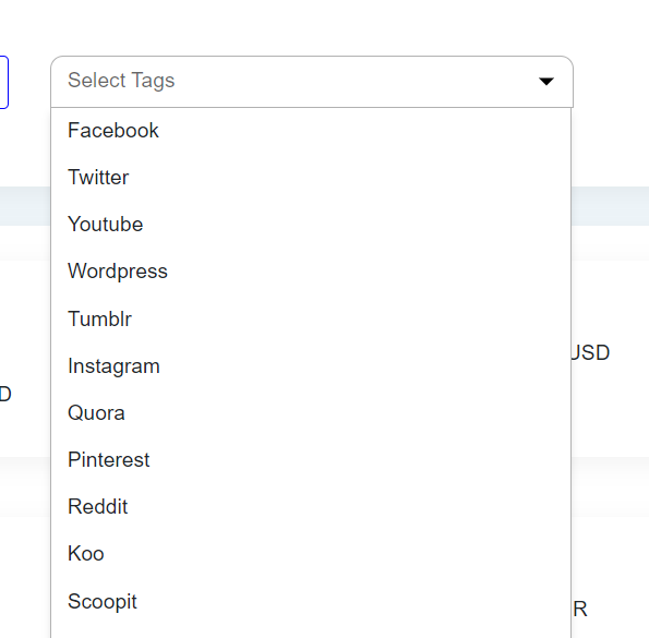
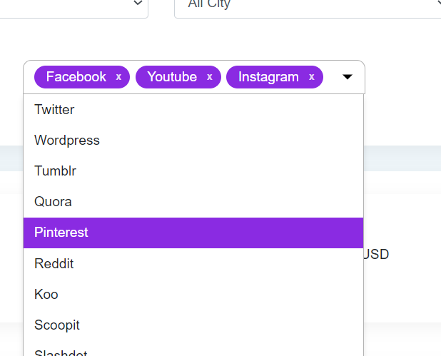
<span class="placeholder" x-show="selected.length == 0">Select Tags</span>
<template x-for="(tag, index) in selected">
<div class="tag-badge">
<span x-text="tag.label"></span> <!-- Use tag.label instead of tag -->
<button x-bind:data-index="index" @click.stop="removeMe($event)">x</button>
</div>
</template>
</div>
<ul id="tag-list" x-show.transition="listActive" role="listbox">
<template x-for="(tag, index, collection) in unselected">
<li x-show="!selected.map(item => item.value).includes(tag.value)"
x-bind:value="tag.value"
x-text="tag.label"
aria-role="button"
@click.stop="addMe($event)"
x-bind:data-index="index"
role="option">
</li>
</template>
</ul>
</div>
</div>
Explanation
x-data Directive: x-data="multiselectComponent()" initializes the Alpine component with a JavaScript object returned by the multiselectComponent() function, which defines the state and behavior of this component.
x-init Directive: x-init="$watch('selected', value => selectedString = value.join(','))" sets up an initialization behavior that watches changes to the selected array. Whenever selected changes, it updates selectedString to be a comma-separated list of the values in selected, which is used for form submissions or tracking.
Input Field: The hidden element is bound to selectedString. It's hidden because it's used to store the value in a format that can be submitted with a form, and its role is to interact with the backend or other JavaScript components.
- x-model="selectedString" binds the input value to selectedString.
x-bind:aria-expanded="listActive.toString()" and aria-haspopup="tag-list" are accessibility features
.
Dropdown Toggle and Display:- is the visible part of the multi-select, showing selected tags and allowing the user to open/close the dropdown.
@click="listActive = !listActive" toggles the visibility of the dropdown (ul element).
@click.away="listActive = false" closes the dropdown if the user clicks outside this element.
x-bind:class="{'active': listActive}" applies the active class when the dropdown is visible
.
Display of Selected Tags:Inside the input-presentation div, a template renders each selected tag.
x-for="(tag, index) in selected" iterates over the selected array.
Each tag is displayed inside a div.tag-badge with the tag's label shown in a and a button to remove the tag
.
Dropdown List:-
- is the dropdown list that appears when listActive is true.
The template within the ul iterates over the unselected array to list items that are not selected.
Each item checks if its value is not included in the selected array before displaying (x-show="!selected.map(item => item.value).includes(tag.value)").
Clicking on a list item will trigger addMe($event), adding the tag to the selected list
.
## Step2: a java script code that manage the state and behavior of a multiselect dropdown using Alpine.js
<script type="text/javascript">
  function multiselectComponent() {
    return {
      listActive: false,
      selectedString: '',
      selected: [],
      unselected: [
        { value: 'facebook', label: 'Facebook' },
        { value: 'twitter', label: 'Twitter' },
        { value: 'youtube', label: 'Youtube' },
        { value: 'wordpress', label: 'Wordpress' },
        { value: 'tumblr', label: 'Tumblr' },
        { value: 'instagram', label: 'Instagram' },
        { value: 'quora', label: 'Quora' },
        { value: 'pinterest', label: 'Pinterest' },
        { value: 'reddit', label: 'Reddit' },
        { value: 'koo', label: 'Koo' },
        { value: 'scoopit', label: 'Scoopit' },
        { value: 'slashdot', label: 'Slashdot' },
        { value: 'roposo', label: 'Roposo' },
        { value: 'chingari', label: 'Chingari' },
        { value: 'telegram', label: 'Telegram' },
        { value: 'linkedin', label: 'LinkedIn' },
        { value: 'linkedin_grp', label: 'LinkedIn Group' },
        { value: 'fb_grp', label: 'Facebook Group' },
        { value: 'mitron', label: 'Mitron' }
      ],

      addMe(e) {
        const index = e.target.dataset.index;
        const extracted = this.unselected.splice(index, 1)[0];
        this.selected.push(extracted);
        this.updateSelectedString();
      },
      removeMe(e) {
        const index = e.target.dataset.index;
        const extracted = this.selected.splice(index, 1)[0];
        this.unselected.push(extracted);
        this.updateSelectedString();
      },
      updateSelectedString() {
        this.selectedString = this.selected.map(item => item.value).join(',');
      }
    };
  }
</script>
Explanation
multiselectComponent Function
Purpose: This function initializes and returns an object containing the state and methods required to operate a multiselect component, typically used with Alpine.js to provide interactivity.
State Variables
listActive: A boolean indicating whether the dropdown list is visible (true) or not (false).
selectedString: A string that holds a comma-separated list of the values of the currently selected items. This is useful for form submissions or any processing where a simple string format is needed.
selected: An array to store the objects that the user has selected.
unselected: An array of objects, each representing a selectable item with a value and a label. These items are available to be selected by the user.
Methods
addMe(e):
Triggered when a user selects an item from the dropdown.
It retrieves the index of the clicked item from e.target.dataset.index.
Using the index, it removes the corresponding item from the unselected array (splice(index, 1)[0]) and adds it to the selected array.
It then calls updateSelectedString() to update the selectedString based on the new state of the selected array.
removeMe(e):
Triggered when a user clicks the remove button (x) on a tag in the selected list.
Similar to addMe, it retrieves the index of the item to be removed from the selected list.
It removes the item from selected and pushes it back into unselected, effectively unselecting it.
Calls updateSelectedString() to refresh the selectedString.
updateSelectedString():
This method updates selectedString by mapping over the selected array and joining the value property of each object in the array into a comma-separated string. This is typically used to sync the UI with backend data needs, where such a string might be sent via a form or AJAX request.
General Use
This component is used in conjunction with Alpine.js in an HTML context where the state and behavior defined here control a UI component for selecting and deselecting options.
It is particularly designed to be used with a list in the UI that can show or hide based on user interaction, where items can be dynamically added to or removed from a selection.
Step 3: design css
.msa-wrapper {
  width: 400px;
  position: relative; /* Ensure the wrapper is positioned relative */

  &:focus-within {
    .input-presentation {
      border-bottom-right-radius: 0;
      border-bottom-left-radius: 0;
    }
  }

  & > * {
    display: block;
    width: 100%;
  }

  .input-presentation {
    display: flex;
    flex-wrap: wrap;
    gap: 6px;
    align-items: center;
    min-height: 40px;
    padding: 6px 40px 6px 12px;
    border: 1px solid rgba(0, 0, 0, 0.3);
    font-size: 1rem;
    border-radius: 10px;
    position: relative;
    cursor: pointer;
    background-color: white; /* Solid background color */

    .placeholder {
      font-weight: 400;
      color: rgba(0,0,0, .6);
    }

    &:after {
      content: '';
      border-top: 6px solid black;
      border-left: 6px solid transparent;
      border-right: 6px solid transparent;
      right: 14px;
      position: absolute;
      top: 50%;
      transform: translateY(-50%);
      cursor: pointer;
    }

    &.active {
      border-bottom-left-radius: 0;
      border-bottom-right-radius: 0;
    }

    .tag-badge {
      background-color: blueviolet;
      padding-left: 14px;
      padding-right: 28px;
      color: white;
      border-radius: 14px;
      position: relative;

      span {
        font-size: 16px;
        line-height: 27px;
      }

      button {
        display: inline-block;
        padding: 0;
        background: transparent;
        border: none;
        color: rgba(255,255,255, .8);
        font-size: 12px;
        position: absolute;
        right: 0px;
        padding-right: 10px;
        padding-left: 5px;
        cursor: pointer;
        line-height: 26px;
        height: 26px;
        font-weight: 600;

        &:hover {
          background-color: rgba(255,255,255, .2);
          color: white;
        }
      }
    }
  }

  ul {
    position: absolute;
    width: calc(100% - 2px); /* Adjust width to fit inside border */
    border: 1px solid rgba(0, 0, 0, 0.3);
    font-size: 1rem;
    margin: 0;
    padding: 0;
    border-top: none;
    list-style: none;
    border-bottom-right-radius: 10px;
    border-bottom-left-radius: 10px;
    z-index: 1000; /* Ensure it is on top of other content */
    background-color: white; /* Ensuring dropdown has a solid background */
    box-shadow: 0 4px 6px rgba(0,0,0,0.1); /* Optional: Adds shadow for better visibility */

    li {
      padding: 6px 12px;
      text-transform: capitalize;
      cursor: pointer;

      &:hover {
        background: blueviolet;
        color: white;
      }
    }
  }
}

Top comments (0)