Evaluating and comparing the performance of different classifiers using ROC (Receiver Operating Characteristic) curves and AUC (Area Under the Curve) scores involves several steps. Below is a step-by-step guide along with a Python example:
Step 1: Import Libraries
from sklearn.metrics import roc_curve, auc
from sklearn.model_selection import train_test_split
from sklearn.linear_model import LogisticRegression
from sklearn.ensemble import RandomForestClassifier
from sklearn.neighbors import KNeighborsClassifier
from sklearn.tree import DecisionTreeClassifier
import matplotlib.pyplot as plt
Step 2: Load and Split Data
Assuming X is your feature matrix and y is your target variable:
X_train, X_test, y_train, y_test = train_test_split(X, y, test_size=0.2, random_state=42)
Step 3: Create Models
Create a dictionary of classifiers you want to compare:
models = {
    'Logistic Regression': LogisticRegression(),
    'Random Forest': RandomForestClassifier(),
    'KNN': KNeighborsClassifier(),
    'Decision Tree': DecisionTreeClassifier()
}
Step 4: Evaluate Models and Plot ROC Curves
plt.figure(figsize=(8, 6))

for name, model in models.items():
    # Fit the model
    model.fit(X_train, y_train)

    # Get predicted probabilities for the positive class
    y_prob = model.predict_proba(X_test)[:, 1]

    # Compute ROC curve and AUC score
    fpr, tpr, thresholds = roc_curve(y_test, y_prob)
    roc_auc = auc(fpr, tpr)

    # Print AUC score for each model
    print(f'AUC of {name}: {roc_auc:.2f}')

    # Plot ROC curve for each model
    plt.plot(fpr, tpr, label=f'{name} (AUC: {roc_auc:.2f})')

# Add labels and legend
plt.plot([0, 1], [0, 1], linestyle='--', color='grey', label='Random Guess')
plt.xlabel('False Positive Rate')
plt.ylabel('True Positive Rate')
plt.title('Receiver Operating Characteristic (ROC) Curve')
plt.legend(loc='lower right')

# Show the plot
plt.show()
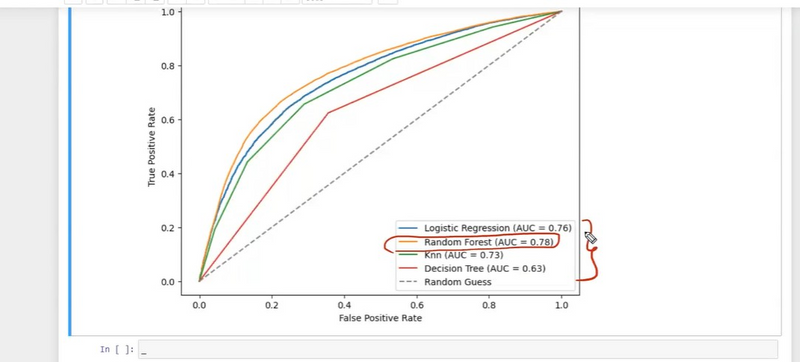
Step 5: Interpret the Results
ROC Curve: The curves show the trade-off between true positive rate (sensitivity) and false positive rate (1-specificity). A model with a curve closer to the top-left corner is better.
AUC Score: The AUC score summarizes the ROC curve into a single value. A higher AUC indicates better model performance.
Step 6: Analyze and Compare
Analyze the AUC scores and shapes of the ROC curves to compare the models. A model with a higher AUC and better trade-off between sensitivity and specificity is generally preferred.
Experiment with different classifiers, hyperparameters, and feature engineering to optimize model performance.

Top comments (0)