Tensor Visualization
Activation Visualization
Embedding Visualization
Attention Visualization
Error Analysis Visualization
Uncertainty Visualization
Time Series Visualization
Interactive Visualization
Tensor Visualization: Visualizing tensors to understand deep learning models. For example, visualizing filters in convolutional neural networks (CNNs) to see what features they are learning.
Feature Visualization: Generating visualizations to understand what features in the input data activate certain neurons in a deep neural network. For example, using gradient ascent to generate images that maximally activate certain neurons in a neural network.
Activation Visualization: Visualizing activations of neurons in different layers of a deep neural network. For example, using heatmaps to visualize which parts of an image activate certain neurons in a CNN.
Embedding Visualization: Visualizing high-dimensional embeddings in lower-dimensional space to understand relationships between data points. For example, using t-SNE to visualize word embeddings in natural language processing tasks.
Attention Visualization: Visualizing attention mechanisms in deep learning models, particularly in sequence-to-sequence models like transformers. For example, visualizing which parts of the input sequence the model is paying attention to when generating an output sequence.
Error Analysis Visualization: Visualizing errors made by deep learning models to gain insights into model performance and areas for improvement. For example, plotting confusion matrices to understand which classes are being misclassified more often.
Model Interpretability Visualization: Visualizing how different parts of a deep learning model contribute to its predictions to make the model more interpretable. For example, using gradient-based techniques to visualize which parts of an image are most important for the model's classification decision.
Uncertainty Visualization: Visualizing uncertainty estimates produced by deep learning models, particularly in tasks like Bayesian deep learning. For example, using color-coded uncertainty maps to show regions of high uncertainty in image segmentation tasks.
Time Series Visualization: Visualizing time series data to understand patterns and trends. For example, using line plots or heatmaps to visualize temporal patterns in sensor data.
Interactive Visualization: Creating interactive visualizations to explore large datasets or deep learning model outputs. For example, using tools like Plotly or Bokeh to create interactive dashboards for exploring model predictions or dataset characteristics.
These visualization techniques play a crucial role in understanding and interpreting the behavior of deep learning models, as well as in communicating insights to stakeholders.
Tensor Visualization
ow you can visualize tensors using Python's matplotlib library:
import numpy as np
import matplotlib.pyplot as plt

# Create a random 3x3 tensor
tensor = np.random.rand(3, 3)

# Visualize the tensor using a heatmap
plt.imshow(tensor, cmap='viridis', interpolation='nearest')
plt.colorbar()  # Add a color bar to show the scale
plt.title('Tensor Visualization')
plt.xlabel('X-axis')
plt.ylabel('Y-axis')
plt.show()
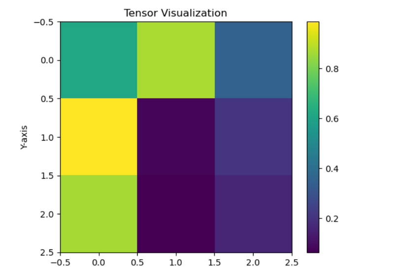
In this example, we create a random 3x3 tensor using NumPy's random.rand() function. Then, we visualize the tensor using imshow() function from matplotlib.pyplot, which displays the tensor as a heatmap. We use the 'viridis' colormap to represent the values in the tensor. Additionally, we add a color bar to indicate the scale of the values. Finally, we set the title, x-label, and y-label for the plot before displaying it using plt.show().
Using Seaborn
This is a basic example of tensor visualization. Depending on your specific use case, you might need to customize the visualization further to suit your needs.
Here's an example of visualizing a tensor using Seaborn, a Python data visualization library built on top of matplotlib:
import numpy as np
import seaborn as sns

# Create a random 3x3 tensor
tensor = np.random.rand(3, 3)

# Visualize the tensor using a heatmap with Seaborn
sns.heatmap(tensor, cmap='viridis', annot=True, fmt=".2f")
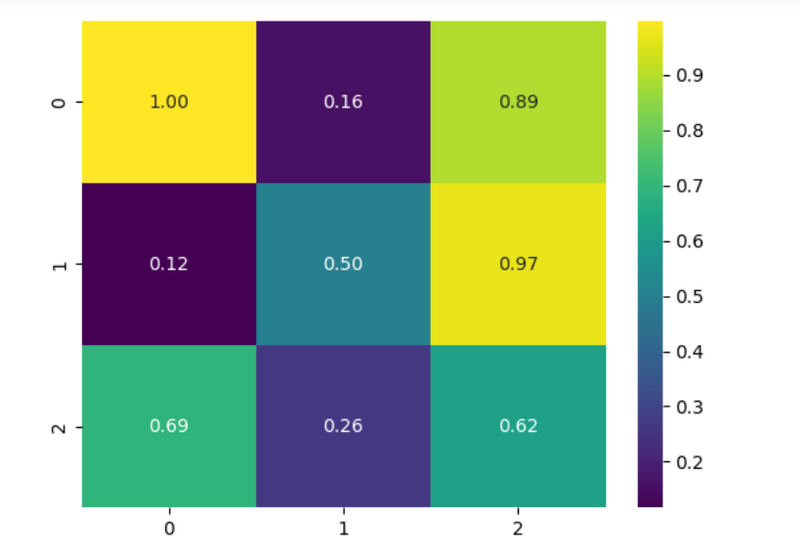
In this example, we use Seaborn's heatmap() function to visualize the tensor. We pass the tensor as input along with the colormap (cmap) parameter specifying 'viridis' colormap. Additionally, we set annot=True to display the numeric values of each cell in the heatmap, and fmt=".2f" to format the annotations to display only two decimal places.
This will produce a heatmap of the tensor with values annotated on each cell, using the 'viridis' colormap. You can further customize the visualization by adjusting parameters such as the colormap, annotating style, and more according to your preferences.
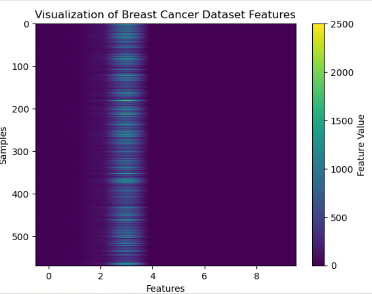
import numpy as np
import matplotlib.pyplot as plt
from sklearn.datasets import load_breast_cancer

# Load the Breast Cancer dataset
cancer = load_breast_cancer()
data = cancer.data

# Convert the data to a tensor
tensor = np.array(data)

# Visualize a slice of the tensor using imshow
plt.imshow(tensor[:, :10], cmap='viridis', aspect='auto')
plt.colorbar(label='Feature Value')
plt.title('Visualization of Breast Cancer Dataset Features')
plt.xlabel('Features')
plt.ylabel('Samples')
plt.show()

Top comments (0)