Index
plt.plot(x, y)
plt.show()
plt.bar(x, y)
plt.hist(y)
plt.scatter(x, y)
'o' in plt.plot(x, y, 'o')
sizes,labels,autopct,startanglein plt.pie()
color,alpha.label in plt.fill_between()
marker='o' in plt.plot()
plt.legend()
Types of Matplotlib
Matplotlib comes with a wide variety of plots. Plots help to understand trends, and patterns, and to make correlations. They’re typically instruments for reasoning about quantitative information. Some of the sample plots are covered here.
Matplotlib Line Plot
Matplotlib Bar Plot
Matplotlib Histograms Plot
Matplotlib Scatter Plot
Matplotlib Pie Charts
Matplotlib Area Plot
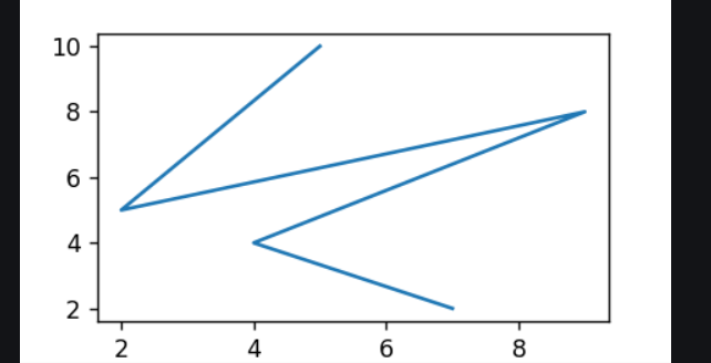
Matplotlib Line Plot
By importing the matplotlib module, defines x and y values for a plotPython, plots the data using the plot() function and it helps to display the plot by using the show() function . The plot() creates a line plot by connecting the points defined by x and y values.
# importing matplotlib module
from matplotlib import pyplot as plt

# x-axis values
x = [5, 2, 9, 4, 7]

# Y-axis values
y = [10, 5, 8, 4, 2]

# Function to plot
plt.plot(x, y)

# function to show the plot
plt.show()
Output:
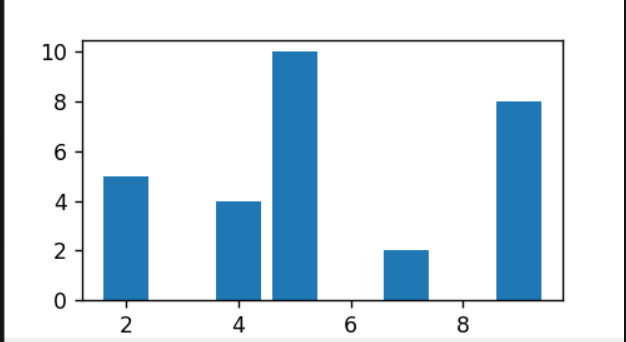
Matplotlib Bar Plot
By using matplotlib library in Pythontwo, it allows us to access the functions and classes provided by the library for plotting. There are tow lists x and y are defined . This function creates a bar plot by taking x-axis and y-axis values as arguments and generates the bar plot based on those values.
# importing matplotlib module
from matplotlib import pyplot as plt

# x-axis values
x = [5, 2, 9, 4, 7]

# Y-axis values
y = [10, 5, 8, 4, 2]

# Function to plot the bar
plt.bar(x, y)

# function to show the plot
plt.show()
Output:
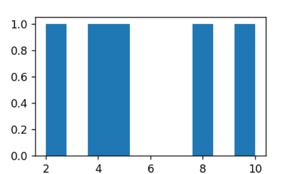
Matplotlib Histograms Plot
By using the matplotlib module defines the y-axis values for a histogram plot. Plots in the ,histogram using the hist() function and displays the plot using the show() function. The hist() function creates a histogram plot based on the values in the y-axis list.
# importing matplotlib module
from matplotlib import pyplot as plt

# Y-axis values
y = [10, 5, 8, 4, 2]

# Function to plot histogram
plt.hist(y)

# Function to show the plot
plt.show()
Output:
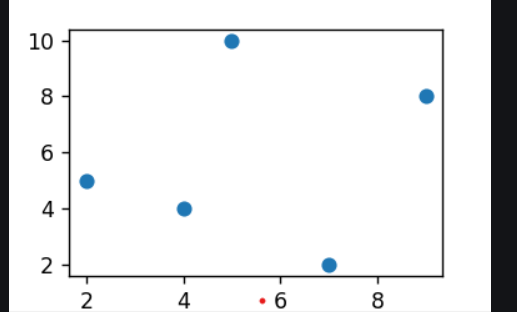
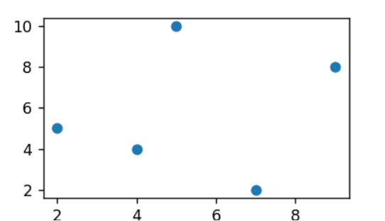
Matplotlib Scatter Plot
By imports,plot the matplotlib module, defines x and y values for a scatter plot, plots the data using the scatter() function, and displays the plot using the show() function. The scatter() function creates a scatter plot by plotting individual data points defined by the x and y values.
# importing matplotlib module
from matplotlib import pyplot as plt

# x-axis values
x = [5, 2, 9, 4, 7]

# Y-axis values
y = [10, 5, 8, 4, 2]

# Function to plot scatter
plt.scatter(x, y)

# function to show the plot
plt.show()
Output :
We can also plot a scatter plot using the plot() method by providing the marker style as ‘o’.
# importing matplotlib module
from matplotlib import pyplot as plt

# x-axis values
x = [5, 2, 9, 4, 7]

# Y-axis values
y = [10, 5, 8, 4, 2]

# Function to plot scatter using plot() method
plt.plot(x, y, 'o')

# function to show the plot
plt.show()
Output:
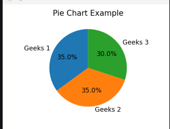
Matplotlib Pie Charts
By importing the module Matplotlib in Python to create a pie chart with three categories and respective sizes. The plot .pie() function is used to generate the chart, including labels, percentage formatting, and a starting angle. A title is added with plt. title(), and plt. show() displays the resulting pie chart, visualizing the proportional distribution of the specified categories.
import matplotlib.pyplot as plt

# Data for the pie chart
labels = ['Geeks 1', 'Geeks 2', 'Geeks 3']
sizes = [35, 35, 30]

# Plotting the pie chart
plt.pie(sizes, labels=labels, autopct='%1.1f%%', startangle=90)
plt.title('Pie Chart Example')
plt.show()
Output:
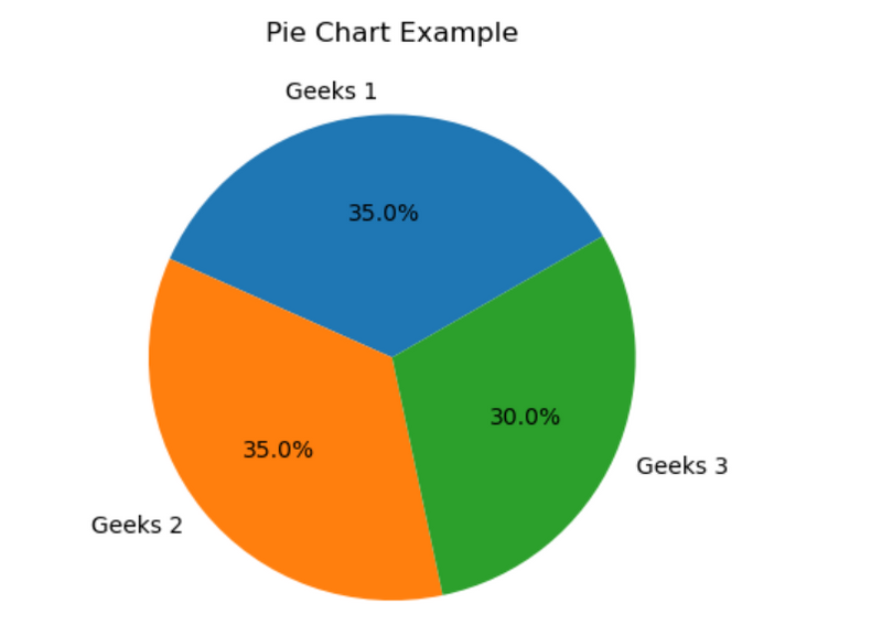
import matplotlib.pyplot as plt

# Data for the pie chart
labels = ['Geeks 1', 'Geeks 2', 'Geeks 3']
sizes = [35, 35, 30]

# Plotting the pie chart
plt.pie(sizes, labels=labels, autopct='%1.1f%%', startangle=30)
plt.title('Pie Chart Example')
plt.show()
Output
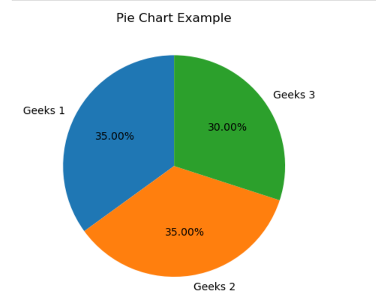
import matplotlib.pyplot as plt

# Data for the pie chart
labels = ['Geeks 1', 'Geeks 2', 'Geeks 3']
sizes = [35, 35, 30]

# Plotting the pie chart
plt.pie(sizes, labels=labels, autopct='%1.2f%%', startangle=90)
plt.title('Pie Chart Example')
plt.show()
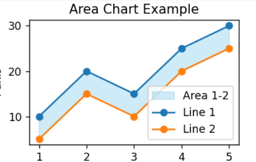
Matplotlib Area Plot
By importing Matplotlib we sky bluegenerated an area chart with two lines (‘Line 1’ and ‘Line 2’). The area between the lines is shaded in a skyblue color with 40% transparency. The x-axis values are in the list ‘x’, and the corresponding y-axis values for each line are in ‘y1’ and ‘y2’. Labels, titleslegends, and legend are added, and the resulting area chart is displayed.
import matplotlib.pyplot as plt

# Data
x = [1, 2, 3, 4, 5]
y1, y2 = [10, 20, 15, 25, 30], [5, 15, 10, 20, 25]

# Area Chart
plt.fill_between(x, y1, y2, color='skyblue', alpha=0.4, label='Area 1-2')
plt.plot(x, y1, label='Line 1', marker='o')
plt.plot(x, y2, label='Line 2', marker='o')

# Labels and Title
plt.xlabel('X-axis'), plt.ylabel('Y-axis'), plt.title('Area Chart Example')

# Legend and Display
plt.legend(), plt.show()
Output :
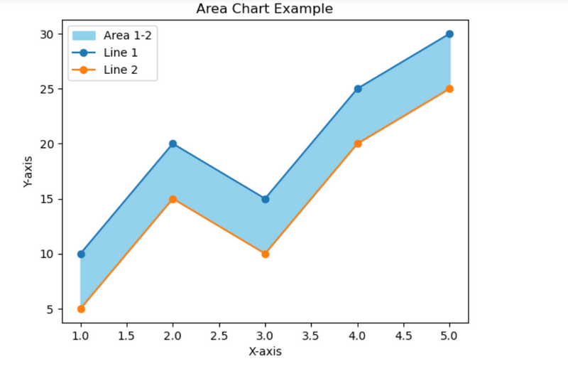
import matplotlib.pyplot as plt

# Data
x = [1, 2, 3, 4, 5]
y1, y2 = [10, 20, 15, 25, 30], [5, 15, 10, 20, 25]

# Area Chart
plt.fill_between(x, y1, y2, color='skyblue', alpha=0.9, label='Area 1-2')
plt.plot(x, y1, label='Line 1', marker='o')
plt.plot(x, y2, label='Line 2', marker='o')

# Labels and Title
plt.xlabel('X-axis'), plt.ylabel('Y-axis'), plt.title('Area Chart Example')

# Legend and Display
plt.legend(), plt.show()
output
alpha=0.9 denote the color is more dark

Top comments (0)