Advantage of object oriented approach
creating two plot sine and cosine wave in single figure with two axis objects having attribute color,linestyle,linewidth
Using the object-oriented approach in Matplotlib offers several advantages, especially for more complex and customized visualizations. Some of the key advantages include:
Note
user uses Pyplot to create figures, and through those figures, one or more axes objects can be created. These axes objects are then used for most plotting actions like object oriented concept create object through this object call one or more function
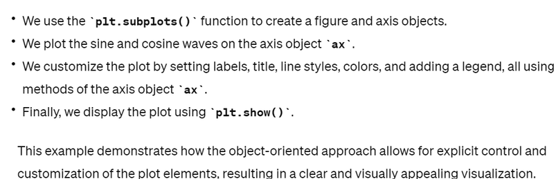
fig, ax = plt.subplots()
Explicit Control: With the object-oriented approach, you have explicit control over every aspect of the plot, including figure, axes, and individual plot elements. This allows for greater flexibility and customization.
Reusable Code: Object-oriented plotting encourages writing modular and reusable code. You can create functions or classes to encapsulate specific visualization tasks, making it easier to create similar plots with different data or configurations.
Multiple Axes and Subplots: Object-oriented plotting makes it straightforward to create plots with multiple axes or subplots within the same figure. This is useful for comparing different datasets or visualizing data from multiple perspectives.
Customization: You can easily customize various aspects of the plot, such as colors, line styles, markers, labels, and annotations, by directly accessing and modifying the corresponding attributes of plot objects.
Integration with Object-Oriented Programming (OOP) Principles: The object-oriented approach in Matplotlib aligns well with OOP principles, allowing you to leverage concepts like inheritance, polymorphism, and encapsulation to build more sophisticated and maintainable visualization code.
Now, let's see some visualization examples using the object-oriented approach:
import matplotlib.pyplot as plt
import numpy as np

# Generate sample data
x = np.linspace(0, 2*np.pi, 100)
y1 = np.sin(x)
y2 = np.cos(x)

# Create a figure and axis objects
fig, ax = plt.subplots()

# Plot the data on the axes
ax.plot(x, y1, label='sin(x)', color='blue', linestyle='-', linewidth=2)
ax.plot(x, y2, label='cos(x)', color='red', linestyle='--', linewidth=2)

# Set labels and title
ax.set_xlabel('x')
ax.set_ylabel('y')
ax.set_title('Sine and Cosine Waves')

# Add legend
ax.legend()

# Show the plot
plt.show()
Explanation
let's break down the example to illustrate how it demonstrates Explicit Control, Reusable Code, and Integration with Object-Oriented Programming (OOP) Principles:
Explicit Control:
- In the example, we create a figure and axis objects explicitly using plt.subplots(). This allows us to have direct control over the layout and structure of the plot.
- We customize various aspects of the plot, such as line styles, colors, labels, and legend, by directly accessing and modifying the corresponding attributes and methods of the axis object ax.
- For example, we set the x-label using ax.set_xlabel(), y-label using ax.set_ylabel(), title using ax.set_title(), and add a legend using ax.legend(). This demonstrates how we have explicit control over these elements of the plot . Reusable Code:
import matplotlib.pyplot as plt
import numpy as np

def plot_sine_and_cosine(x, y1, y2):
    # Create a figure and axis objects
    fig, ax = plt.subplots()

    # Plot the data on the axes
    ax.plot(x, y1, label='sin(x)', color='blue', linestyle='-', linewidth=2)
    ax.plot(x, y2, label='cos(x)', color='red', linestyle='--', linewidth=2)

    # Set labels and title
    ax.set_xlabel('x')
    ax.set_ylabel('y')
    ax.set_title('Sine and Cosine Waves')

    # Add legend
    ax.legend()

    # Show the plot
    plt.show()

# Generate sample data
x = np.linspace(0, 2*np.pi, 100)
y1 = np.sin(x)
y2 = np.cos(x)

# Call the function to plot sine and cosine waves
plot_sine_and_cosine(x, y1, y2)
- We encapsulate the plotting code within a single function or script block, making it reusable for creating similar plots with different data or configurations.
If we need to create similar plots with different datasets or customization options, we can simply reuse this code block by passing different data arrays or modifying customization parameters as needed
.
Integration with Object-Oriented Programming (OOP) Principles:The object-oriented approach in Matplotlib aligns well with OOP principles, allowing us to treat the plot elements (e.g., figure, axis) as objects with attributes and methods.
In the example, we create a figure and axis object using plt.subplots(), and then we customize the plot by calling methods on the axis object ax. This demonstrates the use of objects and methods to achieve our visualization goals.
Additionally, the object-oriented approach enables us to leverage concepts like inheritance and encapsulation to build more complex visualization systems or extend functionality as needed
.
Some More Example
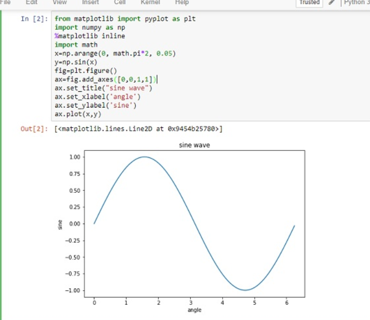
from matplotlib import pyplot as plt
import numpy as np
import math
x = np.arange(0, math.pi*2, 0.05)
y = np.sin(x)
fig = plt.figure()
ax = fig.add_axes([0,0,1,1])
ax.plot(x,y)
ax.set_title("sine wave")
ax.set_xlabel('angle')
ax.set_ylabel('sine')
plt.show()
Summary
Explicit Control||Reusable Code||Multiple Axes and Subplots||Customization||Integration with Object-Oriented Programming (OOP) Principles
fig, ax = plt.subplots()
ax.plot(x, y1, label='sin(x)', color='blue', linestyle='-', linewidth=2)
ax.set_xlabel('x')||ax.set_ylabel('y')||ax.set_title('Sine and Cosine Waves')||ax.legend()||plt.show()
Commands
ax.plot==>x,y,label,color,linestyle,linewidth
ax.set_xlabel('x')||ax.set_title('Sine and Cosine Waves')||ax.legend()

Top comments (0)