LoginScreen Component (Parent)
The LoginScreen component is the entry point of the country picker. It allows users to select their country and input their phone number.
Key Features:
selectedCountry: Tracks the country selected by the user.
isPhoneEnabled: Toggles whether the phone number input field is enabled based on country selection.
isModalVisible: Controls the visibility of the modal dialog for country selection.
countries: List of all countries fetched from an external API via useMotoshareViewModel().
filteredCountries: Filters countries based on the search term.
setNewDialcode: Updates the dial code in the global state using React Context and saves it in AsyncStorage.
Functionality:
Fetch Countries: useEffect fetches the list of countries dynamically when the component mounts.
Country Selection: When a country is selected, handleCountrySelect is invoked to store the country name and its dial code in the global context.
Phone Number Input: Once a country is selected, the user can enter a phone number.
Modal for Country Selection: The CountrySelectModal is displayed when the "Select Country" button is clicked.
import React, { useState, useEffect } from 'react';
import { View, Text, StyleSheet, TouchableOpacity, TextInput, Alert } from 'react-native';
import AsyncStorage from '@react-native-async-storage/async-storage';
import { useNavigation } from '@react-navigation/native';
import useMotoshareViewModel from '../controllers/MotoshareViewModel';  // Import the ViewModel for fetching countries dynamically
import CountrySelectModal from './CountrySelectModal'; // Import the new modal component
import { useBaseUrl } from '../contexts/BaseUrlContext'; // Import the useBaseUrl hook

const LoginScreen = () => {
  const [selectedCountry, setSelectedCountry] = useState(''); // State for selected country
  const [phoneNumber, setPhoneNumber] = useState(''); // State for phone number input
  const [isPhoneEnabled, setIsPhoneEnabled] = useState(false); // To enable/disable phone number input
  const [isModalVisible, setIsModalVisible] = useState(false); // To control the visibility of the modal
  const [countries, setCountries] = useState([]); // State to store countries
  const [filteredCountries, setFilteredCountries] = useState([]); // State to filter countries based on search input
  const [searchTerm, setSearchTerm] = useState(''); // State to store search term
  const { isLoading, _fetchCountries, message } = useMotoshareViewModel();  // Fetch countries from ViewModel
  const navigation = useNavigation(); // Hook to navigate to another screen
  const { setNewDialcode } = useBaseUrl(); // Get the function to update the dial_code

  // Fetch countries when the component mounts
  useEffect(() => {
    const fetchData = async () => {
      try {
        const fetchedCountries = await _fetchCountries();  // Fetch the countries from the ViewModel
        setCountries(fetchedCountries);  // Update the state with the fetched countries
        setFilteredCountries(fetchedCountries); // Set the initial filtered list to all countries
      } catch (error) {
        console.error("Error fetching countries:", error);
        Alert.alert("Error", "Unable to fetch countries");
      } finally {
        setIsLoading(false);  // Stop the loading state when data is fetched or failed
      }
    };

    fetchData();
  }, []); // Empty dependency array ensures the effect runs only once when the component mounts

  // Handle country selection
  const handleCountrySelect = async (country) => {
    try {
      setSelectedCountry(country.name); // Store only the country name
      setIsPhoneEnabled(true); // Enable the phone input after selecting a country
      setIsModalVisible(false); // Close the modal after selection
      await setNewDialcode(country.dial_code); // Ensure the context update is complete
      // Save country and dial_code in AsyncStorage
      console.log('Country and dial_code saved successfully');
    } catch (error) {
      console.error('Error saving country data:', error);
    }
  };

  // Handle search input change
  const handleSearchChange = (text) => {
    setSearchTerm(text);
    // Filter the countries based on the search term
    const filtered = countries.filter((country) =>
      country.name.toLowerCase().includes(text.toLowerCase())
    );
    setFilteredCountries(filtered); // Update the filtered countries
  };

  return (
    <View style={styles.container}>
      <Text style={styles.title}>Login</Text>

      <TouchableOpacity
        style={styles.button}
        onPress={() => setIsModalVisible(true)} // Show modal when button is pressed
      >
        <Text style={styles.buttonText}>
          {selectedCountry ? selectedCountry : 'Select Country'}  {/* Dynamically display country name */}
        </Text>
      </TouchableOpacity>

      {/* Phone number input field, initially disabled */}
      <TextInput
        style={[styles.input, { backgroundColor: isPhoneEnabled ? 'white' : '#f0f0f0' }]}
        placeholder="Phone Number"
        keyboardType="phone-pad"
        editable={isPhoneEnabled} // Enable when a country is selected
        value={phoneNumber}
        onChangeText={setPhoneNumber}
      />

      <TouchableOpacity style={styles.button} disabled={!isPhoneEnabled}>
        <Text style={styles.buttonText}>Send OTP</Text>
      </TouchableOpacity>

      {/* Country Select Modal */}
      <CountrySelectModal
        isModalVisible={isModalVisible}
        setIsModalVisible={setIsModalVisible}
        countries={countries}
        handleCountrySelect={handleCountrySelect}
        isLoading={isLoading}
        searchTerm={searchTerm}
        handleSearchChange={handleSearchChange}
        filteredCountries={filteredCountries}
      />
    </View>
  );
};

const styles = StyleSheet.create({
  container: {
    flex: 1,
    justifyContent: 'center',
    alignItems: 'center',
    backgroundColor: '#f8f8f8',
    padding: 20,
  },
  title: {
    fontSize: 24,
    fontWeight: 'bold',
    marginBottom: 20,
  },
  button: {
    backgroundColor: '#FF6347', // Red color
    padding: 15,
    marginTop: 20,
    width: '80%',
    alignItems: 'center',
    borderRadius: 5,
  },
  buttonText: {
    color: 'white',
    fontSize: 16,
  },
  input: {
    height: 45,
    width: '80%',
    marginTop: 20,
    paddingLeft: 10,
    borderRadius: 5,
    borderWidth: 1,
    borderColor: '#ccc',
  },
});

export default LoginScreen;
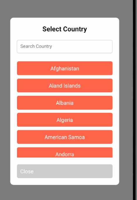
- CountrySelectModal Component (Child) This modal displays the list of countries in a FlatList. It allows the user to select a country, which will update the selectedCountry and store its dial_code in AsyncStorage using React Context.
Key Features:
isModalVisible: Controls whether the modal is visible.
handleCountrySelect: This function is triggered when a user selects a country, and it passes the selected country to the parent.
searchTerm: Filters countries based on search input.
Code for CountrySelectModal:
import React, { useState, useEffect } from 'react';
import { Modal, View, Text, StyleSheet, TouchableOpacity, TextInput, FlatList, ActivityIndicator, ScrollView } from 'react-native';

const CountrySelectModal = ({
  isModalVisible,
  setIsModalVisible,
  countries,
  handleCountrySelect,
  isLoading,
  searchTerm,
  handleSearchChange,
  filteredCountries
}) => {
  return (
    <Modal
      visible={isModalVisible}
      animationType="slide"
      transparent={true}
      onRequestClose={() => setIsModalVisible(false)} // Close the modal when the back button is pressed
    >
      <View style={styles.modalContainer}>
        <View style={styles.modalContent}>
          <Text style={styles.modalTitle}>Select Country</Text>

          {/* Search bar */}
          <TextInput
            style={styles.searchInput}
            placeholder="Search Country"
            value={searchTerm}
            onChangeText={handleSearchChange}
          />

          {isLoading ? (
            <ActivityIndicator size="large" color="#FF6347" />
          ) : (
            <ScrollView style={styles.scrollContainer}>
              <FlatList
                data={filteredCountries} // Dynamically filtered countries
                keyExtractor={(item) => item.id}  // Ensure key is unique
                renderItem={({ item }) => (
                  <TouchableOpacity
                    style={styles.modalButton}
                    onPress={() => handleCountrySelect(item)} // Pass the whole item object
                  >
                    <Text style={styles.modalButtonText}>{item.name}</Text>  {/* Display country name */}
                  </TouchableOpacity>
                )}
              />
            </ScrollView>
          )}

          <TouchableOpacity
            style={styles.closeButton}
            onPress={() => setIsModalVisible(false)} // Close the modal when 'Close' is pressed
          >
            <Text style={styles.closeButtonText}>Close</Text>
          </TouchableOpacity>
        </View>
      </View>
    </Modal>
  );
};

const styles = StyleSheet.create({
  modalContainer: {
    flex: 1,
    justifyContent: 'center',
    alignItems: 'center',
    backgroundColor: 'rgba(0,0,0,0.5)', // Semi-transparent background
  },
  modalContent: {
    backgroundColor: 'white',
    width: '80%',
    padding: 20,
    borderRadius: 10,
  },
  modalTitle: {
    fontSize: 20,
    fontWeight: 'bold',
    marginBottom: 20,
    textAlign: 'center',
  },
  searchInput: {
    height: 40,
    width: '100%',
    borderColor: '#ccc',
    borderWidth: 1,
    marginBottom: 15,
    paddingLeft: 10,
    borderRadius: 5,
  },
  modalButton: {
    backgroundColor: '#FF6347', // Red color
    padding: 10,
    marginTop: 10,
    alignItems: 'center',
    borderRadius: 5,
  },
  modalButtonText: {
    color: 'white',
    fontSize: 16,
  },
  closeButton: {
    marginTop: 20,
    padding: 10,
    backgroundColor: '#ccc',
    borderRadius: 5,
  },
  closeButtonText: {
    color: 'white',
    fontSize: 16,
  },
  scrollContainer: {
    maxHeight: 300, // Limit the height of the list inside the modal
  },
});

export default CountrySelectModal;
Summary
This setup allows you to implement a Multi-Country Dial Code Picker using a popup modal in React Native:
LoginScreen: Manages the country selection, phone input, and controls the modal visibility.
CountrySelectModal: Displays the list of countries in a FlatList, with a search bar to filter countries.
React Context: The selected country’s dial_code is stored globally using React Context and AsyncStorage.

Top comments (0)