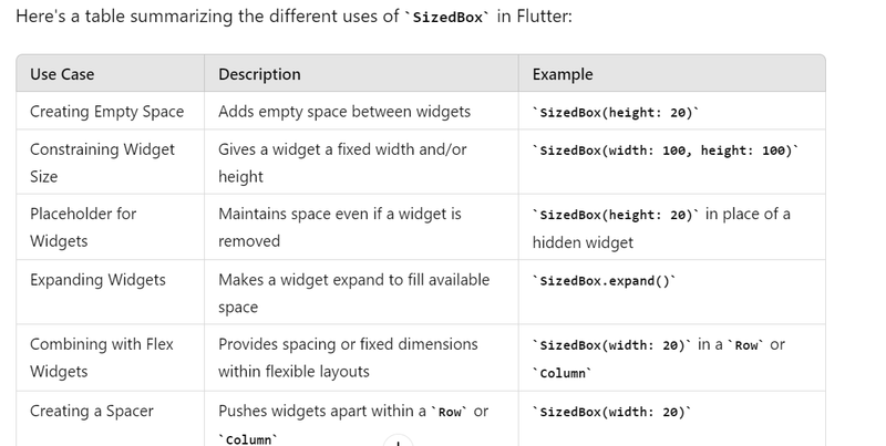
SizedBox is a widget in Flutter that is commonly used to create space and constraints within the layout. Here are several reasons and examples of why and how to use SizedBox in Flutter:
- Creating Empty Space SizedBox can be used to create space between widgets.
Example:
Column(
  children: <Widget>[
    Text('First Widget'),
    SizedBox(height: 20), // 20 pixels of vertical space
    Text('Second Widget'),
  ],
)
- Constraining Widget Size SizedBox can be used to give a widget a fixed width and/or height.
Example:
SizedBox(
  width: 100,
  height: 100,
  child: Container(
    color: Colors.blue,
    child: Center(child: Text('Fixed Size')),
  ),
)
- Placeholder for Widgets SizedBox can act as a placeholder, maintaining space even if a widget is temporarily removed.
Example:
bool _isVisible = false;

Widget build(BuildContext context) {
  return Column(
    children: <Widget>[
      _isVisible ? Text('Visible Widget') : SizedBox(height: 20),
      ElevatedButton(
        onPressed: () {
          setState(() {
            _isVisible = !_isVisible;
          });
        },
        child: Text('Toggle Visibility'),
      ),
    ],
  );
}
- Expanding Widgets When used with an infinite dimension (double.infinity), SizedBox can make a widget expand to fill available space.
Example:
SizedBox.expand(
  child: Container(
    color: Colors.red,
    child: Center(child: Text('Expanded')),
  ),
)
- Combining with Flex Widgets SizedBox can be combined with Row, Column, and other flex widgets to provide spacing or fixed dimensions within flexible layouts.
Example:
Row(
  children: <Widget>[
    Expanded(
      child: Container(color: Colors.blue),
    ),
    SizedBox(width: 20), // Spacer of 20 pixels
    Expanded(
      child: Container(color: Colors.green),
    ),
  ],
)
- Creating a Spacer SizedBox can be used as a spacer to push widgets apart within a Row or Column.
Example:
Row(
  children: <Widget>[
    Text('Start'),
    SizedBox(width: 20), // Spacer of 20 pixels
    Text('Middle'),
    SizedBox(width: 20), // Spacer of 20 pixels
    Text('End'),
  ],
)
Benefits of Using SizedBox
Simplicity: SizedBox is a simple and readable way to add spacing and size constraints in your widget tree.
Performance: It is lightweight and performs well, especially for adding space and constraints.
Clarity: Improves code clarity by explicitly showing that the purpose of the widget is to provide a specific amount of space or size.
Complete Example
Here's a complete example demonstrating several uses of SizedBox:
import 'package:flutter/material.dart';

void main() {
  runApp(MyApp());
}

class MyApp extends StatelessWidget {
  @override
  Widget build(BuildContext context) {
    return MaterialApp(
      home: Scaffold(
        appBar: AppBar(title: Text('SizedBox Examples')),
        body: Padding(
          padding: const EdgeInsets.all(16.0),
          child: Column(
            children: <Widget>[
              // Creating Empty Space
              Text('First Widget'),
              SizedBox(height: 20),
              Text('Second Widget'),

              // Constraining Widget Size
              SizedBox(height: 20),
              SizedBox(
                width: 100,
                height: 100,
                child: Container(
                  color: Colors.blue,
                  child: Center(child: Text('Fixed Size')),
                ),
              ),

              // Placeholder for Widgets
              SizedBox(height: 20),
              PlaceholderWidget(),

              // Expanding Widgets
              SizedBox(height: 20),
              SizedBox.expand(
                child: Container(
                  color: Colors.red,
                  child: Center(child: Text('Expanded')),
                ),
              ),

              // Combining with Flex Widgets
              SizedBox(height: 20),
              Row(
                children: <Widget>[
                  Expanded(
                    child: Container(color: Colors.blue),
                  ),
                  SizedBox(width: 20),
                  Expanded(
                    child: Container(color: Colors.green),
                  ),
                ],
              ),

              // Creating a Spacer
              SizedBox(height: 20),
              Row(
                children: <Widget>[
                  Text('Start'),
                  SizedBox(width: 20),
                  Text('Middle'),
                  SizedBox(width: 20),
                  Text('End'),
                ],
              ),
            ],
          ),
        ),
      ),
    );
  }
}

class PlaceholderWidget extends StatefulWidget {
  @override
  _PlaceholderWidgetState createState() => _PlaceholderWidgetState();
}

class _PlaceholderWidgetState extends State<PlaceholderWidget> {
  bool _isVisible = false;

  @override
  Widget build(BuildContext context) {
    return Column(
      children: <Widget>[
        _isVisible ? Text('Visible Widget') : SizedBox(height: 20),
        ElevatedButton(
          onPressed: () {
            setState(() {
              _isVisible = !_isVisible;
            });
          },
          child: Text('Toggle Visibility'),
        ),
      ],
    );
  }
}


Top comments (0)